

In the last episode of our Gutenberg editor series, we showcased the new block-based paradigm and how you can use it to create content. In this episode, we will focus on the default Gutenberg blocks that are provided out of the box. Some are self-explanatory and simple to use, while others are more complex and sport various different settings.
At the time of writing, Gutenberg categorizes blocks as follows:
- Most Used
- Common Blocks
- Formatting
- Layout Elements
- Widgets
- Embeds
- Shared
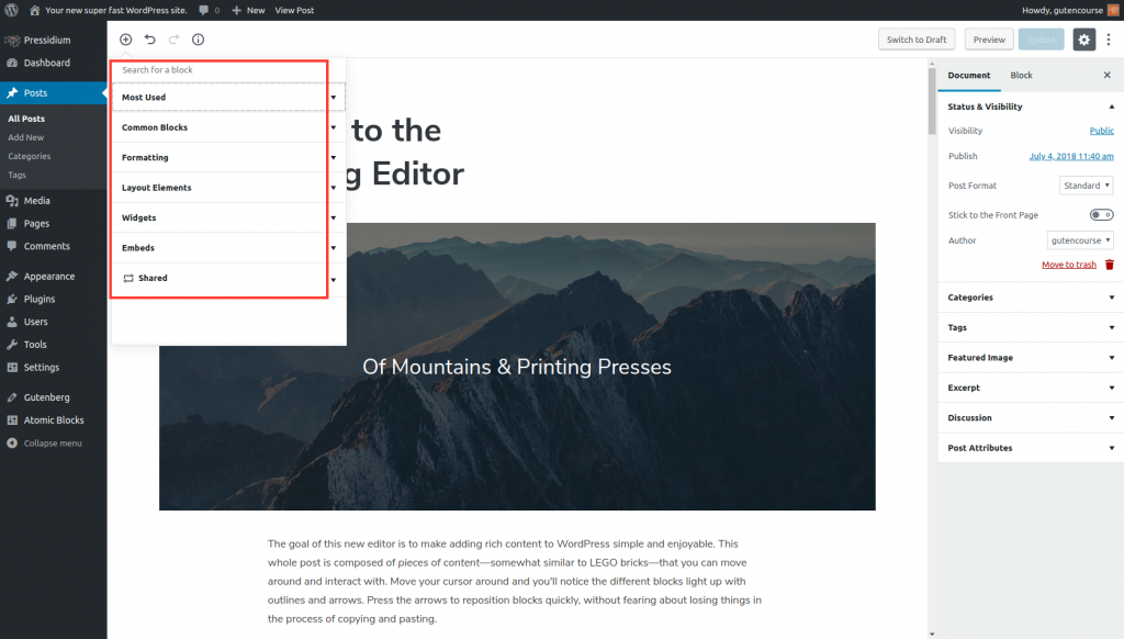
“Most Used” will depend on your installation, since it will display the blocks you use more frequently. “Shared” also depends on your installation. Once you “Add to Reusable Blocks” a block, it becomes reusable and available under the Shared menu section.
Note: How the blocks look on the front end of your website will heavily depend on the theme you are using.
Before proceeding to the presentation of default blocks we recommend opening frontenberg in a new tab so you can experiment as you read along 😉
The default Gutenberg blocks
Here are the most common blocks you will use in your posts, including text and media. These blocks are available from your default Gutenberg installation, out of the box.
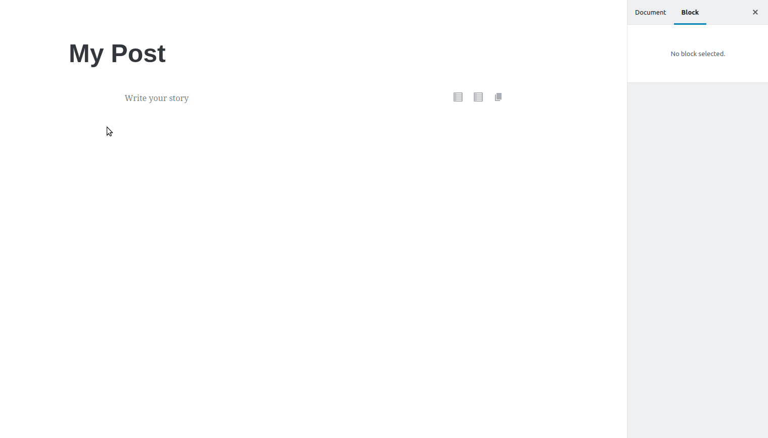
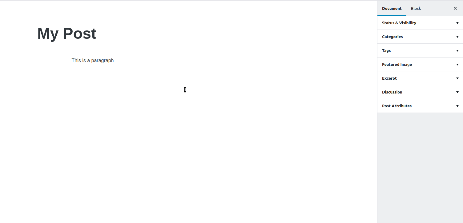
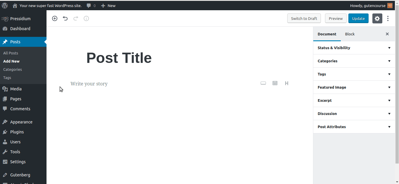
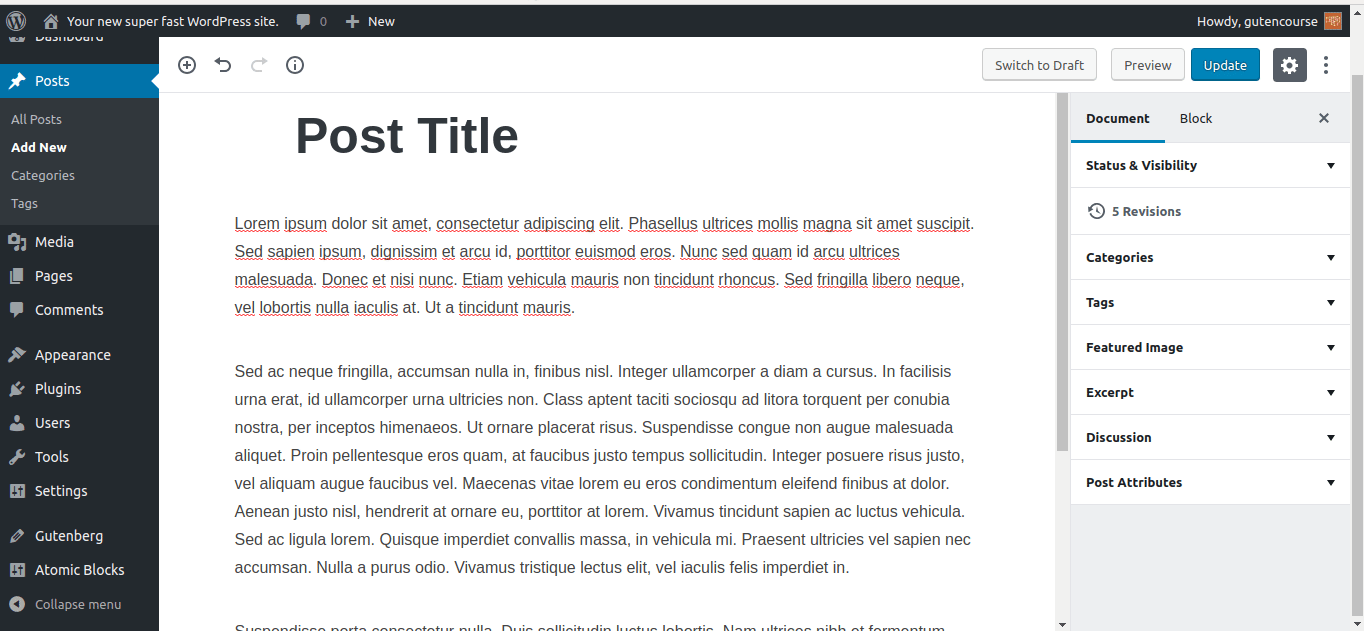
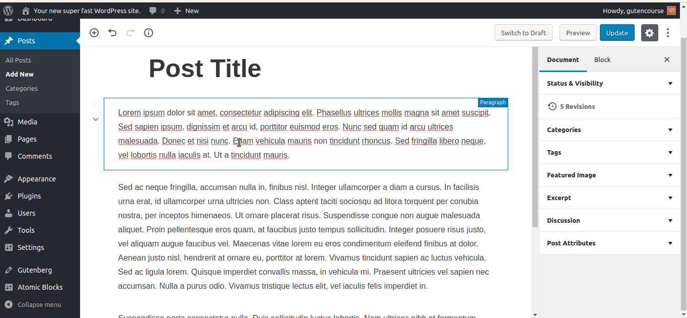
Paragraph
The end result on the front-end will be different and will depend on your theme’s styling.
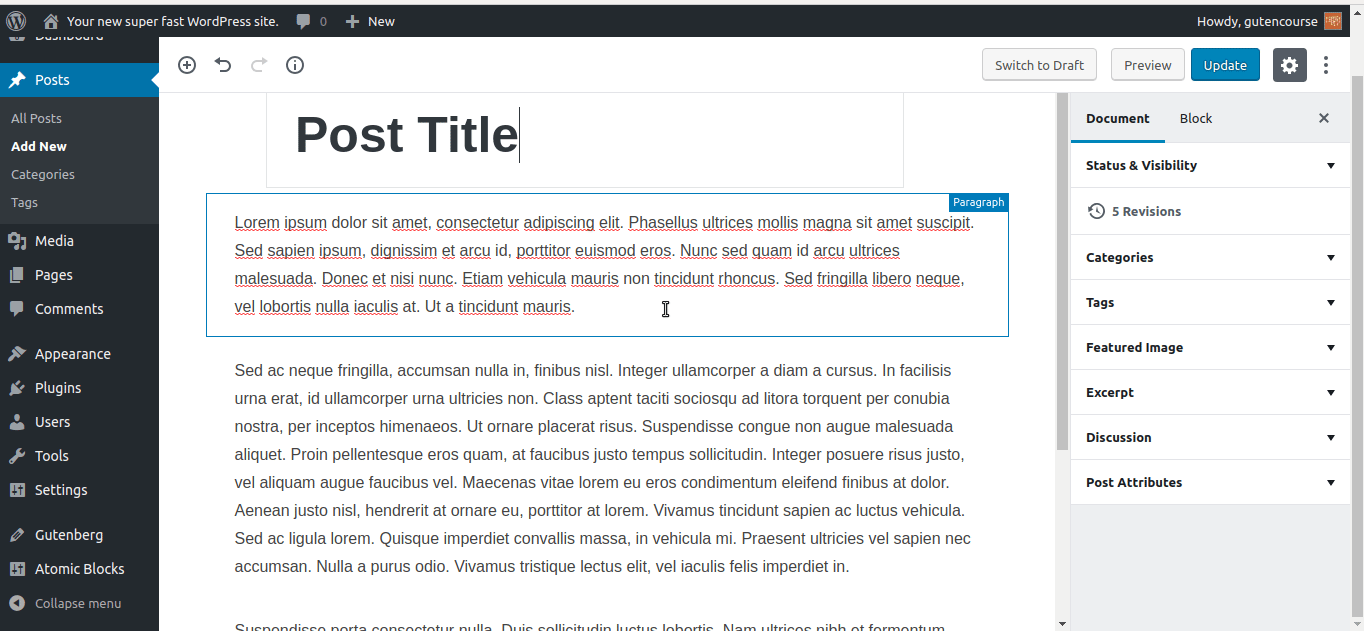
This is the basic building block of Gutenberg. Each time you press “Enter” while you type, a new Paragraph block is created, splitting your text into separate paragraph blocks. As we mentioned in previous episodes, each paragraph block has its own set of settings. An important thing to note is that the Paragraph block can be easily converted into other text blocks.
Heading
Front-end:
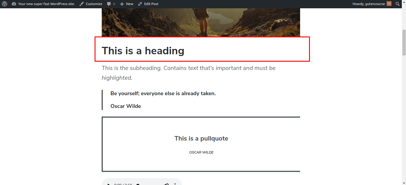 Using the Headings block you can insert different Headings, <h1> through <h6>, inside your content. Once you insert multiple heading blocks, a Table of Contents becomes available in the sidebar.
Subheading
Front-end:
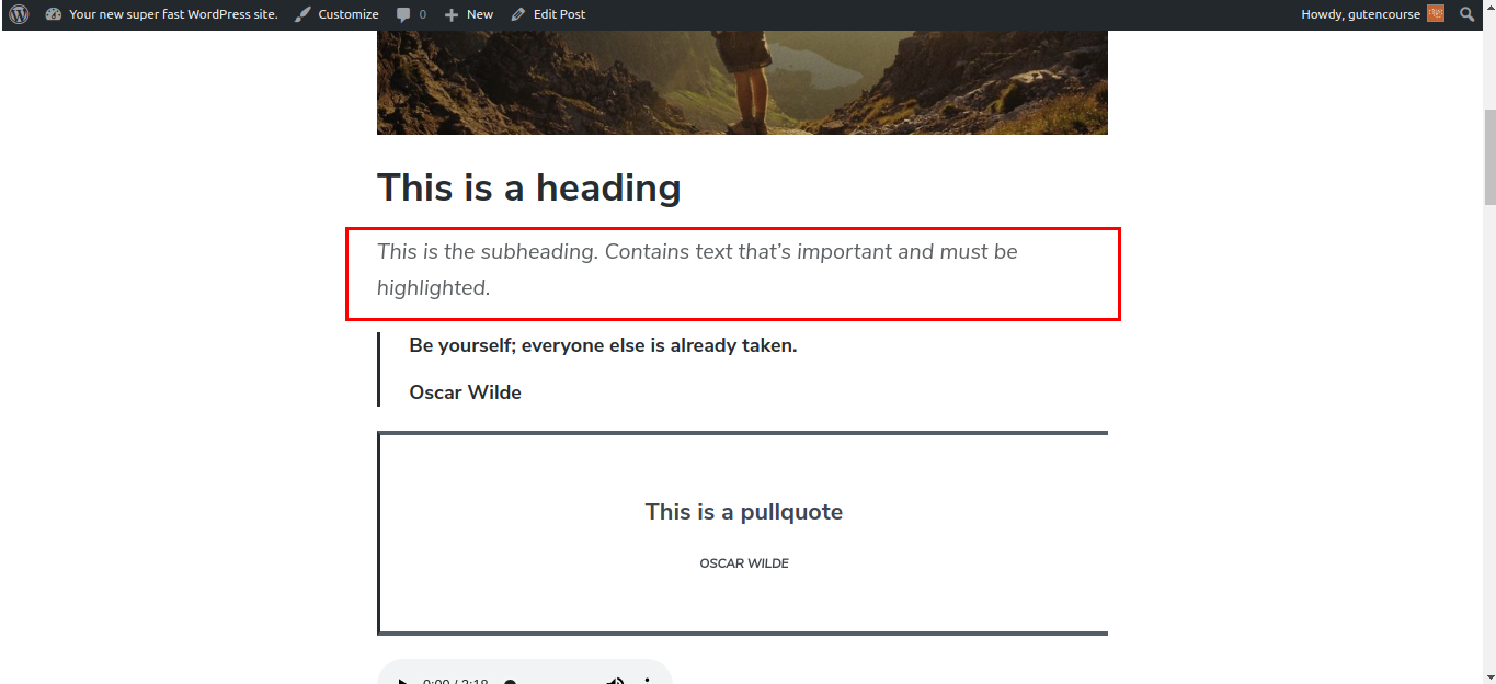
A subheading is used to highlight a piece of text, usually right after your main heading. It’s smaller than a heading but larger than regular text. It’s used sparingly, whenever there is a need to further break down your content’s structure.
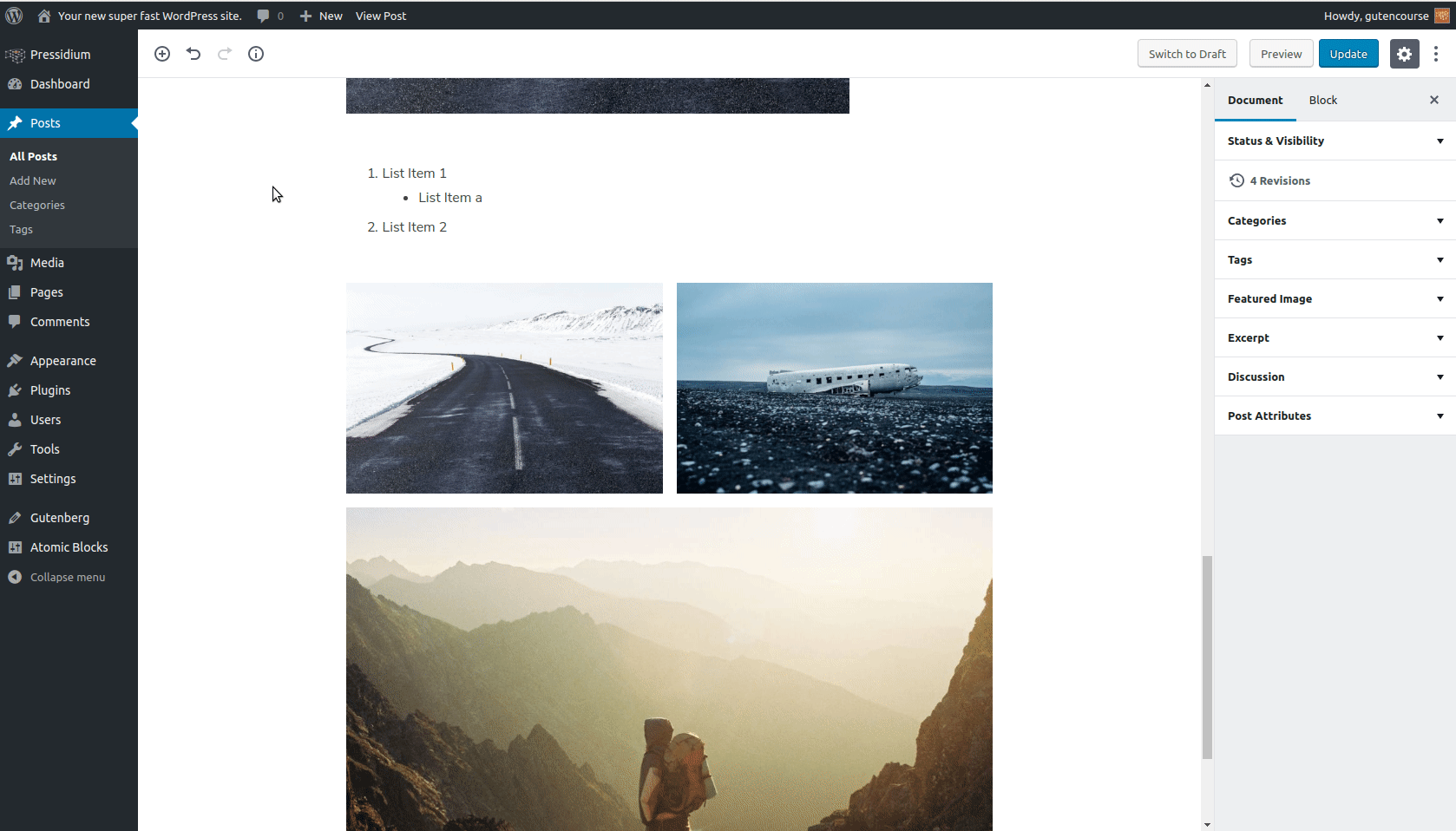
List
Front-end:
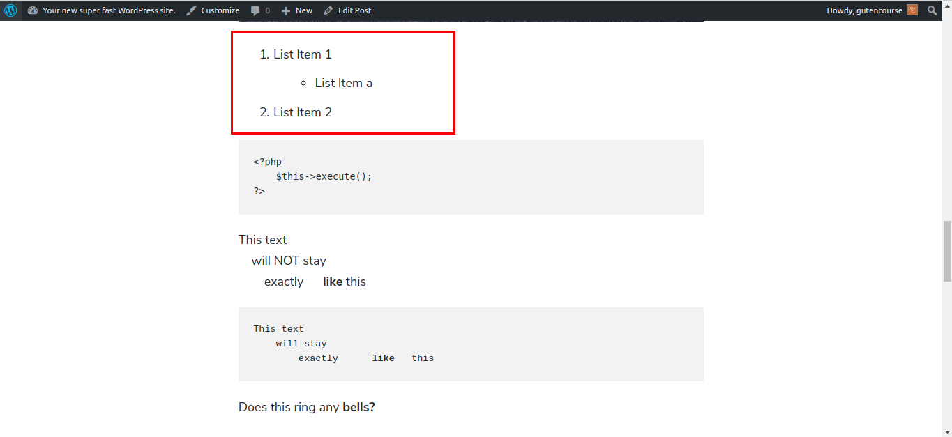
This is the basic List block. It can be indented, ordered, or unordered.
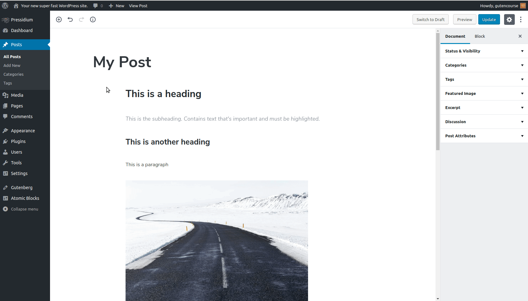
Image
Front-end:
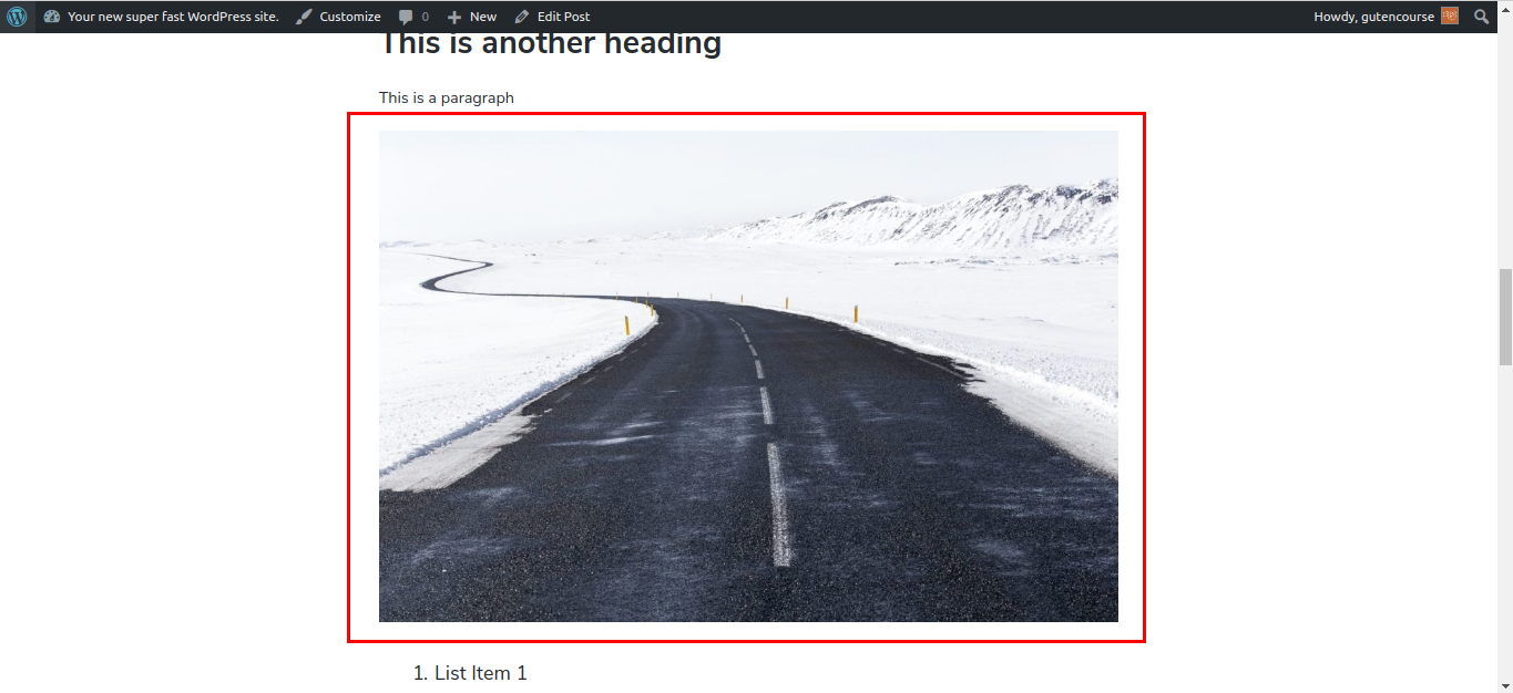
This block allows you to insert a single image inside your content. There are also options for alignment, resizing, and URL linking.
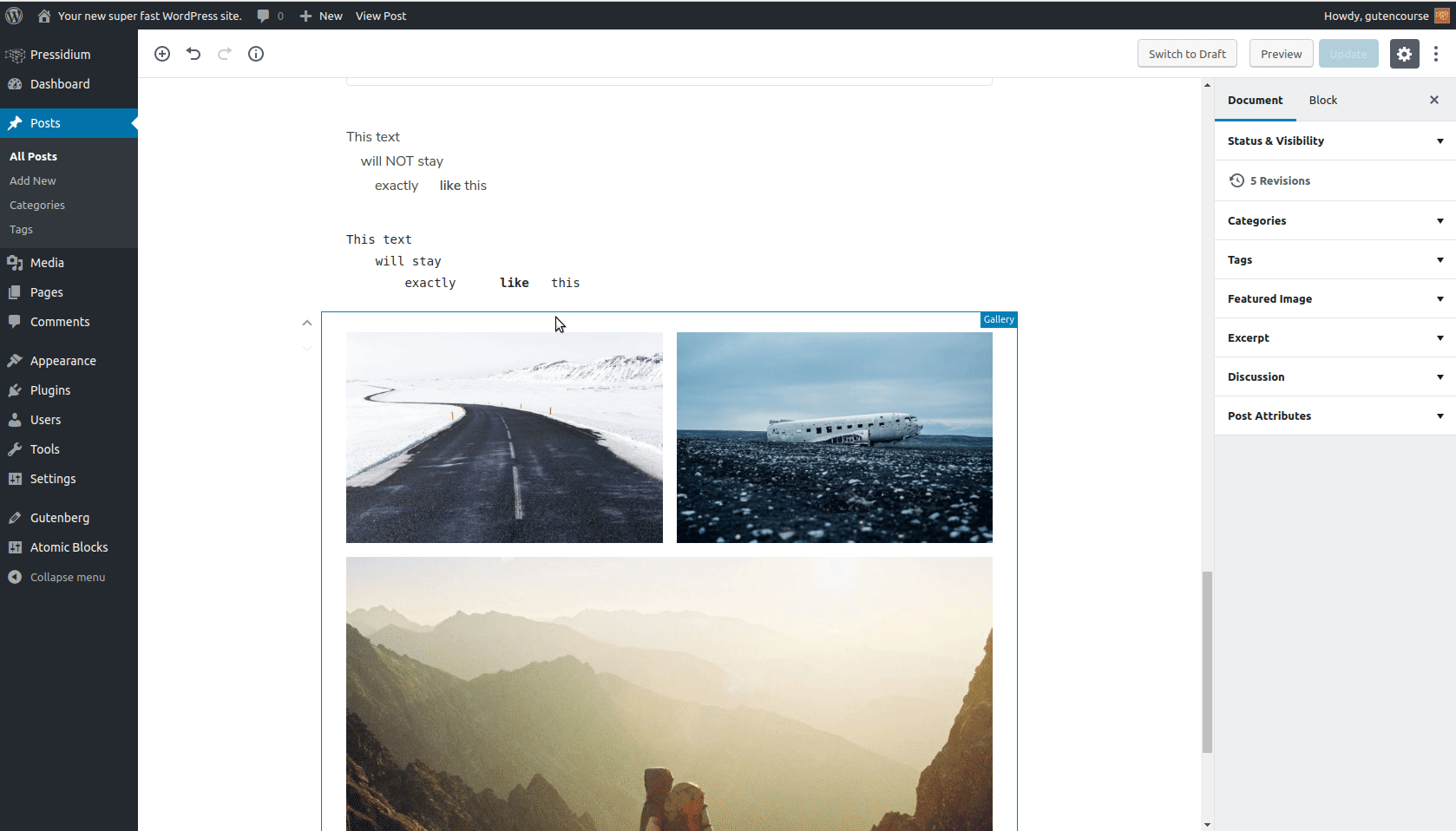
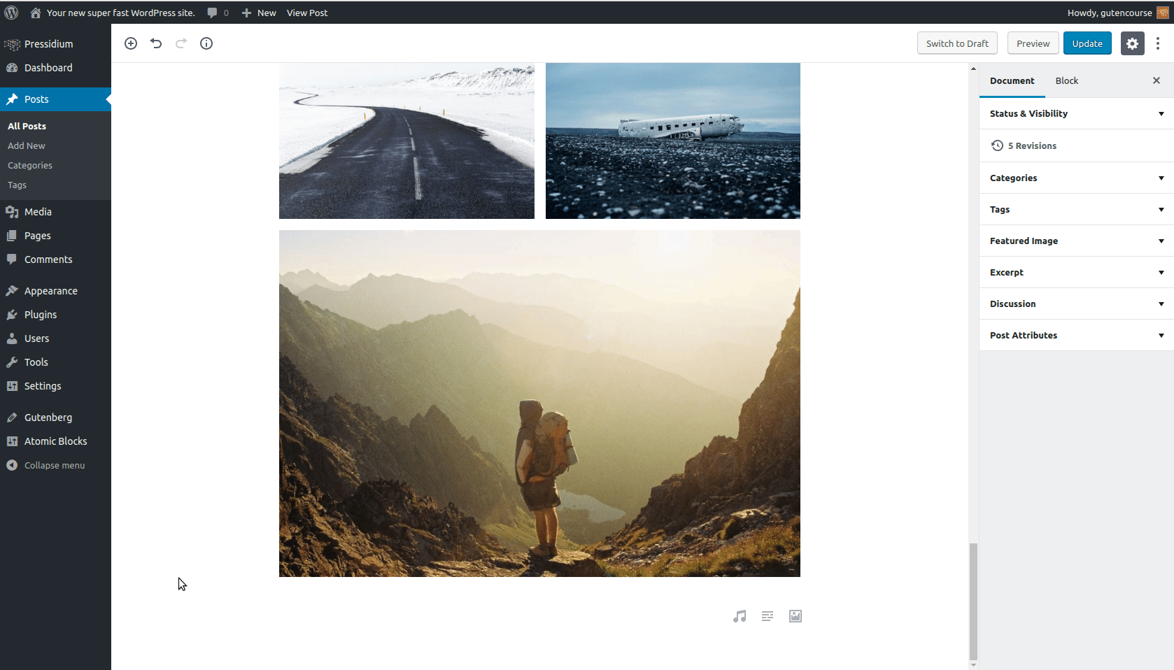
Gallery
Front-end:
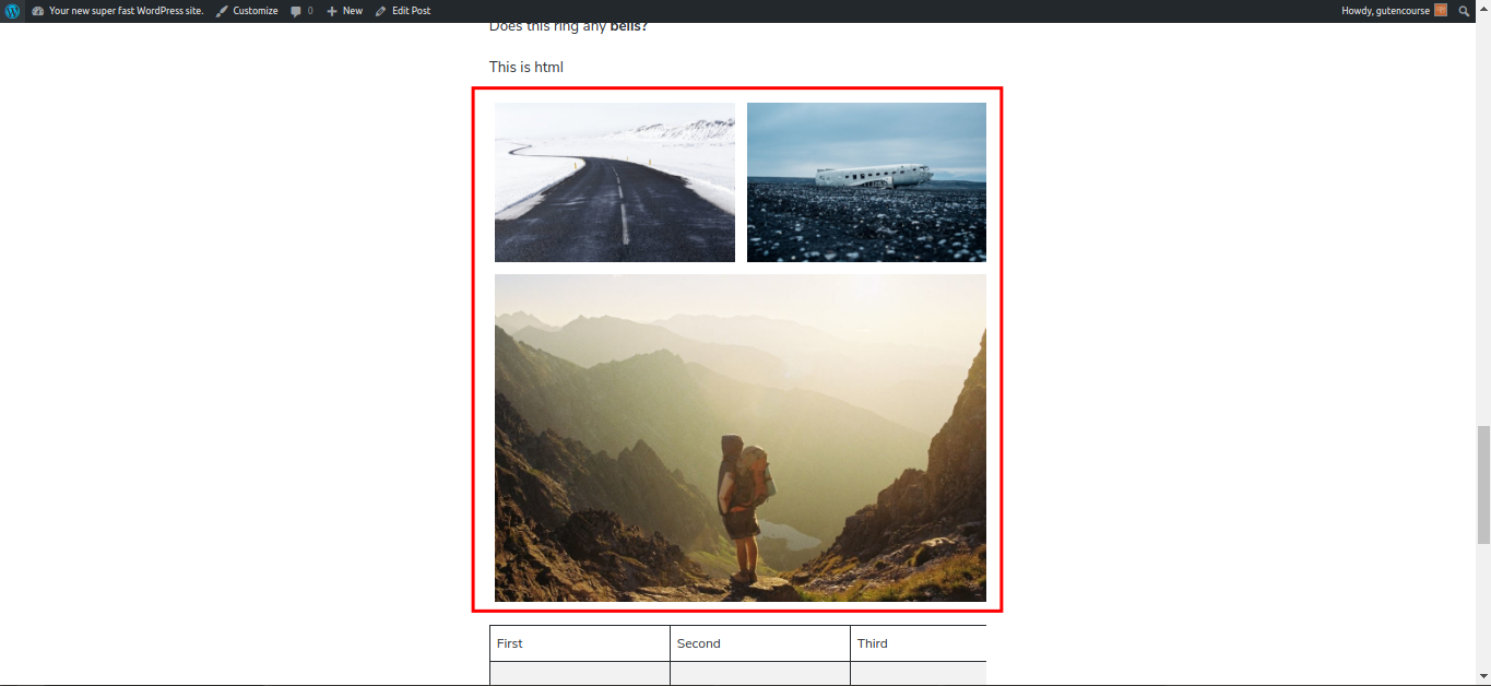
Using the Gallery block, you can add multiple images inside a page in a grid-like fashion. You can customize the image caption and the number of grid columns as well.
Cover Image
Front-end:
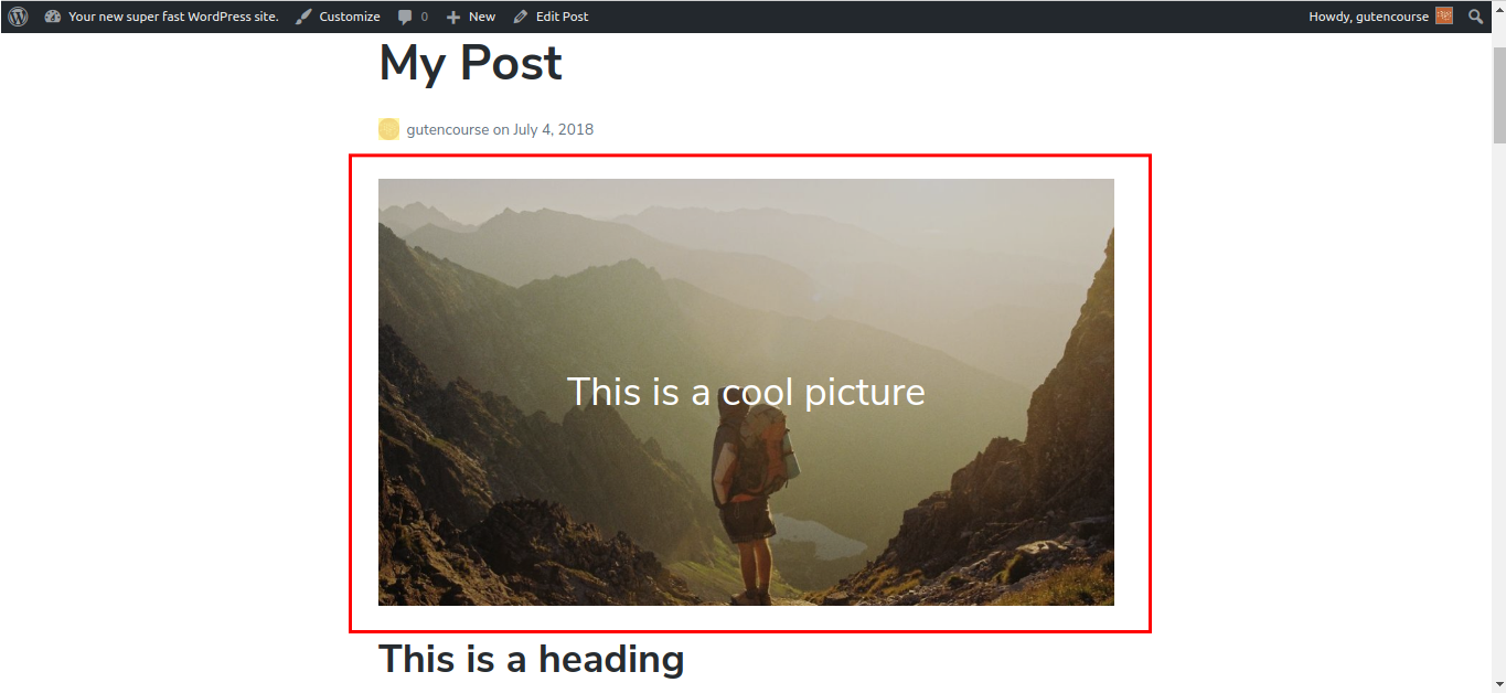
The Cover Image is a block that combines an Image with text inside. It’s commonly used as a banner in a post but can be placed anywhere.
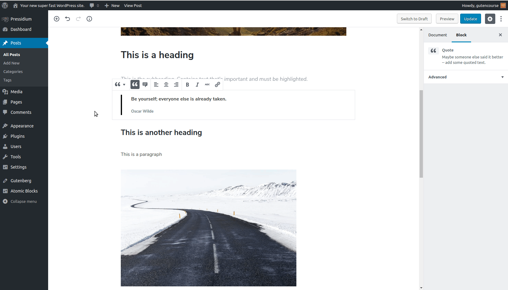
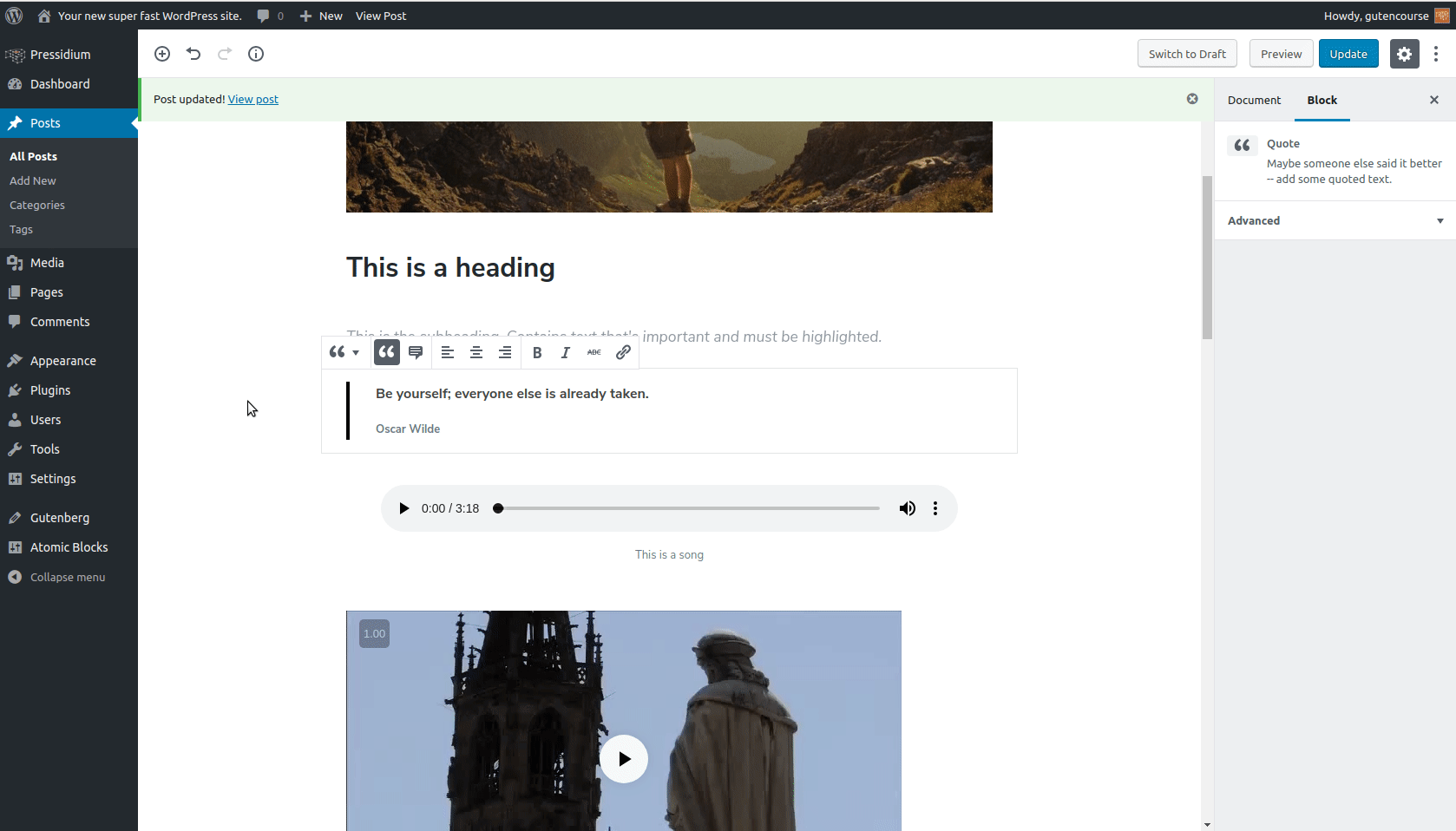
Quote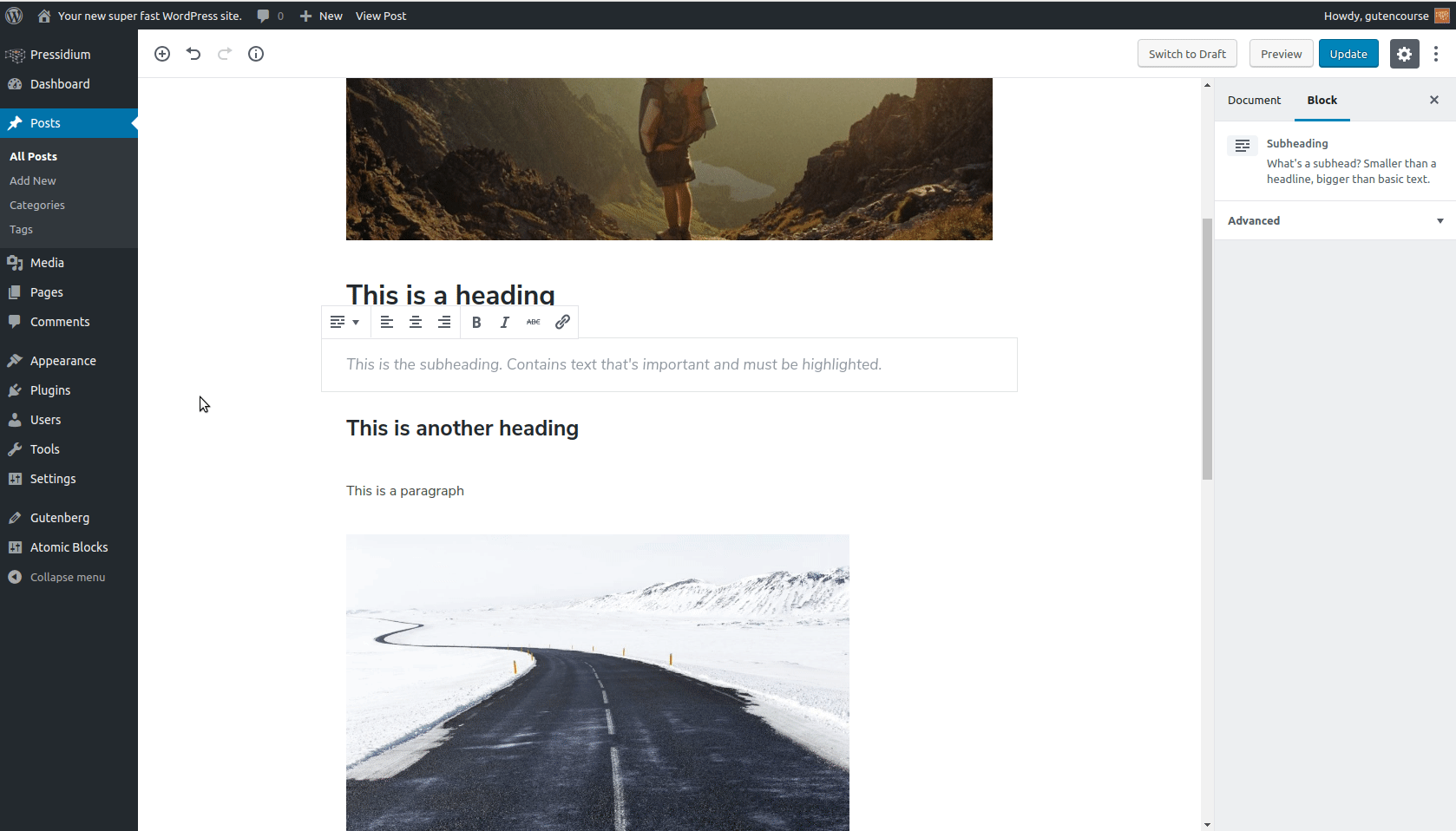
Front-end:
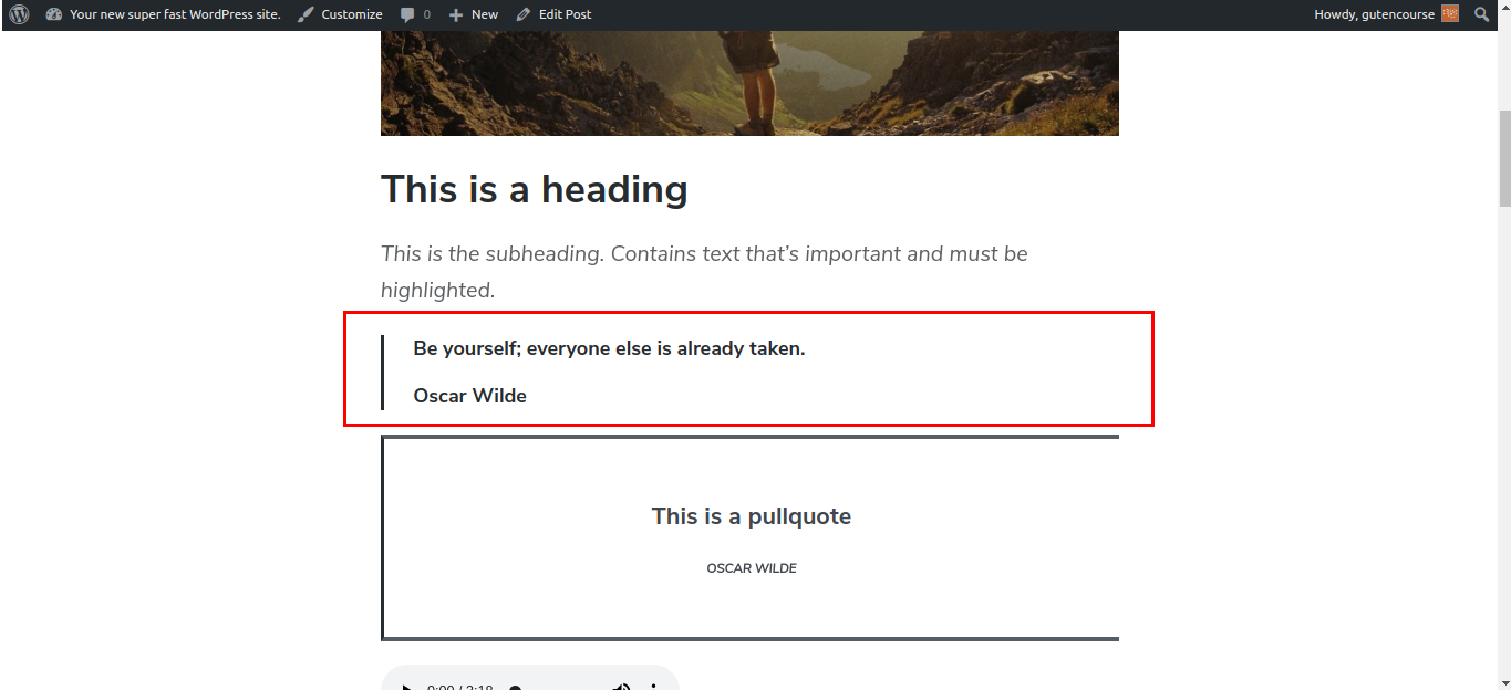
The Quote block is used when you want to reproduce words written or spoken by another person. After entering the quote’s text, add the author reference in the placeholder at the bottom.
Audio
Front-end:
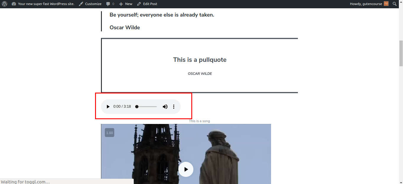
The Audio block provides a simple native HTML audio player that can be used to add and play audio files inside your content. Audio files are stored in the Media Library.
Video
Front-end:
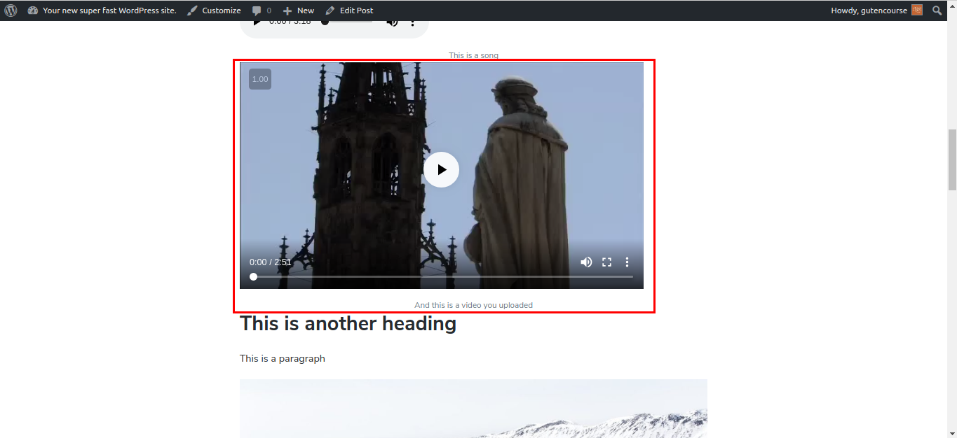
The Video block is used to upload videos on your WordPress site and display them inside your post content.
Note: This is not intended to display YouTube videos, or videos hosted on external services (ex. Vimeo). WordPress provides a special block for these.
Formatting
These blocks provide some extra formatting options for your content: code, verse, and other types of text that need special format.
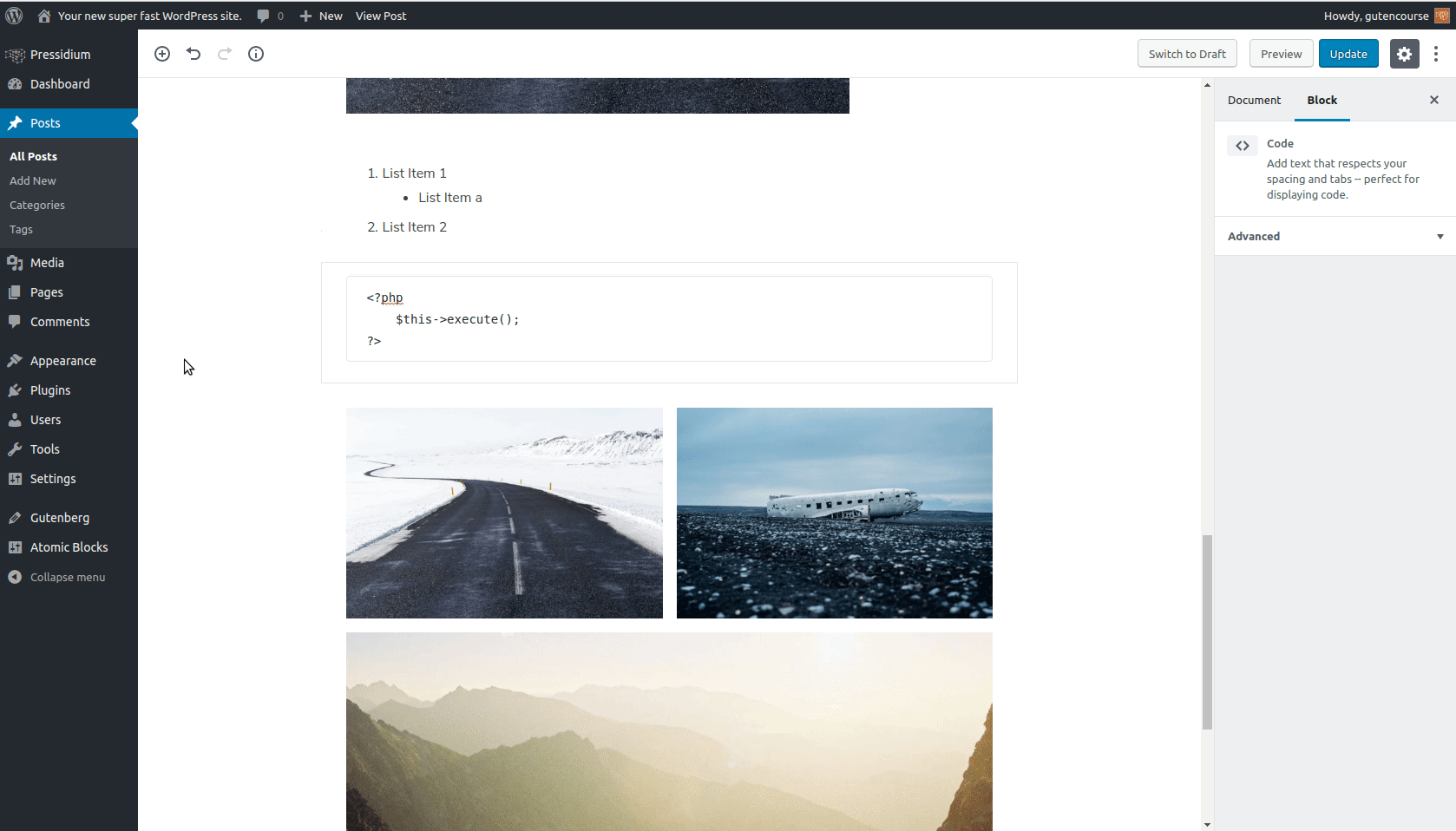
Code
Front-end:
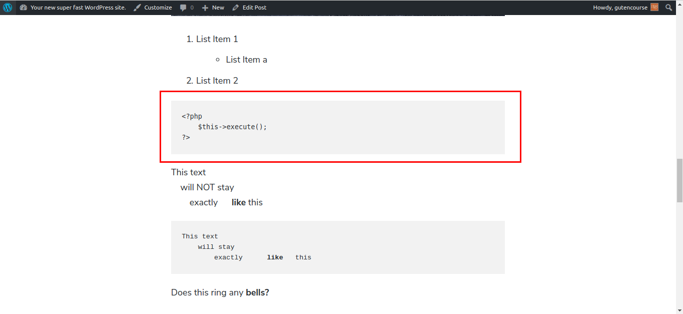
Code block is used to display code snippets from any programming language. It preserves tabs and spaces.
Preformatted
Front-end:
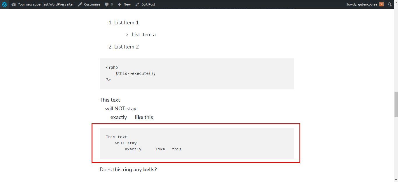
This block is the same as the Code block, meaning that it preserves formatting. The only difference is that you can add your additional formatting like bold, italics, etc.
Classic (tinyMCE)
Front-end:
The “Classic” block is the good old TinyMCE editor, for those that still want a taste of the past. 😅
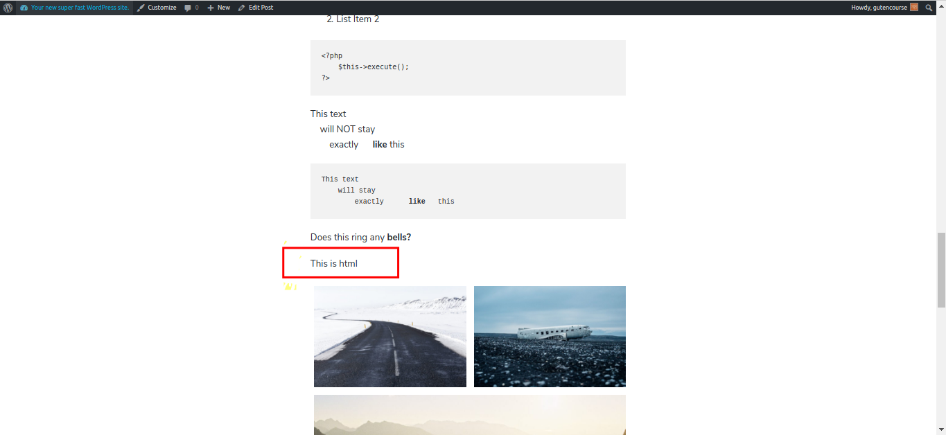
Custom HTML
Front-end:
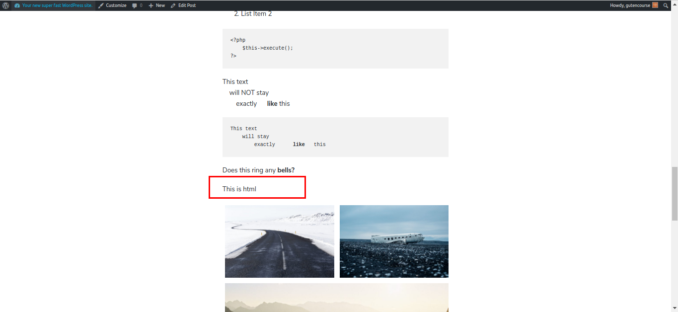
This block is used to add Custom HTML code inside your content. You can also see a preview, on the spot.
Pullquote
Front-end:
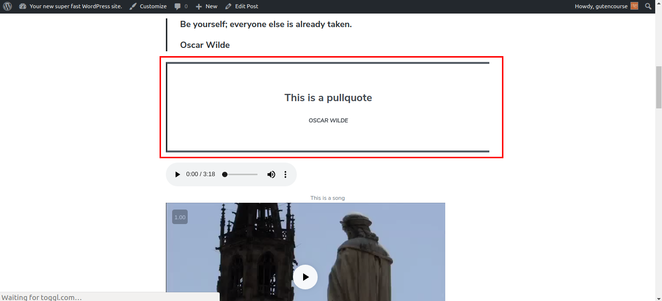
Pullquote is similar to the “Quote” block, but larger and more prominent.
Verse
Front-end:
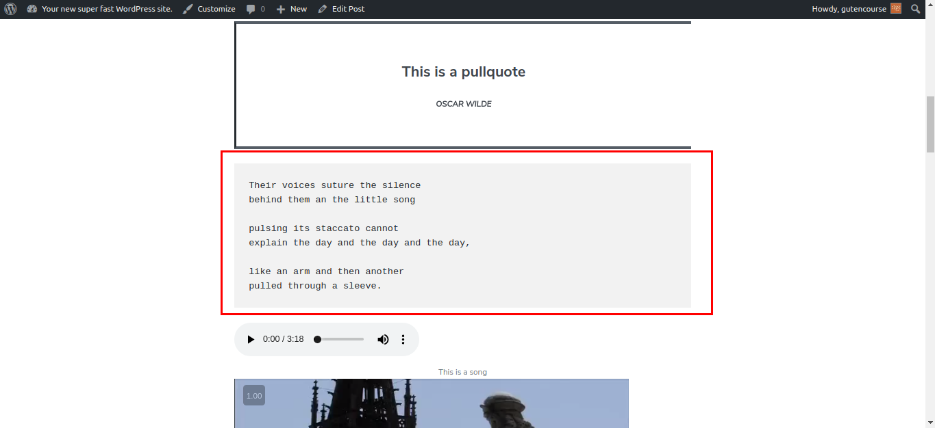
The Verse block is commonly used for displaying verses from lyrics, poetry, and such. Line breaks and spaces are left intact.
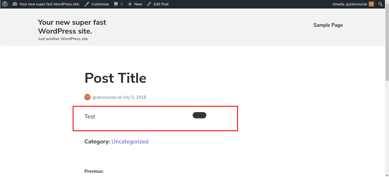
Table
Front-end:
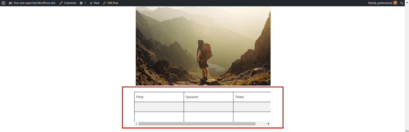
The Table block allows you to insert tables in your content. You can customize the table’s alignment as well as the number of rows and columns.
Layout
Button
Front-end:
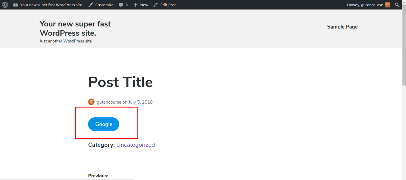
With the Button block you can display links as customized buttons.
Columns (beta)
Front-end:
The Columns block allows you to split the content into multiple columns, max. 6. You can add blocks inside the columns as you would normally do.
Text Columns
Front-end: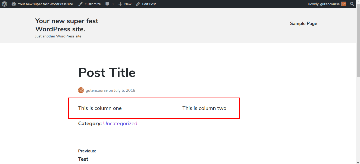
This block is similar to the Columns block, except you can only have text inside the columns.
More
Front-end:
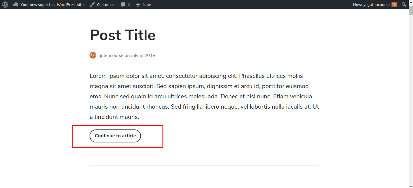
The Read More block allows you to make an introductory excerpt of your text. The user can read the rest of the article by clicking a “Continue” link at the bottom.
Separator

Front-end:
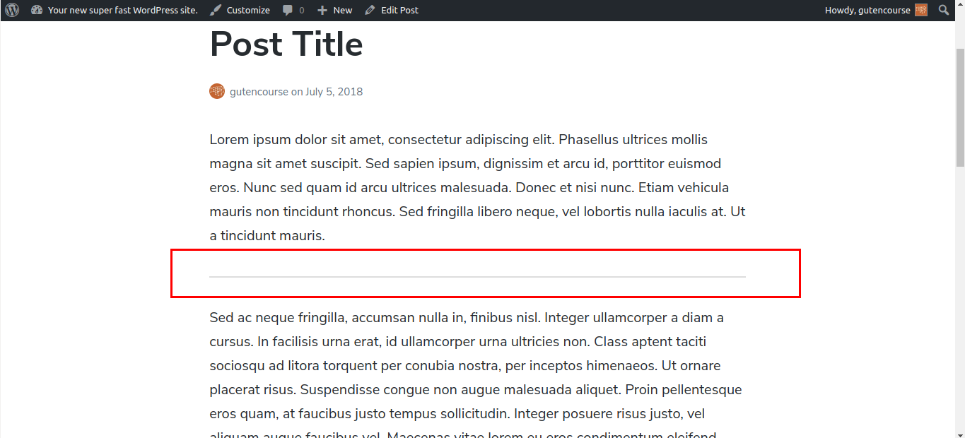
This is a simple horizontal line separator, useful for differentiating between sections in your post.
Page Break
Front-end:
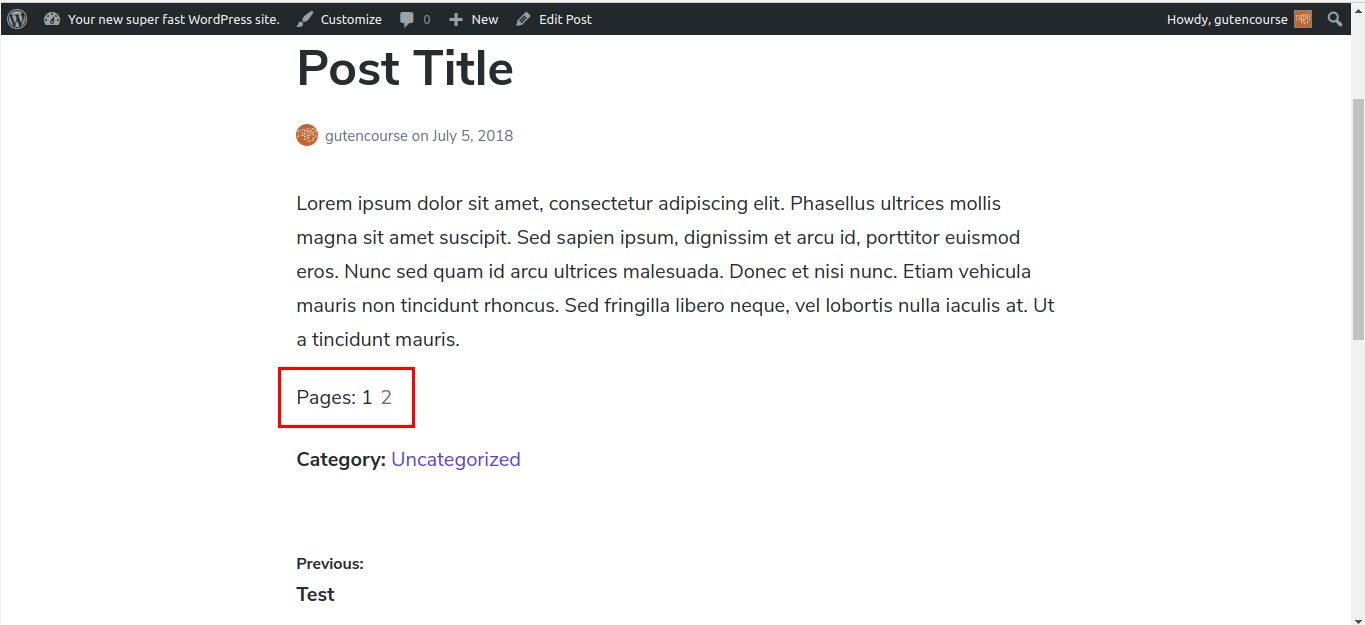
A Page Break block splits your content into multiple pages. The user will have to click on ‘Next Page’ to view the rest of the post. This is useful for long stories or Top 100 lists.
Spacer
Front-end:
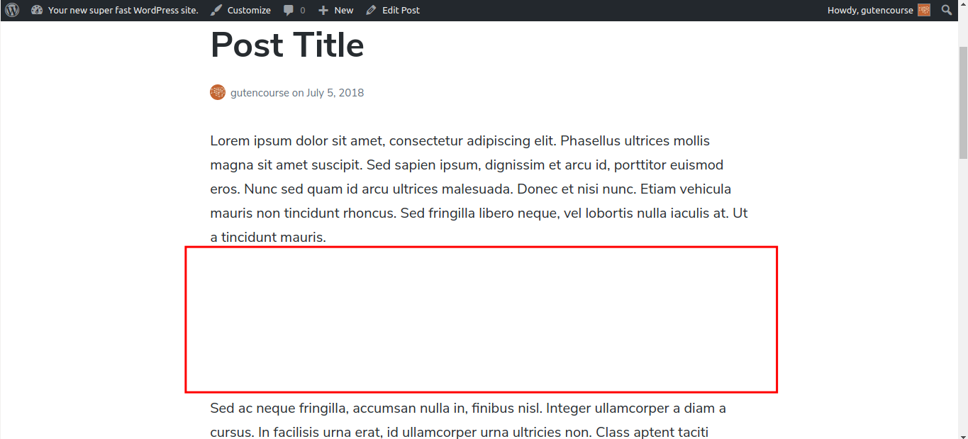
This block adds a large rectangular blank space between two blocks in your post.
Widgets
We suspect that this category will have more blocks in the future. It will enable you to use WordPress Widgets inside your content, and not only in sidebars as you are used to.
Shortcode
This block allows you to enter a shortcode, as you would do with TinyMCE. Shortcodes retain their functionality in Gutenberg, but it’s not considered as best practice. Ideally shortcodes should be converted to Custom Blocks.
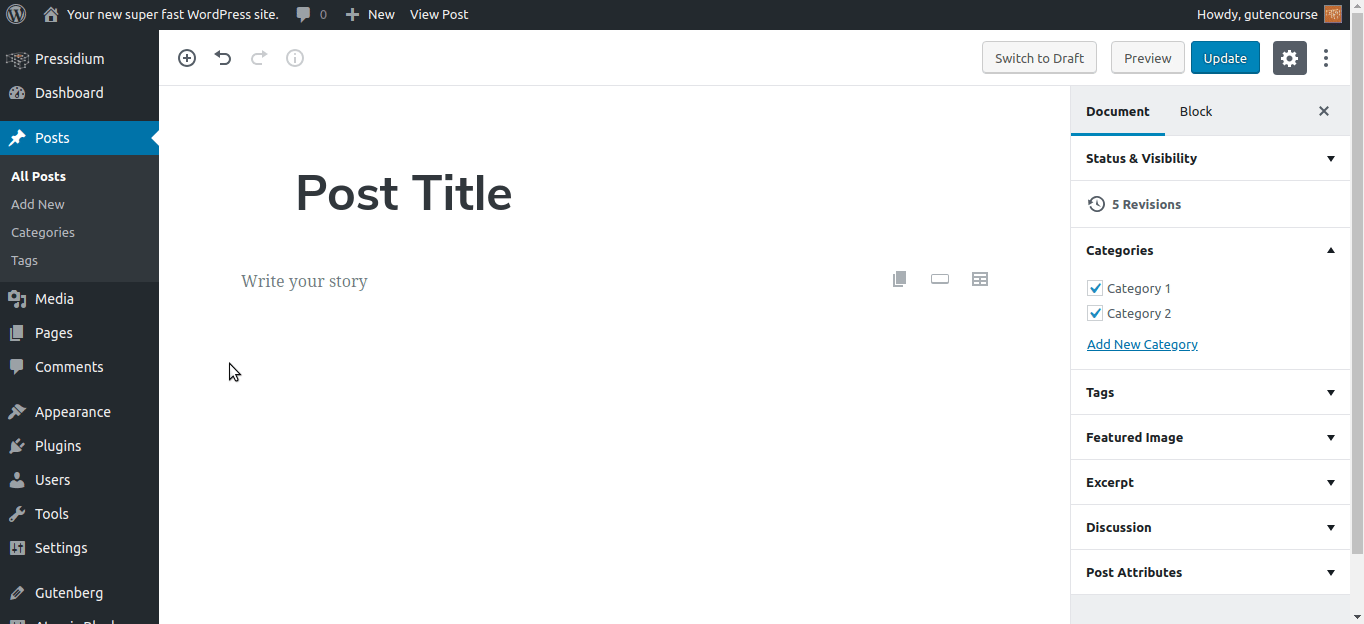
Categories

Front-end:
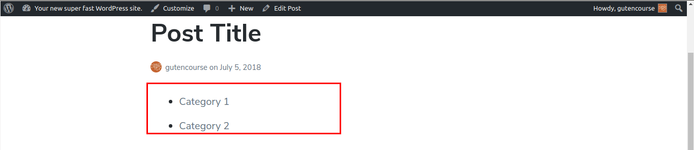
This block displays a list of your categories with links, exactly like the Categories Widget. There are settings to customize the look, show post counts, and whether to display the categories hierarchically, or flat.
Latest Posts
Front-end:
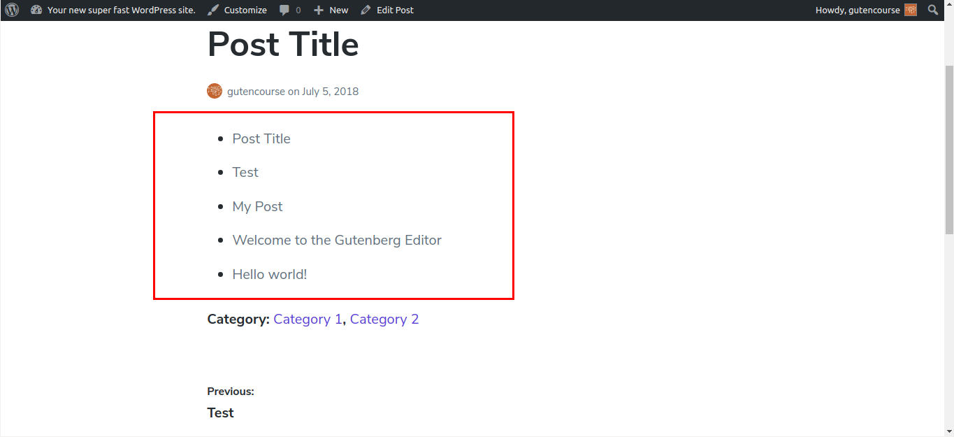
Just like the Recent Posts Widget, the Latest Posts block provides a list of links to the most recent posts on your website. The number of posts and the way they are ordered can be changed through the block’s settings.
Embeds
Front-end:
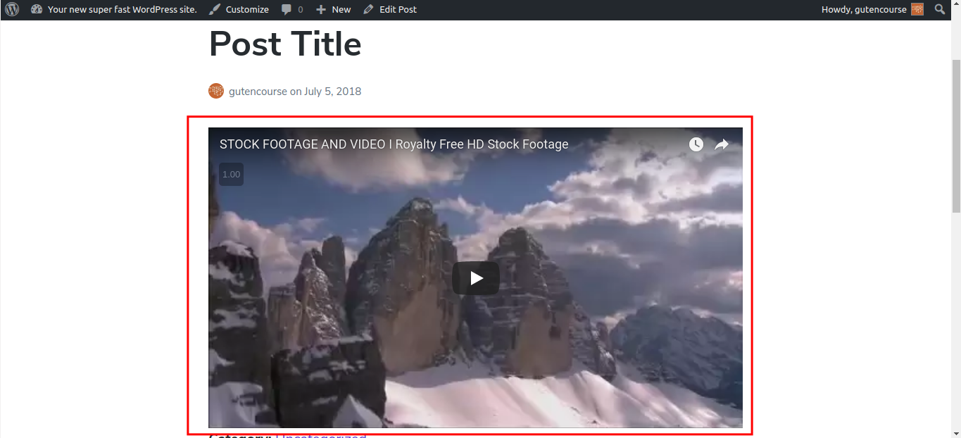
Embeds are different blocks, each corresponding to content from a third-party service, like Youtube, Giphy, etc. Select the ‘Embed’ block and enter a URL; If supported, the service associated with that URL will pop-up.
Conclusion
In this episode, we described in detail all of the blocks that WordPress Gutenberg provides by default. If you want to learn how custom blocks work and look like, make sure to check out our next episode!
Start Your 14 Day Free Trial
Try our award winning WordPress Hosting!


