Let’s face it, we’ve all been there. You’re designing a website and you want to be as creative as possible and that includes using some amazing fonts! However, when it comes to typography there are some restrictions you should consider before settling on fonts for your WordPress website. Why? Pick the wrong one and you could find it won’t display properly for all website visitors.
After all, using creative, unique typography on your website designs is no use if the font you picked can’t be loaded and is substituted by a random system font, which totally messes up your beautiful designs, isn’t it?
This is why it’s recommended to choose a so-called Web Safe Font for your designs.
Let’s take this from the very beginning and find out more about Web Safe fonts and then look at 33 of the very best Web Safe fonts you can use for your WordPress website!
What does ‘Web Safe Fonts’ mean?
Web Safe Fonts are fonts that are universally pre-installed across all devices. They don’t have to be downloaded from the website’s server like the rest of the website’s assets in order to be displayed. This comes with two major benefits:
- You can expect typography involving Web Safe Fonts to appear exactly as intended for the majority of users. If however, you’re not using a Web Safe font and that font isn’t installed on a user’s computer and for some reason can’t be downloaded, your website will revert to a system font, which will not only ruin your design and visual branding, but sometimes even end up as unreadable.
- Web Safe Fonts are stored locally, so your website should load much faster. This means better speed and performance, which will positively impact your SEO efforts as page loading speed is one of the factors taken into account for page ranking.
So, almost without exception, it would seem to make sense to always use a Web Safe font for your website designs. But, even if you decide you want to sacrifice part of your website’s performance for brand consistency issues, and use you brand’s typeface, you should always design with Web Safe Fonts in mind. Why is that? Because there will be cases where you font will not be downloaded and displayed properly (older browsers or poor internet connection for example).
In these instances it’s good to have a Plan B, a fallback option for when your first option might not work. Even though the list of Web Safe Fonts is not long, you can definitely find one very similar to your original option. This way you can have 100% control of how your website will be displayed to all users and you won’t risk of Times New Roman popping up (as a random font substitute) and ruining your beautifully designed website!
What about Google Fonts?
Google fonts are often mistaken as Web Safe Fonts. That’s not exactly the case though. Google fonts are not pre-installed on a device, but hosted by Google. So, in order for them to be displayed on a site visitor’s computer, the fonts files must first be downloaded just like any other asset. This automatically lists them as Web Fonts and this is why they are so often confused with ‘Web Safe Fonts’.
However, fonts served by the Google Fonts API are automatically compressed for a faster download, and once downloaded they are cached in the browser and reused by any other web page that uses the Google Fonts API. Simply put, they are downloaded much more quickly, and will have much less effect on your website’s speed and performance. So, even though they are not strictly speaking Web Safe fonts, they are still perfectly safe to use on your website and can help give it a more unique, creative look.
Note: While using Google Fonts is considered a ‘safe’ and popular choice for web-design, it is still highly recommended you design with web-safe fonts in mind, like we mentioned before. Always have a web-safe-font selected, close to your primary choice, in which your fonts will ‘fall-back’ to if needed.
You can browse and get inspired for your next project by visiting Google Fonts.
Which Are The Best Web Safe Fonts?
Truth is, the list of Web Safe fonts is shorter than a designer would ideally wish for! Fortunately though, some of the most popular and well-designed ones are included. Let’s have a look, starting with the Sans-serif fonts and moving on to the Serif, Monospace and Cursive font families.
1. Arial
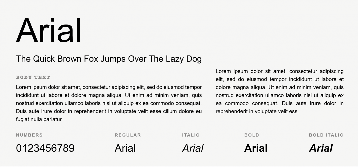
Arial is a classic Sans serif font, widely used for the past 30 years, thanks to its readability on both small and large texts. Introduced as an “alternative for Helvetica” by Microsoft on 1992, Arial has been the default font for Microsoft for many years, and is still used as the default font in Google Docs.
2. Arial Black
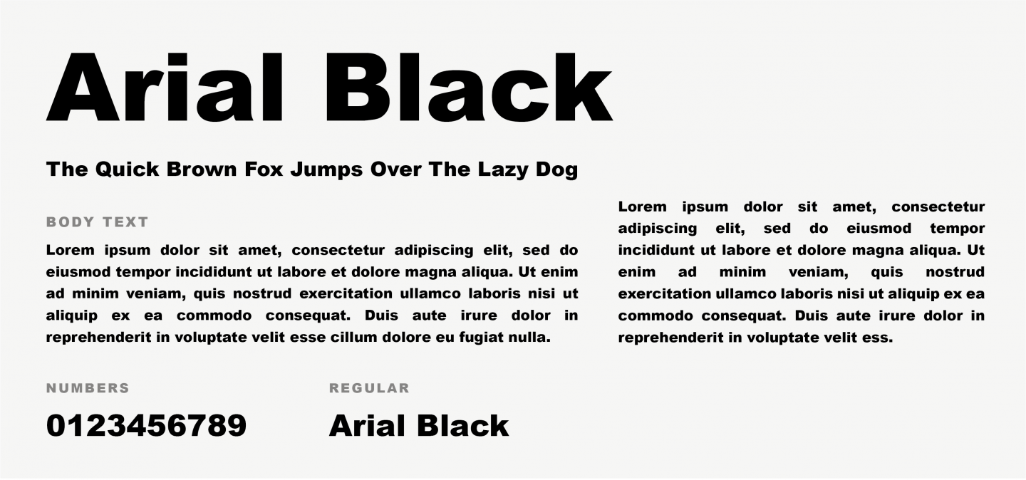
Just like you’d imagine, Arial Black is the much bolder version of Arial. However, it consists of a more humanist design and shares proportions with Helvetica. It has been successfully used in newspapers, advertising and large headlines.
3. Calibri
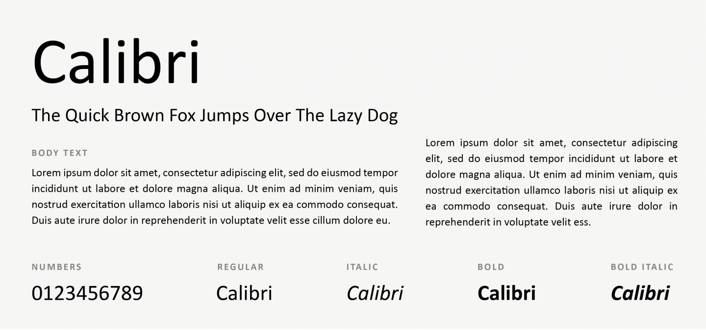
Having replaced Times New Roman as the default Microsoft Word font, Calibri is an excellent option for a safe, universally readable Sans-serif font.
4. Candara
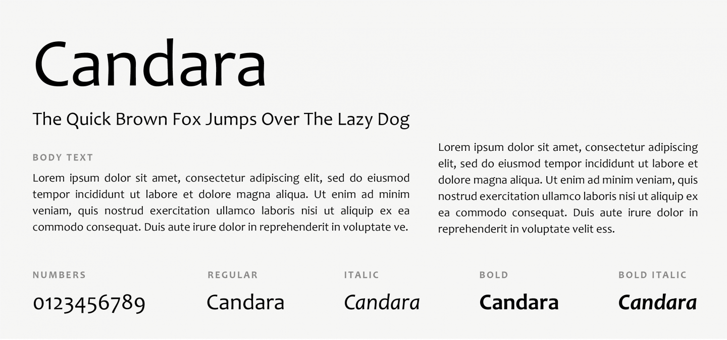
Candara is a humanist Sans-serif typeface designed by Gary Munch and commissioned by Microsoft. It supports the Windows ClearType text rendering system, which should improve text readability on LCD displays.
5. Century Gothic
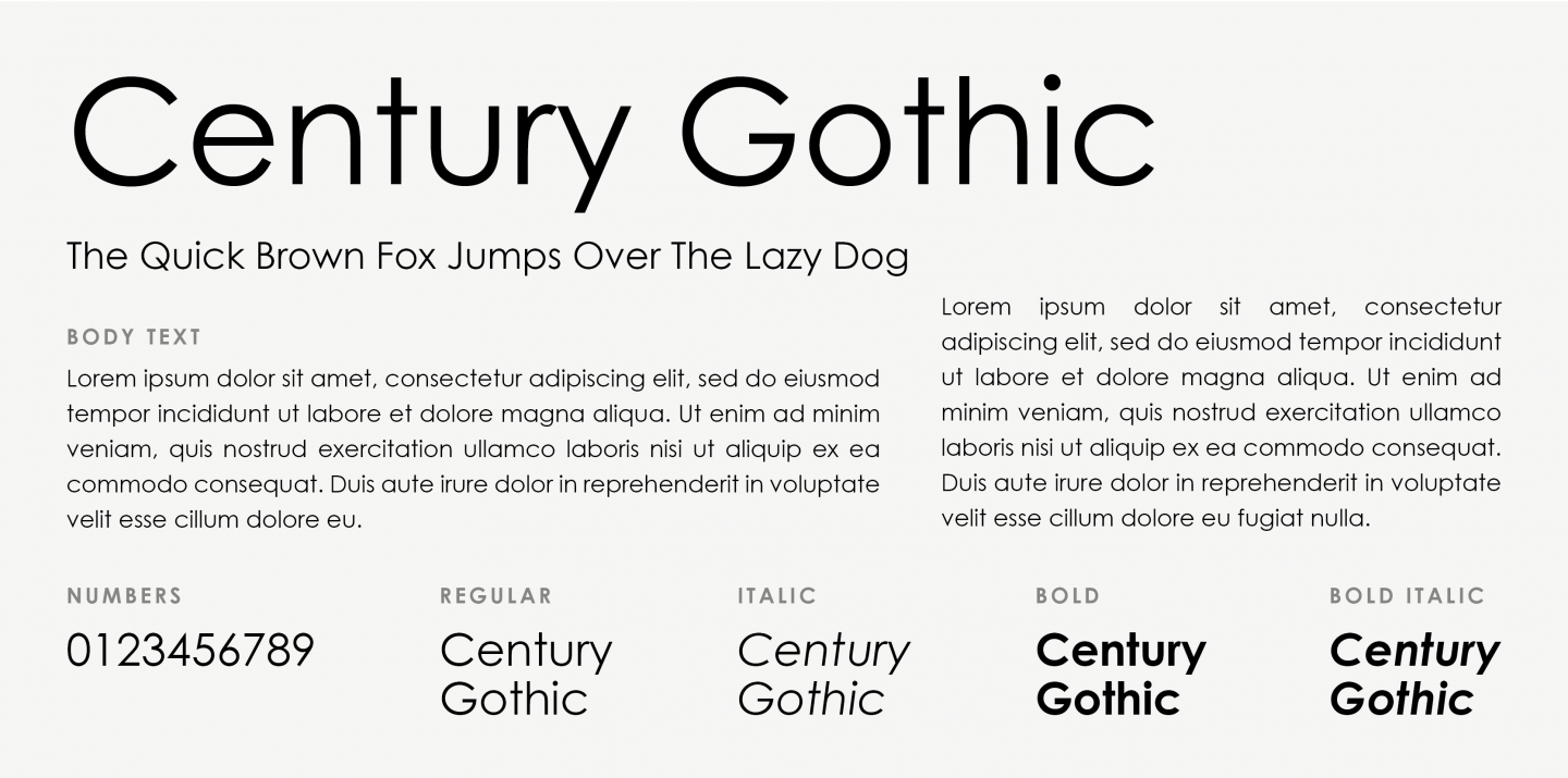
A wide, clean and spacious font that can give your website a modern look. Its design is similar to circular fonts but still carries geometric characteristics common to the early 20th century typefaces.
6. Gill Sans
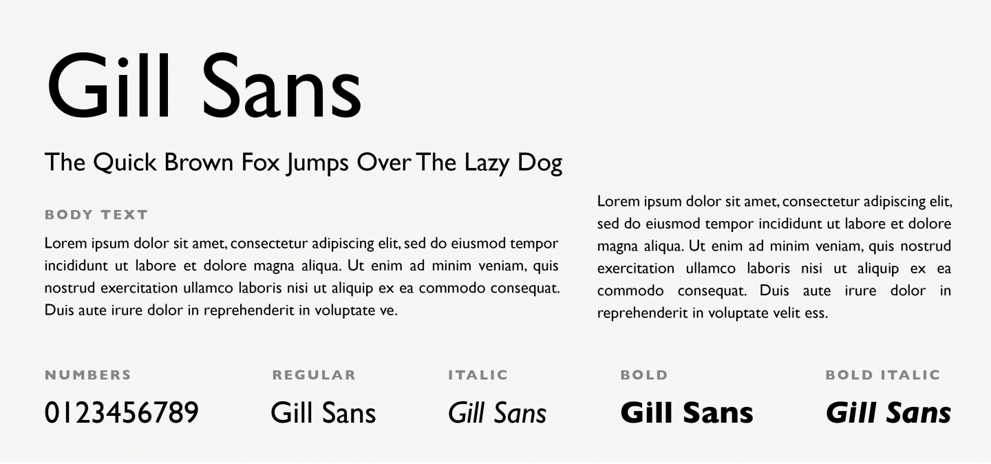
Gill Sans is a humanist, Sans-serif typeface with a touch of modernity. This font has a handwritten quality that guides the eye horizontally which make it ideal for long passages.
7. Helvetica
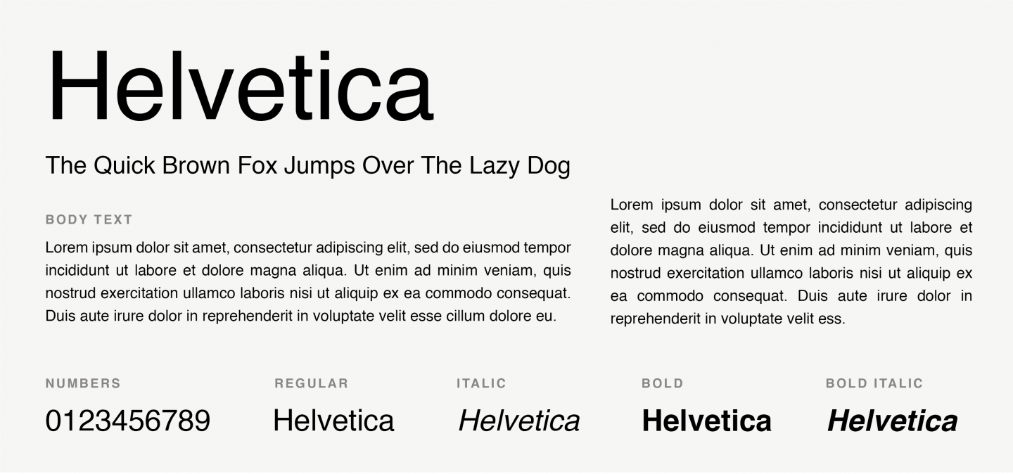
You can never go wrong with Helvetica. Probably the most popular and widely used Sans-serif font on typography history, this font remains every designer’s favourite. Helvetica’s balanced and clean design make it an amazing choice for both headlines and body text. After staring for two years on Apple’s typographic identity, it is still included on every Apple device.
8. Impact
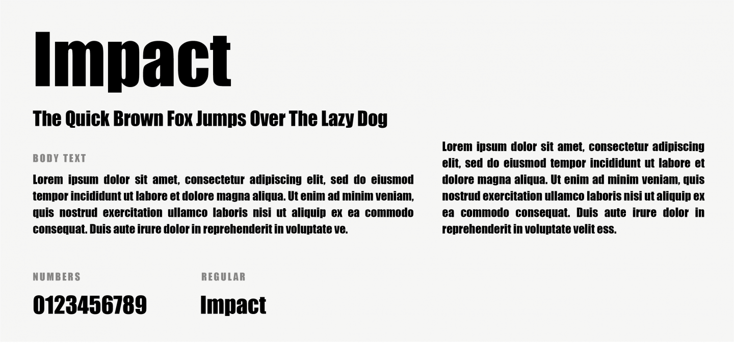
Impact is another Sans-serif font, great for drawing attention. It works very well on headings but is not a very good option for body text, since it’s not that easy to read on small size.
9. Lucida Grande
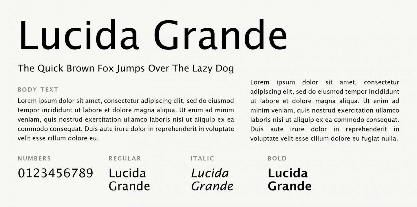
Lucida Grande is a humanist Sans-serif font with a large x-height, clear letterforms, and space-saving economy. Its easy reading qualities make it legible for printing and screen displays even down to small sizes.
10. Optima
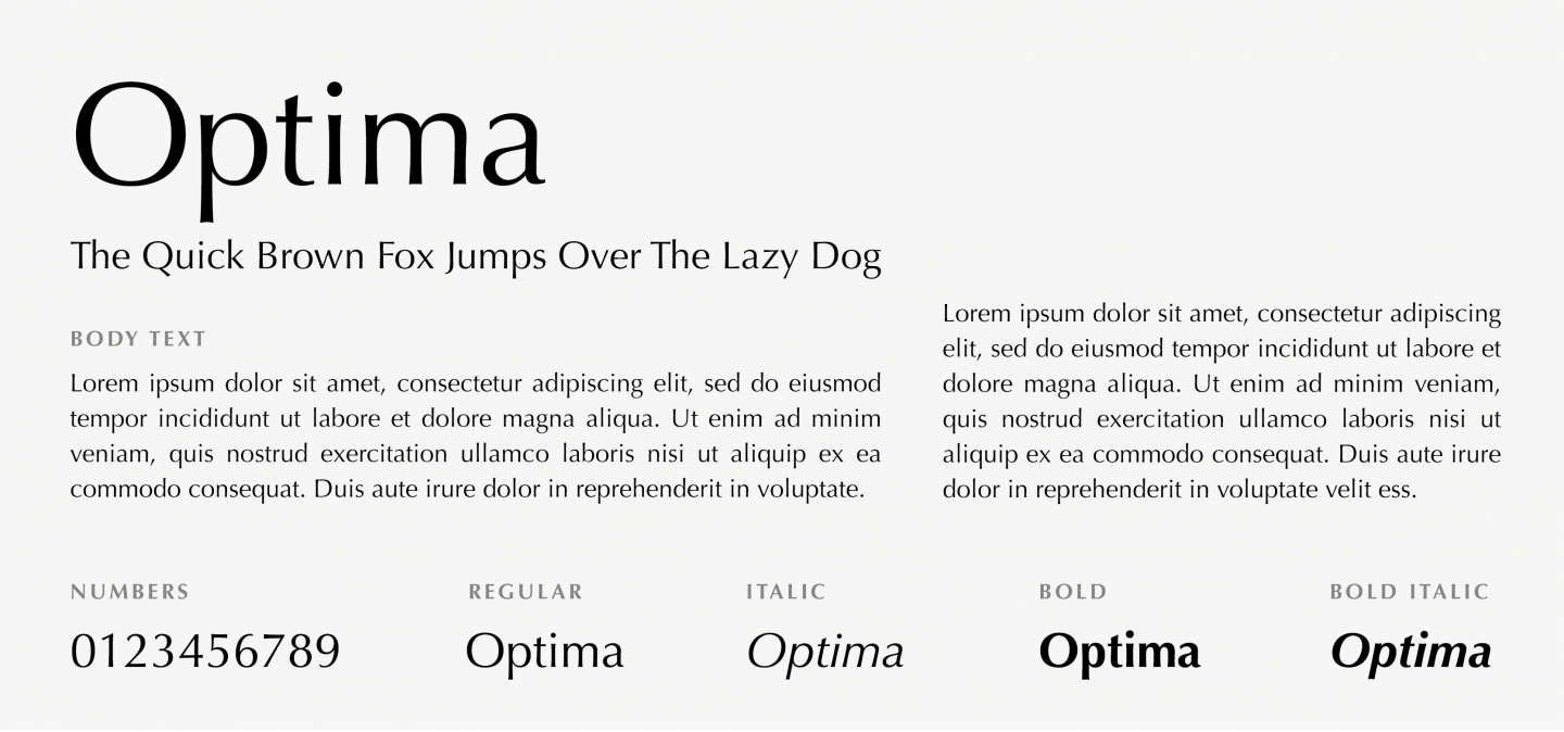
Though classified as a Sans-serif, Optima has a subtle swelling at the terminals suggesting a glyphic serif. Elegant and highly visible, it has been used from road signs to beauty product logos.
11. Segoe UI
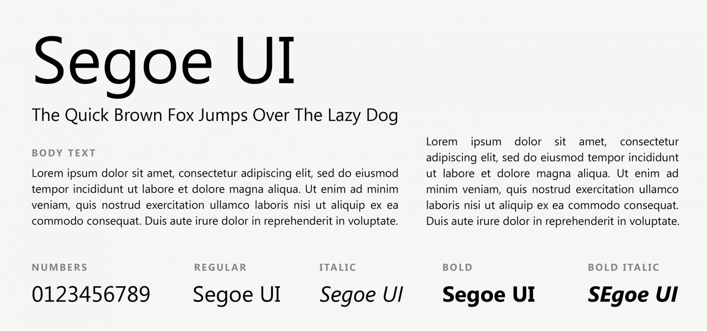
Segoe UI is a typeface, most known for its use by Microsoft. It has been used in many Microsoft products for user interface text and has been designed to assure consistency across different languages.
12. Tahoma
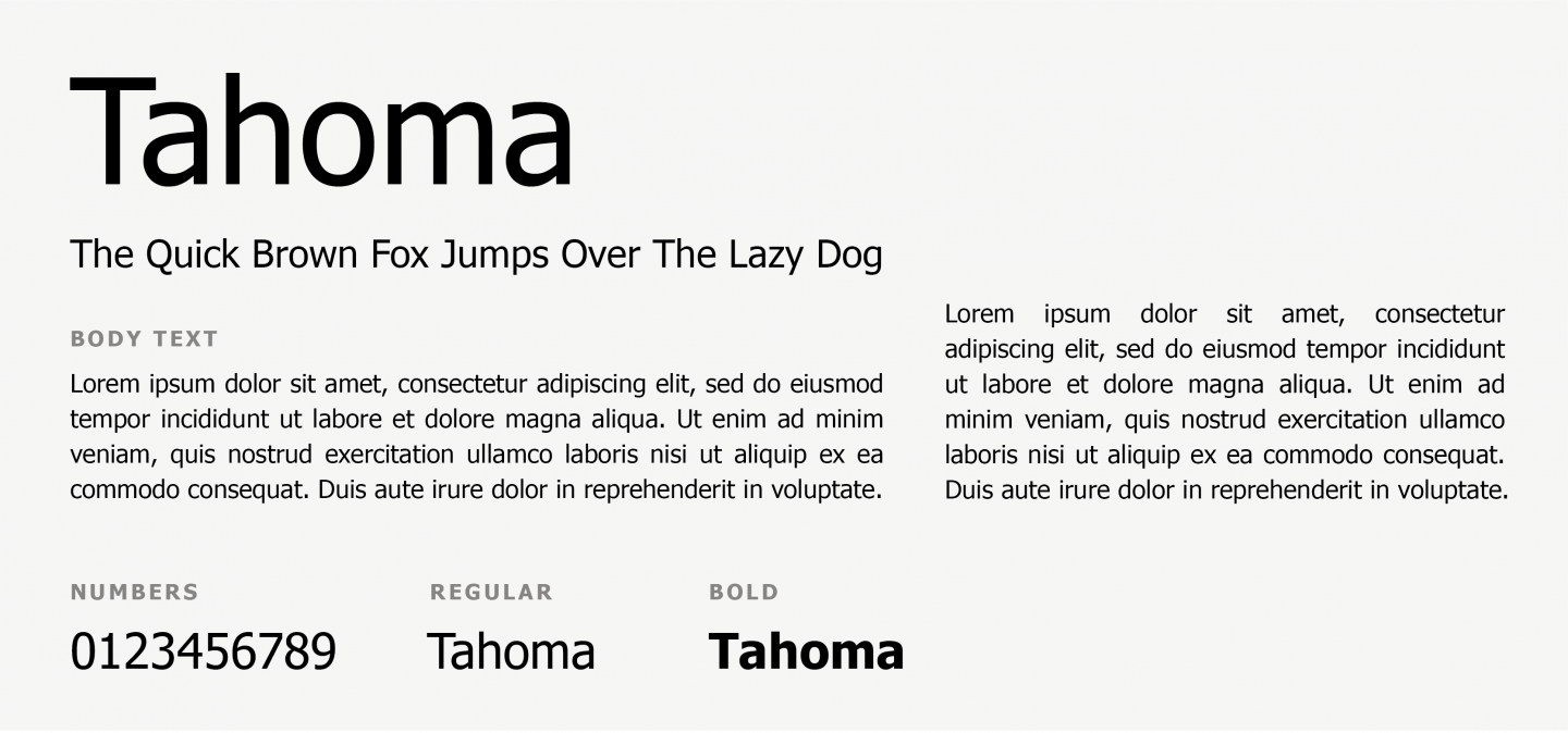
Tahoma also belongs to the Sans-serif typefaces family. It has been extensively used as an alternative to Arial and was the default version for some of the earlier versions of Windows. Quite similar to Verdana, but with narrower tracking and slightly bolder height.
13. Trebuchet MS
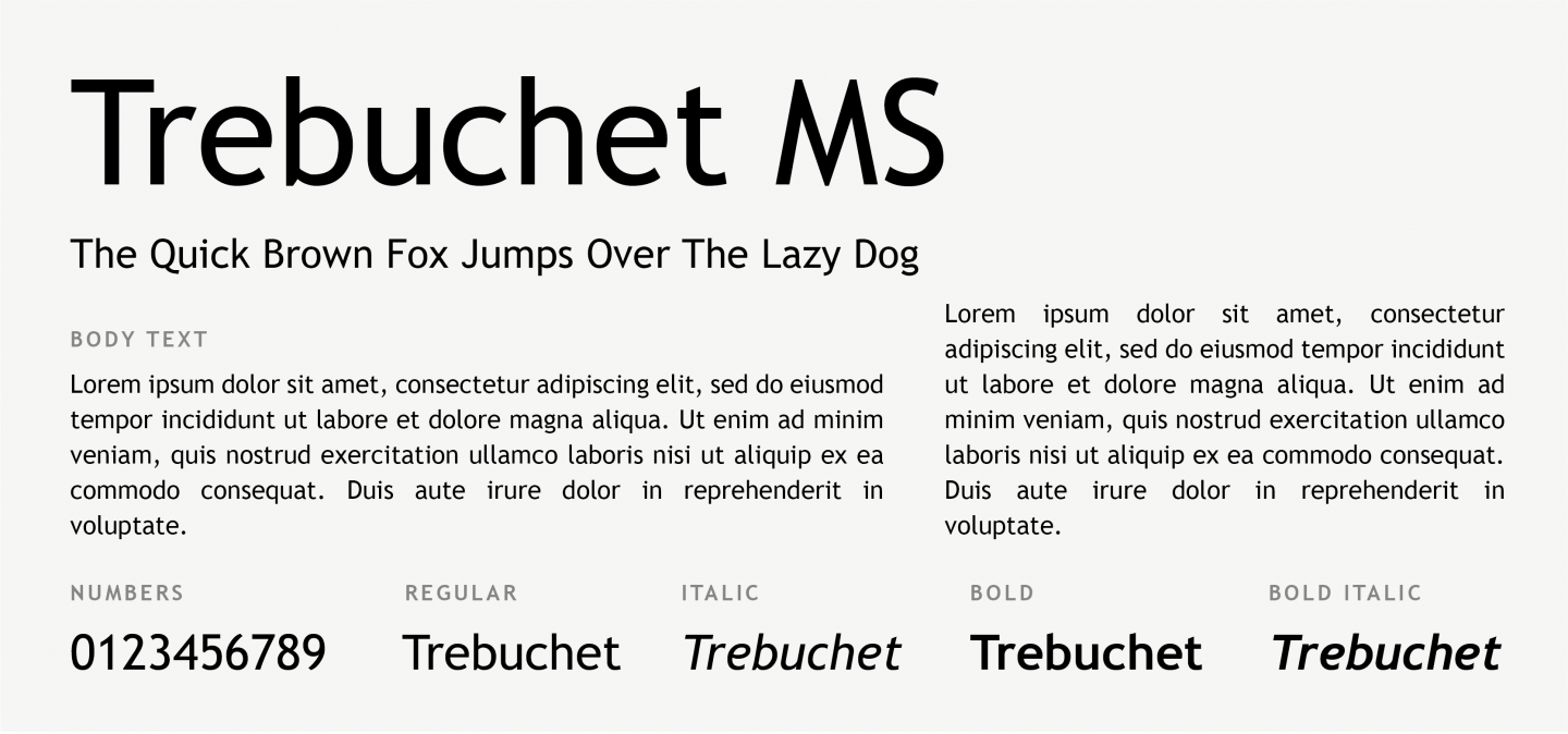
Trebuchet MS is another web safe Sans-serif font, designed and released by Microsoft Corporation in 1996. It is still one of the most popular body text fonts on the web.
Try our Award-Winning WordPress Hosting today!

14. Verdana
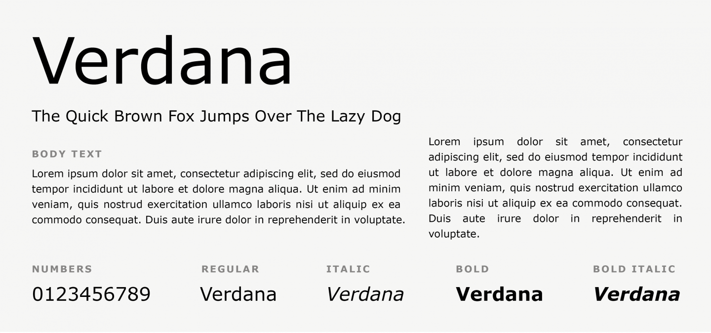
Verdana is a Sans serif font, with great readability even on small font sizes or when displayed on low-resolution screens. This is actually the font IKEA is using, not only for its website but for their printed catalogs as well.
15. American Typewriter
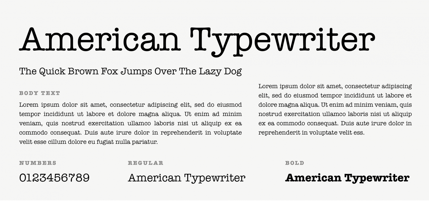
American Typewriter is a Slab font, immitating typewriter text. Unlike other typewriter-inspired fonts, the design is proportional rather than monospaced, which makes it much more suitable for setting text. This typeface can give a classic and nostalgic quality on your designs.
16. Baskerville
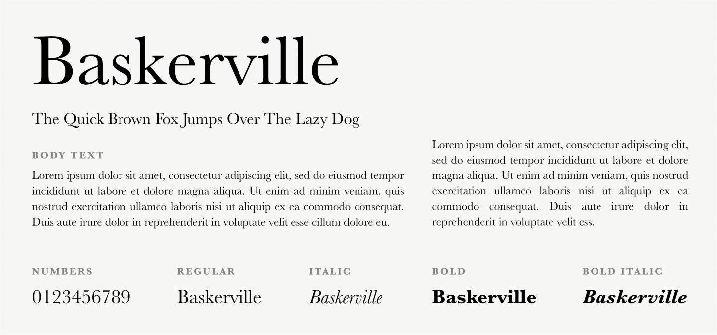
A classic Serif font, with crisp edges high contrast and generous proportions, published by Bitstream. Today it remains one of the most popular and classic typefaces for print, for its legibility and refined beauty.
17. Bookman (Old style)
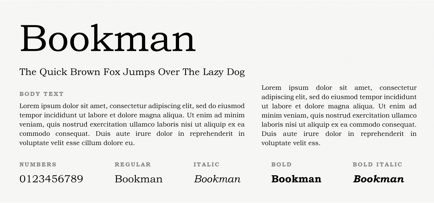
Bookman is another Serif font, also known as Bookman Old Style. Its simple, stalky design makes it a perfect headline options while it remains readable in small text as well.
18. Bodoni
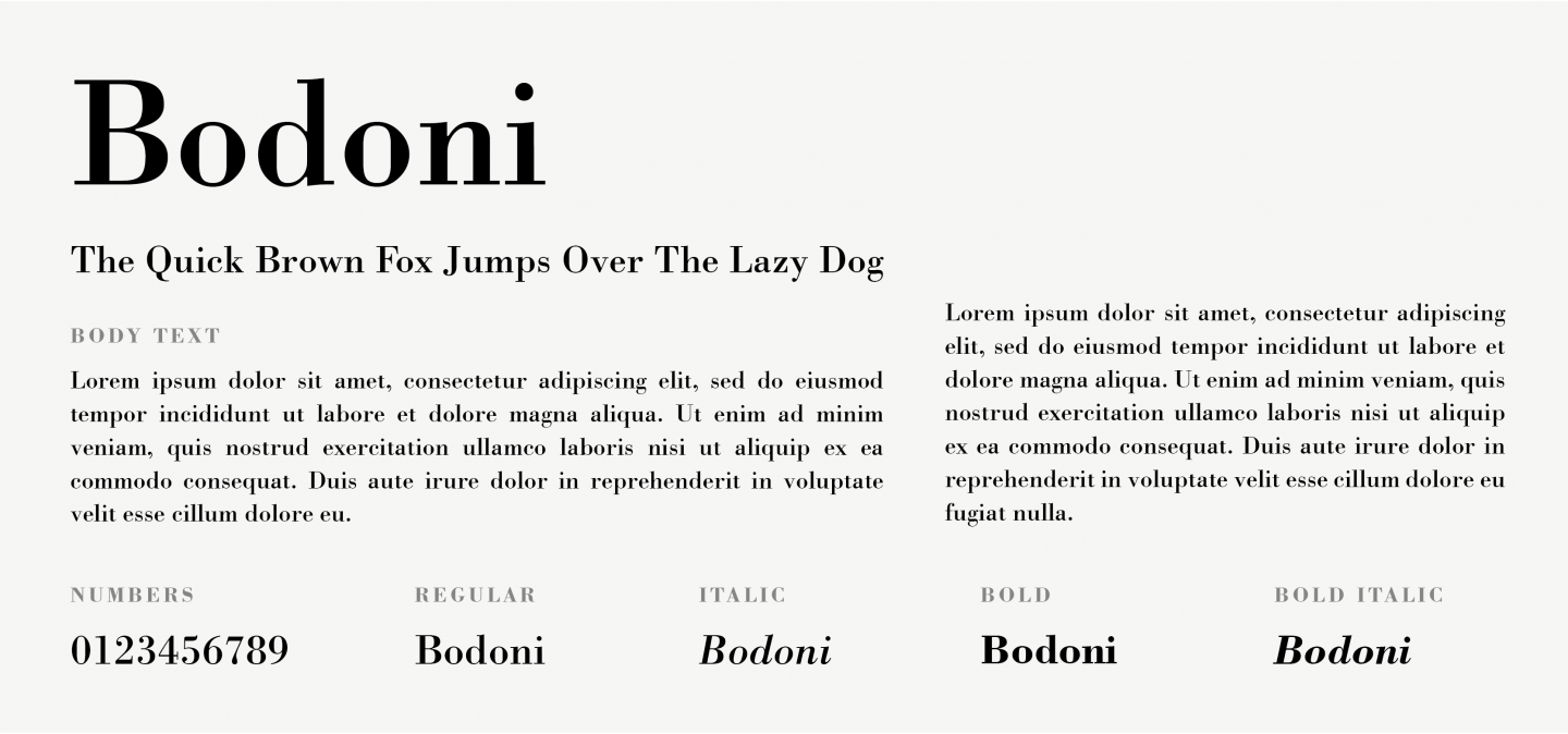
Widely used in the luxury industry, this Serif font is a synonym to elegance. Bodoni has been a long lasting favourite to the Fashion industry and has been used on web design, editorials and even logos. Two of its main, unique characteristics are the hairline thin and crispy serifs, and the high contrast between thin and thick strokes.
19. Copperplate Gothic
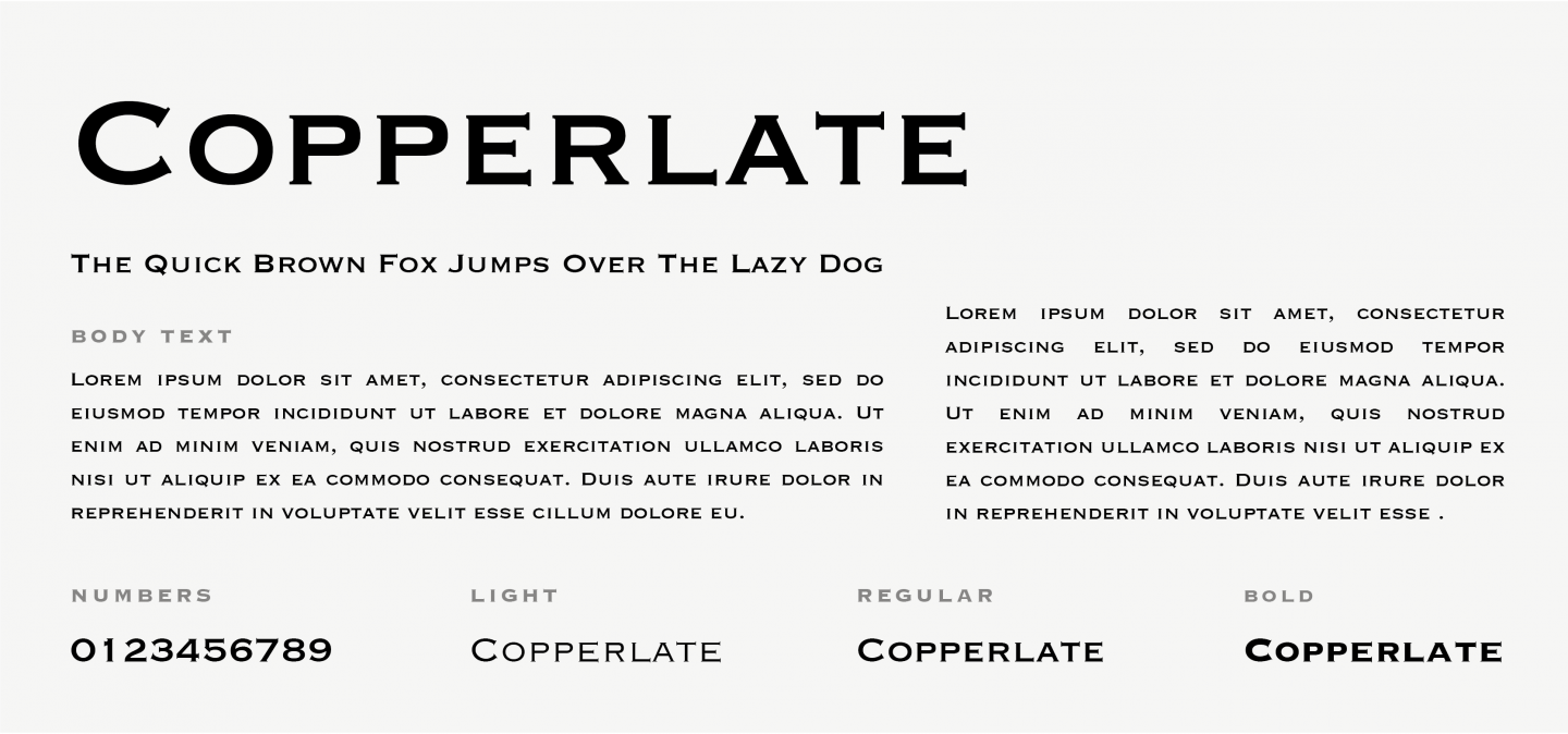
Copperlate was initially intended to be used only for headers to titles, this is why it contains only capital letters. Today, Copperplate Gothic enjoys a revival in corporate and advertising design, still imparting a look of serious business, both understated and posh.
20. Didot
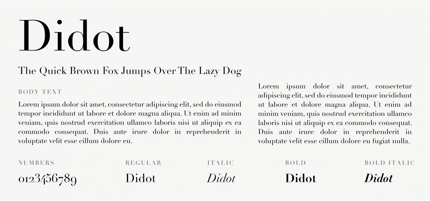
Didot is a neoclassical Serif font. It carries a classic design but adds a modern twist to it. Known for its high contrast and sophisticated aesthetic, its a go-to for larger headlines, magazines and posters. A loved one in fashion branding, as seen in Harper’s Bazaar, Vogue and the work of Louis Vuitton.
21. Garamond
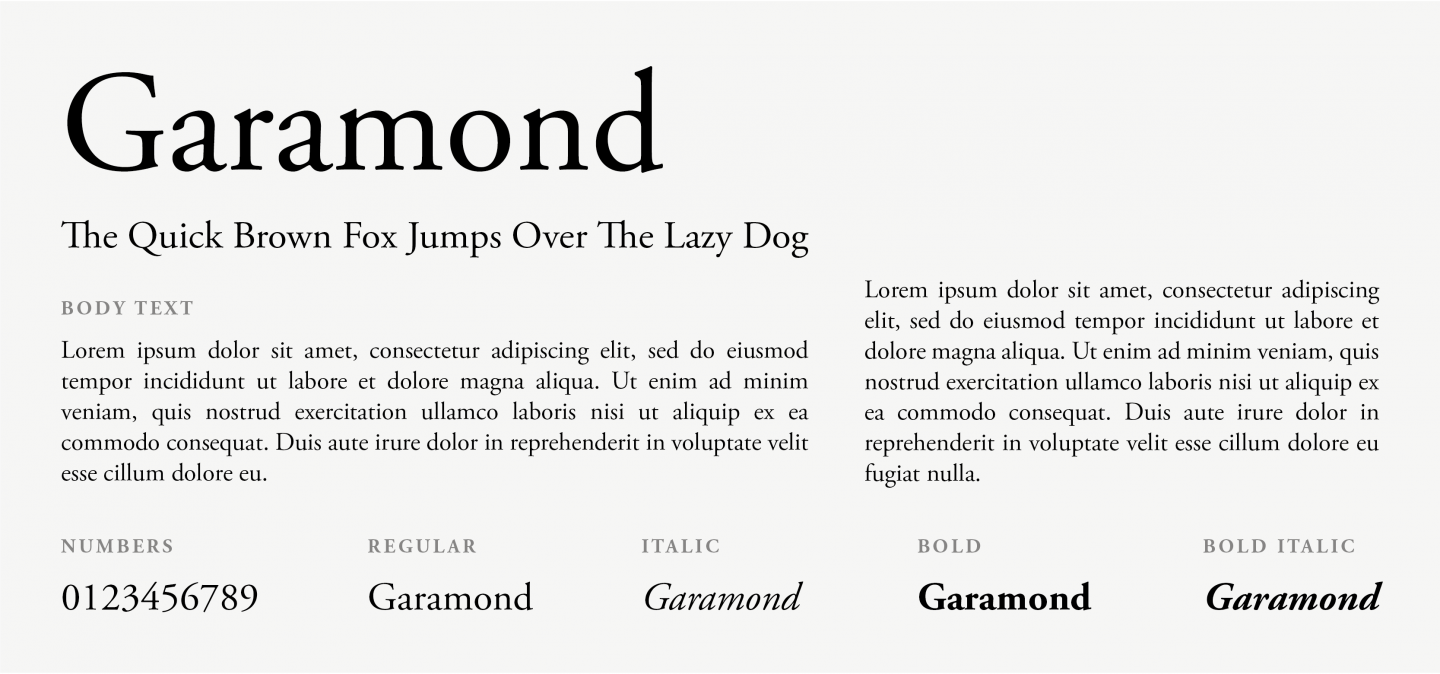
Garamond is a classic font with timeless look and great readability. Even though it dates back to styles used in 16th century and has been mainly used in book design, we have no doubt it can add an antique nuance to a modern website or blog.
22. Georgia
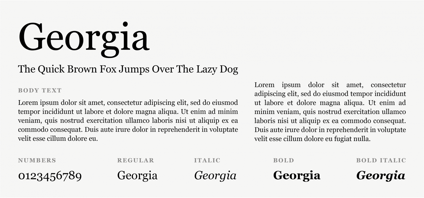
Georgia is another elegant Serif font, but was designed to be more readable at different font sizes than other Serif fonts. This happens thanks to its heavier weight, making this font an ideal candidate for mobile-responsive design.
23. Palatino
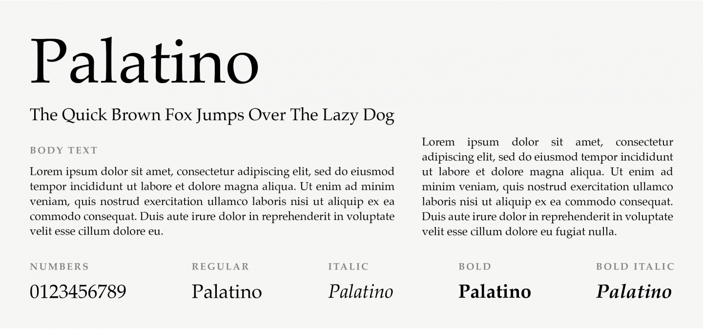
Palatino is a Serif font that is also a part of the humanist typeface family, and it actually dates back to the Renaissance. Thanks to its solid structure, it is widely preferred for heading and titles.
24. Perpetua
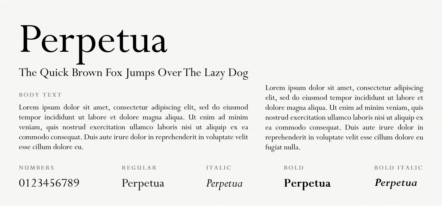
Eric Gill designed Perpetua at the beginning of the 20th century, based on designs of old engravings and memorial lettering. This font gives a formal feel to any text used, thanks to its small diagonal serif and medieval-type numbers.
Try our Award-Winning WordPress Hosting today!
25. Times New Roman
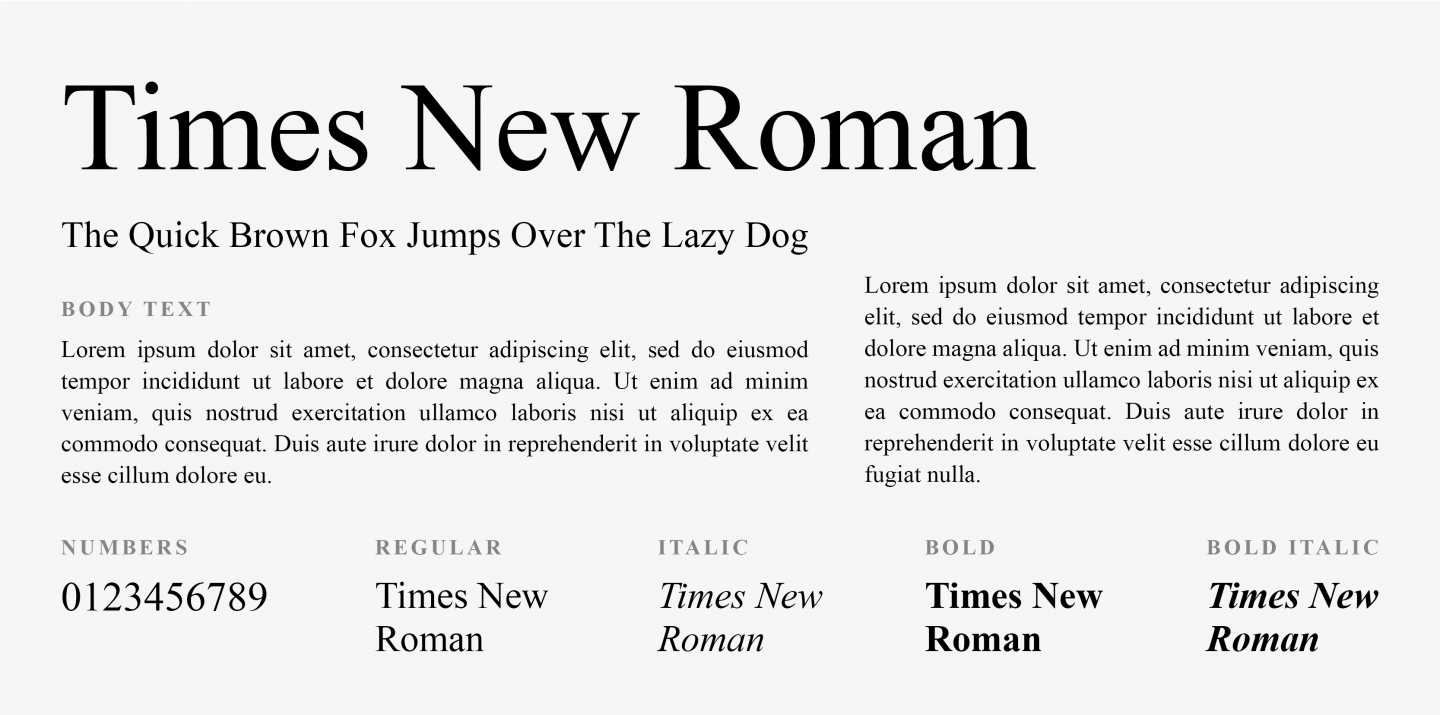
Times New Roman is a variation of the Times font, from the Serif family. It is most preferred for more formal content, since it carries a very professional look. Plus, it’s a favourite choice for news websites and blogs.
26. Andale Mono
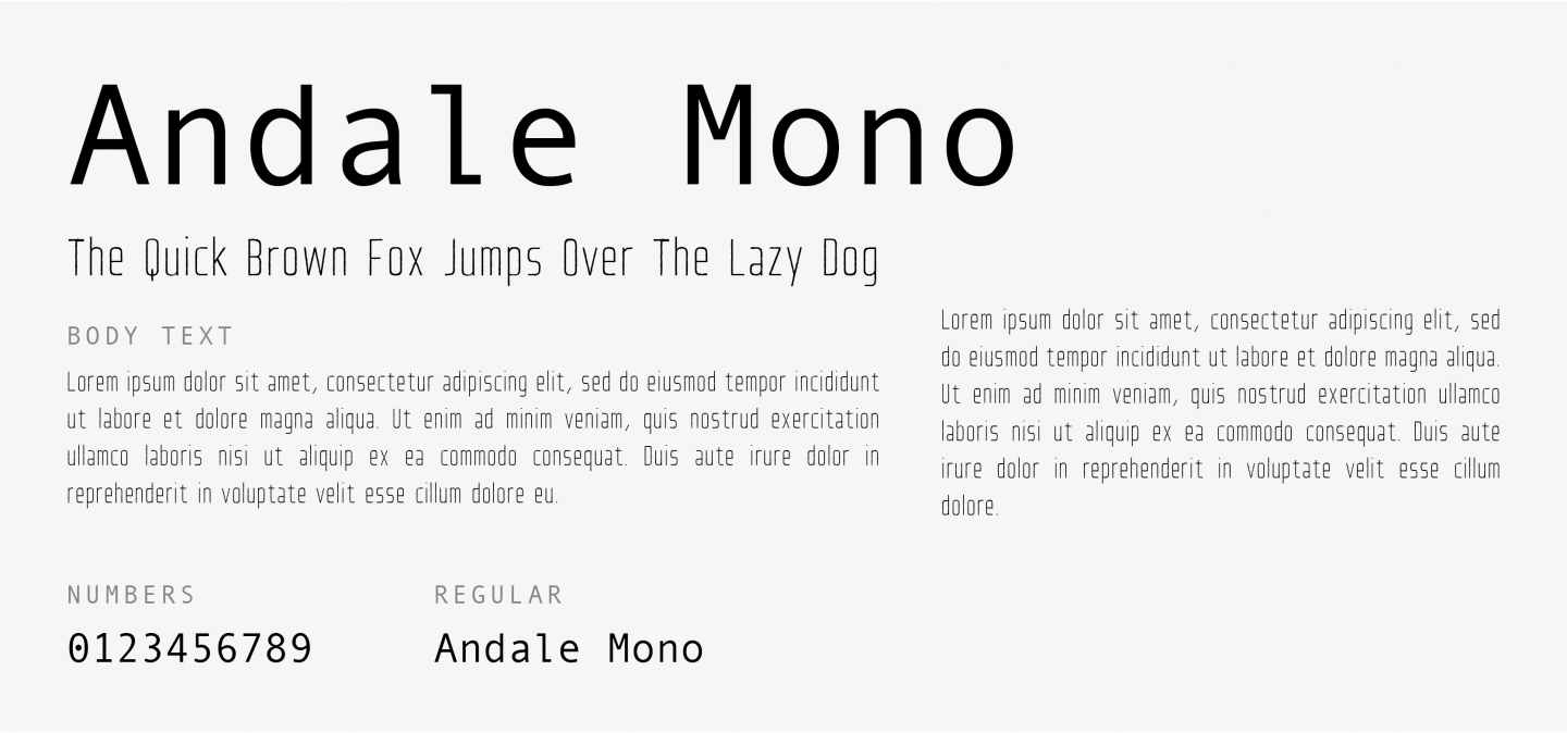
Andale Mono belongs to the Monospace font family and was developed by Apple and IBM. This means that each letter is the same width, giving the typeface a mechanical quality. Versions of this font support several different languages, making it a good choice for multilingual websites.
27. Courier
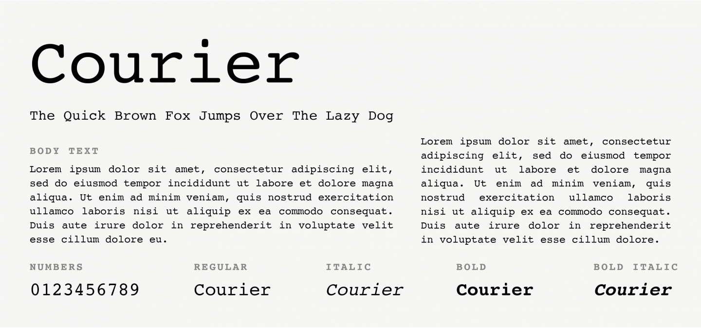
Courier is with no doubt the most famous Monospace font. All operating systems come prepackaged with it. While it’s widely used in coding and computer programming, it is also a standard font for movie screenplays and can add a “typewriting” touch to your website.
28. Courier New
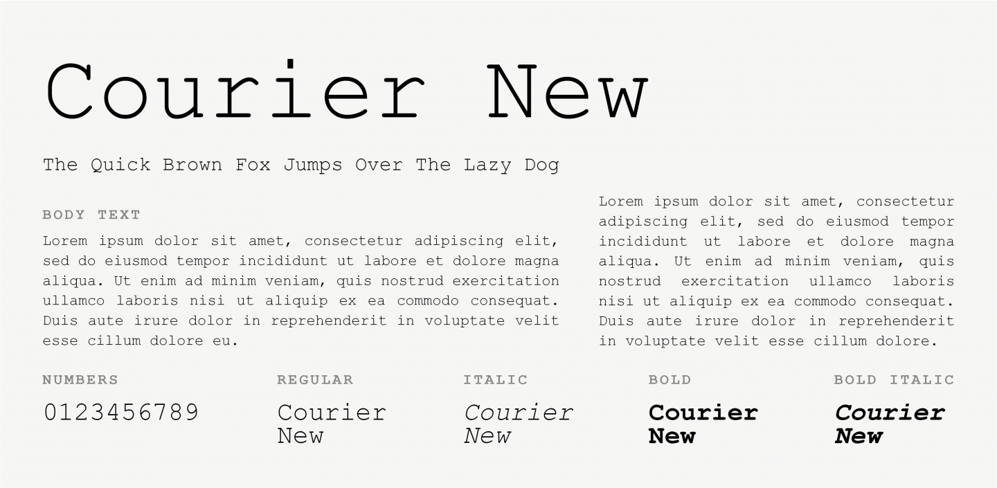
As the name suggests, this font is a newer version of Courier, also part of the Monospace family, but carrying some similarities to Times New Roman. Its design is thinner and more visually appealing, which makes it look great on websites that need an old-school design but with a modern touch.
29. Lucida Console
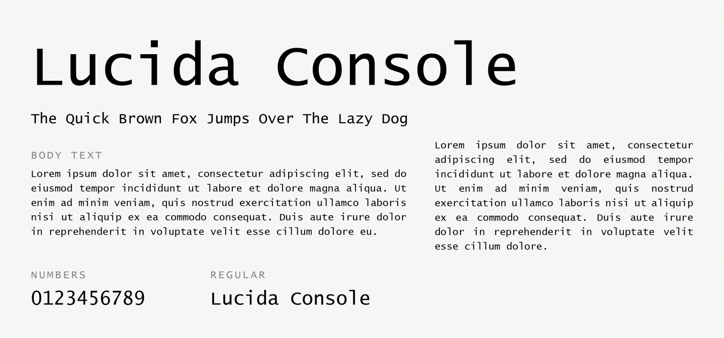
Lucida Console is a Monospace font, part of the extended Lucida family. Even though it is a Monospace font, it resembles human writing characteristics, which make it look less “mechanical”. A great choice for small text sizes or low-resolution displays thanks to its legibility.
30. Monaco
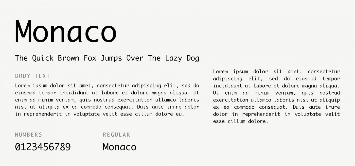
Monaco is another Monospace font, designed by Susan Kare and Kris Holmes. It has been widely used by Apple and is a perfect choice for coding and terminal uses since it is the most readable monospace font even in very small text sizes.
31. Bradley Hand
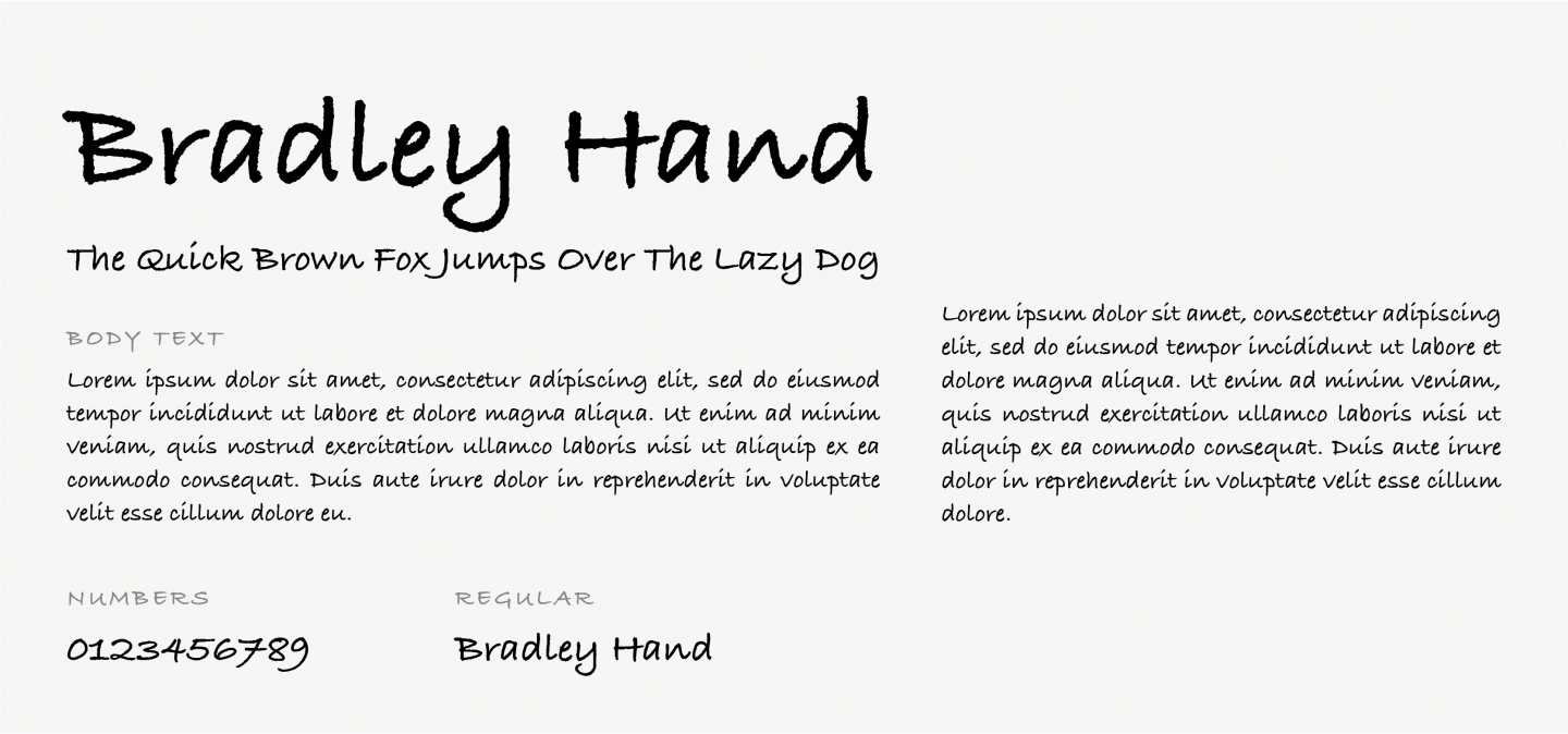
Based on designer Richard Bradley’s handwriting, this Calligraphic typeface evokes a casual, personal feeling. It’s suggested for use in headings, decorative text, and short bodies of text.
32. Brush Script MT
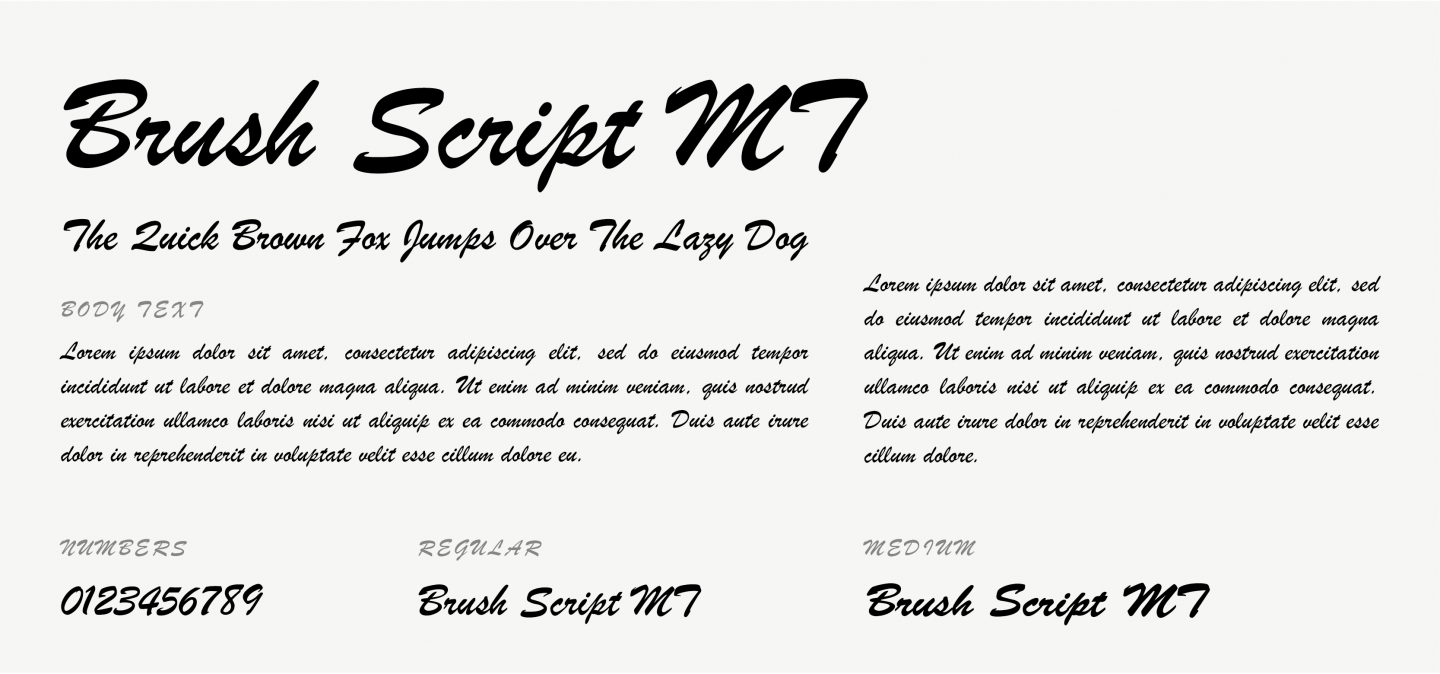
This Cursive font was designed to mimic handwriting techniques. Despite its elegance and sophisticated style, it can be hard to read on body text. Hence, it might be best suited for notes or similar decorative uses.
33. Comic Sans
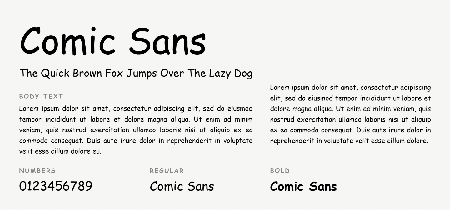
Comic Sans MS is a playful, whimsical alternative to other Cursive fonts, and truth is, it has become somewhat of a meme over the years. It’s not the best option for your website, since it’s a bit funny and childish. But, on the upside, it is an easy font to read!
Conclusion
Choosing the right typography for representing your brand is a hard job.
We hope this article helped you understand why Web Safe Fonts are important, either as a primary or as a ‘backup’ option, and how to use them in order to ensure your designs look good on any device.
Good luck and remember… stay creative, yet Web Safe!
Start Your 14 Day Free Trial
Try our award winning WordPress Hosting!