

Have you always wondered how many modern websites seem to ‘fit’ so perfectly regardless of the device you are using to view them? Coding a responsive web page is a common practice that is now widely prevalent across many new websites today. Responsive web pages perform a clever trick by resizing themselves to fit the screen of the device that is being used to view the website. That means they look great on an iPhone or a desktop computer and everything in-between.
This ‘responsiveness’ happens so seamlessly that you might not have even really noticed it. A great responsive web design should seamlessly flow from device to device whilst ensuring the optimal browsing experience is maintained. Responsive websites have gone from being a ‘nice to have’ feature to something that is now pretty much mandatory for any website. Why? Quite simply because the number of people who now use mobile devices to browse online has shot up in recent years and this trend towards mobile devices (and therefore smaller screens) shows no sign of slowing.
Take a look at the data below (provided courtesy of statcounter.com). You’ll see that by far the most prevalent screen sizes are small (i.e. mobile screens).
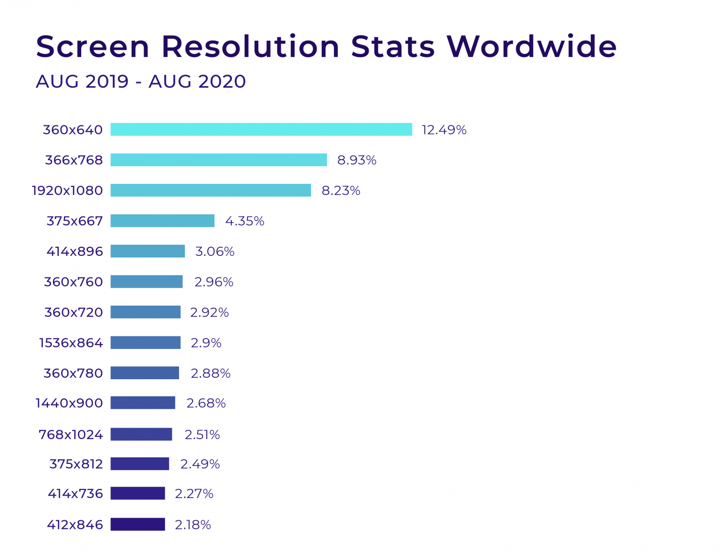
Imagine if all of these millions of users had to look at non-responsive websites on these devices. They would be hugely frustrated as it would involve doing a lot of ‘pinch and zoom’ actions to be able to adequately see the content on those respective websites. Odds are high that these users would abandon these websites in favor of a responsive equivalent.
If losing potential customers isn’t enough to convince you as to the value of having a responsive website, then perhaps the thought of losing search rankings might be. Google has for some time penalized websites that do not offer some form of responsive or adaptive design for mobile users. That means if your website doesn’t work nicely on a mobile then expect to get a ranking penalty.
What does ‘work nicely’ on a mobile mean? Well, content needs to be displayed in a way that is user-friendly. This means it must be readable without pinch and zooming in. It also needs to load quickly (if you’re interested in how WordPress Caching can help with your speed goals then take a look at this article ‘WordPress Caching – How It Works and Why You Should Use It!‘)
Responsive Web Pages vs Adaptive Web Pages
If we head back a decade or two, mobile phones were not nearly as prevalent as they are now. Certainty, ones that did a good job of allowing you to browse the web didn’t really start to arrive until perhaps 2005 onwards (as incredible as it seems the iPhone didn’t even come on the scene until 2007). Cellular networks weren’t able to carry much data either which meant there was limited opportunity for mobile web browsing. That has all rapidly changed over the last decade and websites were left scrabbling to play catch up in order to serve their customers better in the new mobile-driven world that we now find ourselves.
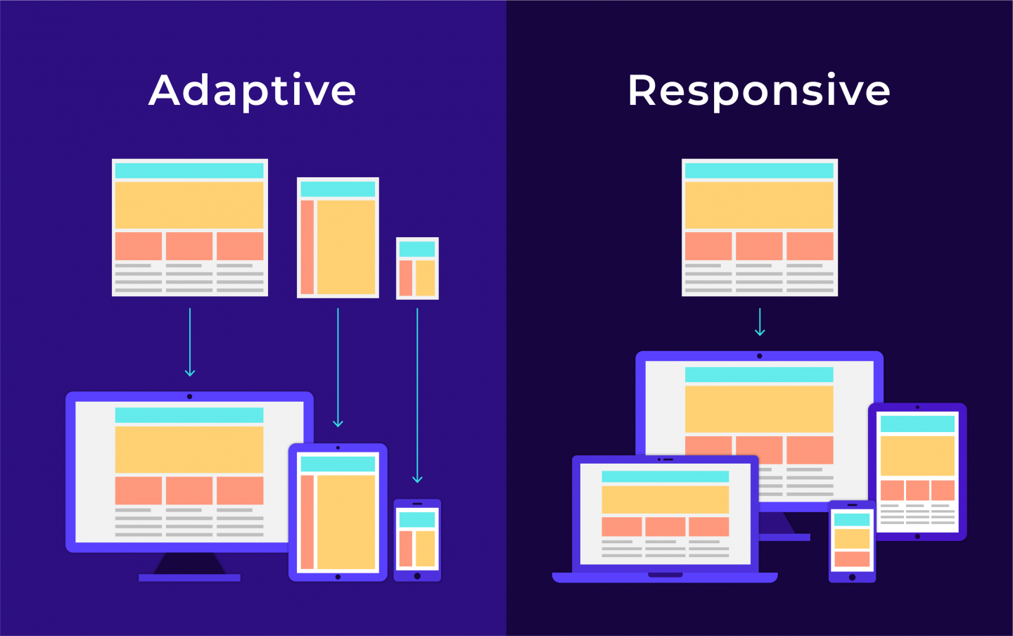
There were several ways that web designers worked to solve the problem of needing to fit a ‘desktop’ website on a mobile screen. In the very early days, stand-alone ‘mobile only’ websites were developed that were run alongside the main ‘desktop’ version of a website. These were normally fairly crude in design and frequently offered a stripped-back browsing experience that omitted many features of their bigger, desktop sibling.
Try our Award-Winning WordPress Hosting today!

After this, Adaptive Design came on the scene. This took the mobile-only version of serving up a specially designed mobile website a step further. Multiple static layouts are created that offer a more compelling mobile browsing experience for the user. The screen size of the device using the website is loaded and the most suitable size is served up. Typically six sizes would be built to cater for screens ranging from a large desktop through to a mobile. Adaptive design however is somewhat limiting and definitely not future proof as it fails to cater to screen sizes that don’t fall neatly into the set 6 categories that have been built. It’s also resource-intensive from a design perspective as 6 versions of a website have to be built.
The primary drawbacks of Adaptive designs were solved with Responsive Design. Instead of serving up a prebuilt layout based on a screen size, responsive designs adjust how they render depending on the device. This means that you should get a good-looking and user-friendly website no matter what device (and corresponding screen size) is used to view the website.
Responsive design is now considered the industry standard for mobile websites. In fact, Google itself recommends Responsive Web Design. In this tutorial, we’ll be taking a beginner’s look at responsive design and how this can be applied to your website layout.
How do Responsive Websites Work?
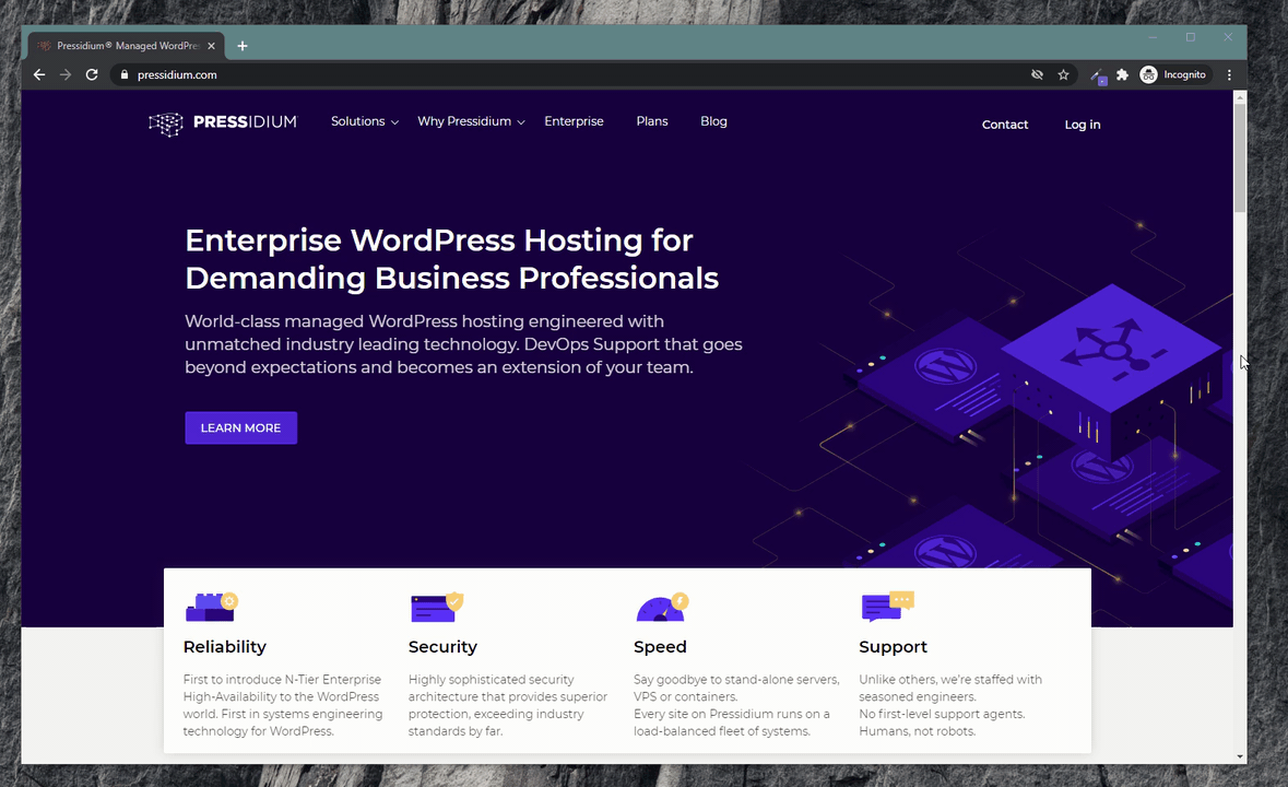
Responsive websites use what are called CSS Media Queries to modify the layout of a website based on the screen width. CSS Media Queries are a powerful tool that are actually fairly simple to deploy if you have a basic understanding of CSS. A place to start before you dive into the process of building a responsive website is to take a look at a few live examples. The best way to do this is on a desktop or laptop screen. Open a browser, like Chrome and head to a popular website. You might want to try our own at pressidium.com.
Reduce the browser window size and then, hovering over the right-hand edge of the browser window, begin to slide the window so it becomes narrower. You’ll see that as it becomes smaller, the layout of the website alters. What’s happening is as the website hits a pre-defined size (for example 1,000px wide) a CSS Media Query is triggered that tells the browser to use the CSS styling that relates to this screen width. The website then gracefully flows or responds to this new screen size and displays accordingly. Pretty clever!
So, now we have a basic understanding of what’s going on let’s dive into the nitty-gritty and see how we could build a responsive web page ourselves.
Building a Responsive Web Page
We’re not going to be using any backend code in this tutorial so there is no need to access a server to give this a go. Just create a folder on your desktop and add your working files to this.
Step 1: HTML
Create an index.html file inside your new folder. Open this file with your favorite text/code editor and then insert the following code:
<!DOCTYPE html>
<html lang="en-US">
<head>
	<link rel="stylesheet"   type = "text/css"   href = "style.css" />
</head>

<body>
<div id="content-wrapper">
<div id="content">
	<h1>My website</h1>
	<div id="main">
		<div id="post-01" class="post">
			<h3 class="post-title">Post 1 title</h3>
			<p><b>post 1 content.</b> Lorem Ipsum is simply dummy text of the printing and typesetting industry. Lorem Ipsum has been the industry's standard dummy text ever since the 1500s, when an unknown printer took a galley of type and scrambled it to make a type specimen book. It has survived not only five centuries, but also the leap into electronic typesetting, remaining essentially unchanged. It was popularised in the 1960s with the release of Letraset sheets containing Lorem Ipsum passages, and more recently with desktop publishing software like Aldus PageMaker including versions of Lorem Ipsum.</p>
		</div>
		<div id="post-02" class="post">
			<h3 class="post-title">Post 2 title</h3>
			<p><b>post 2 content.</b> Lorem Ipsum is simply dummy text of the printing and typesetting industry. Lorem Ipsum has been the industry's standard dummy text ever since the 1500s, when an unknown printer took a galley of type and scrambled it to make a type specimen book. It has survived not only five centuries, but also the leap into electronic typesetting, remaining essentially unchanged. It was popularised in the 1960s with the release of Letraset sheets containing Lorem Ipsum passages, and more recently with desktop publishing software like Aldus PageMaker including versions of Lorem Ipsum.</p>
		</div>
		<div id="post-03" class="post">
			<h3 class="post-title">Post 3 title</h3>
			<p><b>post 3 content.</b> Lorem Ipsum is simply dummy text of the printing and typesetting industry. Lorem Ipsum has been the industry's standard dummy text ever since the 1500s, when an unknown printer took a galley of type and scrambled it to make a type specimen book. It has survived not only five centuries, but also the leap into electronic typesetting, remaining essentially unchanged. It was popularised in the 1960s with the release of Letraset sheets containing Lorem Ipsum passages, and more recently with desktop publishing software like Aldus PageMaker including versions of Lorem Ipsum.</p>
		</div>
		<div id="post-04" class="post">
			<h3 class="post-title">Post 4 title</h3>
			<p><b>post 4 content.</b> Lorem Ipsum is simply dummy text of the printing and typesetting industry. Lorem Ipsum has been the industry's standard dummy text ever since the 1500s, when an unknown printer took a galley of type and scrambled it to make a type specimen book. It has survived not only five centuries, but also the leap into electronic typesetting, remaining essentially unchanged. It was popularised in the 1960s with the release of Letraset sheets containing Lorem Ipsum passages, and more recently with desktop publishing software like Aldus PageMaker including versions of Lorem Ipsum.</p>
		</div>
		<div id="post-05" class="post">
			<h3 class="post-title">Post 5 title</h3>
			<p><b>post 5 content.</b> Lorem Ipsum is simply dummy text of the printing and typesetting industry. Lorem Ipsum has been the industry's standard dummy text ever since the 1500s, when an unknown printer took a galley of type and scrambled it to make a type specimen book. It has survived not only five centuries, but also the leap into electronic typesetting, remaining essentially unchanged. It was popularised in the 1960s with the release of Letraset sheets containing Lorem Ipsum passages, and more recently with desktop publishing software like Aldus PageMaker including versions of Lorem Ipsum.</p>
		</div>
	</div>

	<div id="sidebar">
		<div id="menu">
			<h3>Menu title</h3>
			<ul>
				<li>item 1</li>
				<li>item 2</li>
				<li>item 3</li>
				<li>item 4</li>
			</ul>
		</div>
	</div>

</div>
</div>
</body>
</html>
Step 2: External CSS
You will need to add an external style.css file. To do this, create a file called style.css and place this in the same folder as your index.html file. Then, add in the following code:
h1 {
text-align: center;
}
div#content {
margin: 0 auto;
display: table;
}
div#main {
width: 900px;
float: left;
padding: 20px;
margin: 20px;
border: 1px solid darkgrey;
}
div#sidebar {
width: 300px;
float: left;
padding: 20px;
margin: 20px;
border: 1px solid darkgrey;
}
div.post {
width: 31.1%;
float: left;
padding: 10px;
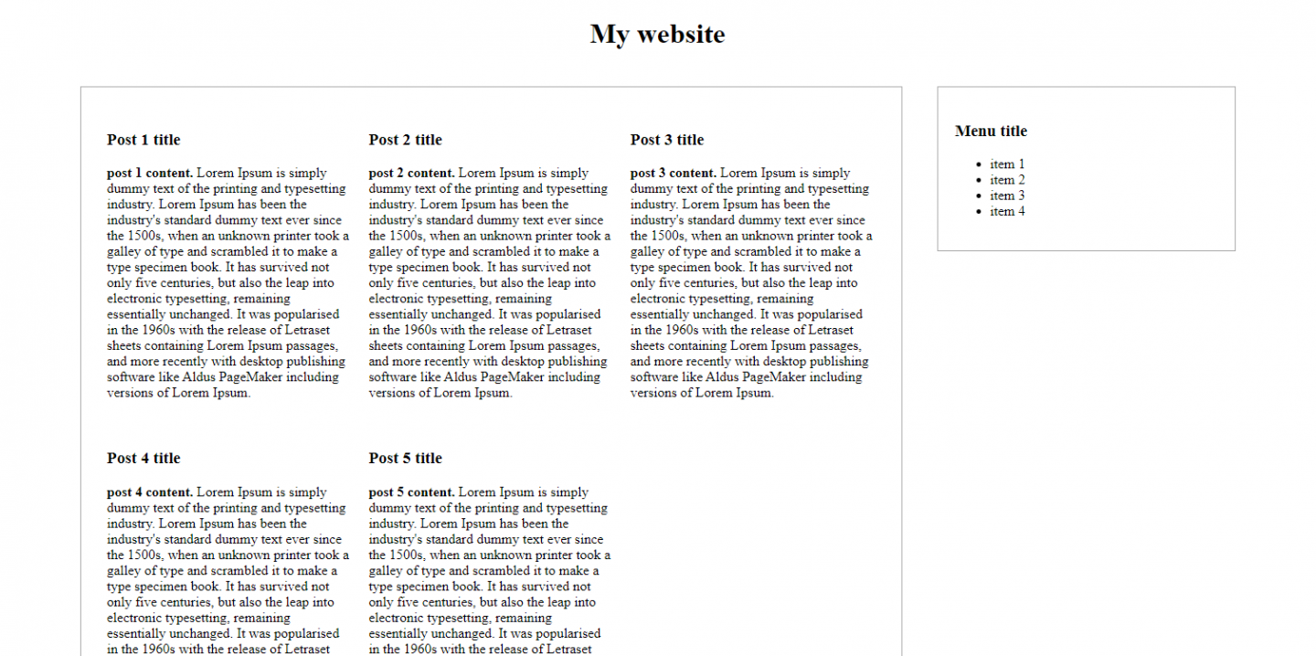
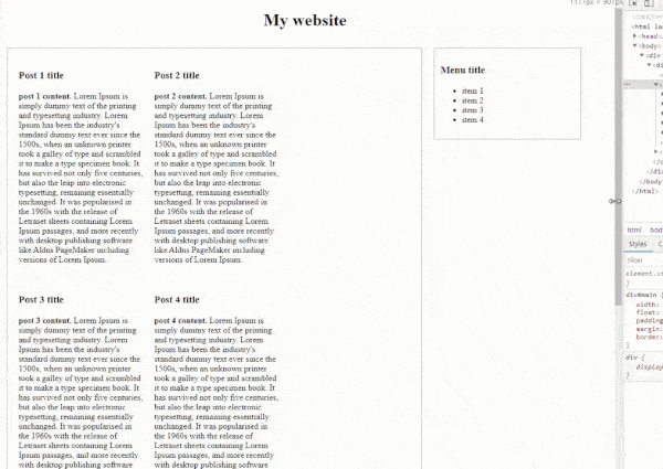
}At this point, if you open your index.html file with your internet browser (we used Chrome in this example), what you should see on your page is something like this:
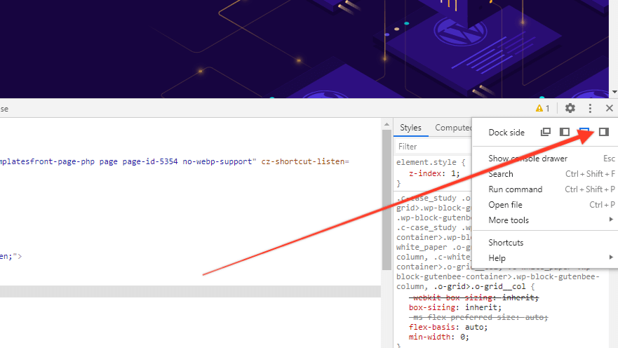
Now let’s take a look at our browser’s developer tools (again, we’re using Chrome for this example). Open Chrome and press F12 and set it to view on the right side.
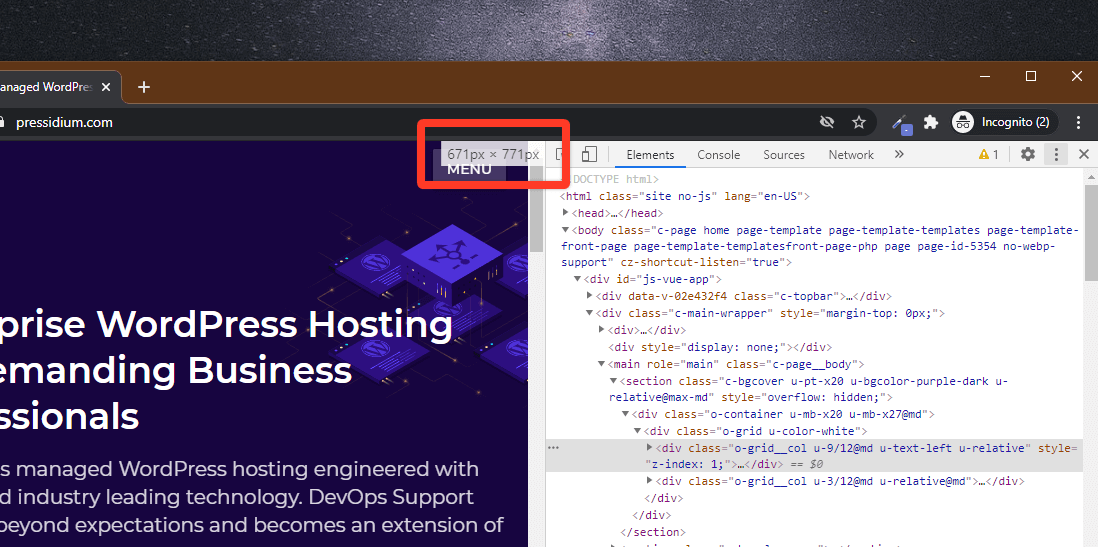
Change the window size by moving the separator cursor and watch the screen resolution change in real-time.
Step 3: CSS Relative Units
In our example, you’ll see that if you drag it to 1396px wide you will notice that the right sidebar with the menu will move below the main content as it will no longer fit.
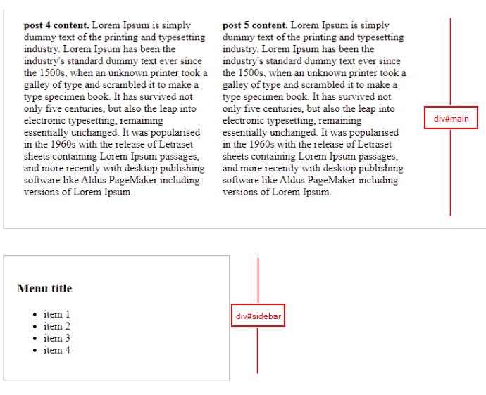
That happened because we have set a fixed width of 900px on the div#main and 300px on the div#sidebar. Let’s change the format of these values and use percentages instead. (Please note that paddings and margins are also counted on width so these values have to be converted to a percentage as well.)
When you’ve made these edits the style.css should look like this:
h1 {
    text-align: center;
}
div#content {
    margin: 0 auto;
    display: table;
}
div#main {
	width: 66%;
    float: left;
    padding: 1%;
    margin: 1%;
    border: 1px solid darkgrey;
}
div#sidebar {
    width: 22%;
    float: left;
    padding: 1%;
    margin: 1%;
    border: 1px solid darkgrey;
}
div.post {
    width: 31.1%;
    float: left;
    padding: 10px;
}
This is now getting exciting as we have a page that is now becoming more responsive!
Although things are shaping up, the posts area though needs some more CSS editing. The smaller the width the “uglier” the post boxes become. To get around this we need to edit the post CSS in order to achieve a prettier and more responsive layout.
You’ll note that the visual issues only occur when the screen narrows. To solve this problem we will have to use some CSS media queries so that beyond a certain point alternate CSS that produces a better-looking layout kicks in.
What we’re going to try and do is to convert our ‘wide screen’ 3 columns post area to a 2 columns area that will fit better into a narrower screen. In order to accomplish this, we use CSS media queries.
Step 4: CSS Media Queries
For our ‘wide screen’ mode we will introduce a CSS media query like this: like this @media screen and (min-width: 1396px) . This query lives at the top of our CSS style sheet and encloses the entire set of CSS that we want to run when our screen is a minimum of 1396px wide.
We can now copy all of this code and duplicate it in our CSS style sheet (copy and paste it below the current CSS so you have two identical versions in the one file). Now, edit the CSS media query at the top of the second batch of CSS to read @media screen and (max-width: 1395px). This is now telling our browser that if it is smaller than 1395px then it should run this CSS. Now this is done we can tweak the CSS in this ‘smaller’ section so it alters the layout of our web page in order that it better fits on a smaller screen. In this example we’re going to tweak the and there we should tweak the div.post percentage from 31.1% to 45%.
You should now have a CSS file that looks like this:
@media screen and (min-width: 1396px) {

h1 {
    text-align: center;
}
div#content {
    margin: 0 auto;
    display: table;
}
div#main {
	width: 66%;
    float: left;
    padding: 1%;
    margin: 1%;
    border: 1px solid darkgrey;
}
div#sidebar {
    width: 22%;
    float: left;
    padding: 1%;
    margin: 1%;
    border: 1px solid darkgrey;
}
div.post {
    width: 31.1%;
    float: left;
    padding: 10px;
}

}

@media screen and (max-width: 1395px) {

h1 {
    text-align: center;
}
div#content {
    margin: 0 auto;
    display: table;
}
div#main {
	width: 66%;
    float: left;
    padding: 1%;
    margin: 1%;
    border: 1px solid darkgrey;
}
div#sidebar {
    width: 22%;
    float: left;
    padding: 1%;
    margin: 1%;
    border: 1px solid darkgrey;
}
div.post {
    width: 45%;
    float: left;
    padding: 2%;
}


}
Now that the posts boxes have a different style for screens with widths smaller than 1395px, let’s see how this reflects in action:
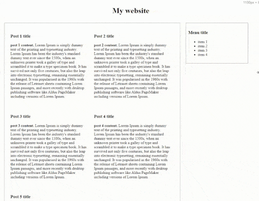
Nice!
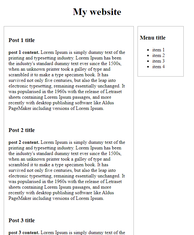
You will notice that things are still getting weird while scaling down and after crossing 760px wide.
To sort this we can use the same trick that we used to go from 3 columns to 2. This time though we’ll be using a ‘break point’ of 760px and will alter our CSS div.post to 94%. If we do this we will have three CSS media queries which should look like this:
@media screen and (min-width: 1396px) {

}

@media screen and (min-width: 761px) and (max-width: 1395px) {

}

@media screen and (max-width: 760px) {

}
Our @media screen and (max-width: 760px) CSS will include our edited div.post which will look like this:
div.post {
    width: 94%;
    float: left;
    padding: 2%;
}
All being well you should now see something like the following when you reduce the width of your browser to below 760px wide:
And that’s it! We’ve now created a responsive web page that works on larger screens, tablets, and mobiles!
Using this template have more of a play and experiment with other CSS styles. There is a lot to be learned by playing around with this example and applying various CSS rules that can later be used to build beautiful AND responsive websites.
Conclusion
If you are using a CMS like WordPress you might be wondering why it’s necessary to dig into the underlying CSS and media queries that go to power a responsive web page. After all, any decently coded WordPress theme should already have a responsive design built-in. Whilst this is true, understanding why a website acts the way it does based on certain browser widths can be hugely helpful. There may be times when, for some reason, the initial responsive design added by the theme author isn’t working as you need it to. By knowing how to apply media queries to alter which CSS is displayed at certain break points you’re free to go ahead and apply changes that result in the look and function you require.
And if you ever plan on building your own WordPress theme then a solid understanding of media queries is an absolute must! Hopefully this article has given you a glimpse of what goes on behind the scenes with today’s responsive websites. Happy responsive coding!
Start Your 14 Day Free Trial
Try our award winning WordPress Hosting!


