As a web designer, you have a lot of big decisions to make when working on your next project. Color palette, UI interactions, layout, illustration, typography… the list goes on and on. However, one area of web design which is often overlooked is font pairing, and in this article we will provide you with a guide with some tips and examples that will help you decide what suits you better.
Choosing the right font is one thing. Once you have established the voice and style of the brand, identifying the font which will convey the desired vibe is normally relatively easy.
But, why have one font representing your brand and repeating itself throughout your website, when you can have two? A successful and balanced font combination can help establish a hierarchy to your content, keep visitors engaged and tell more of a story about your brand’s personality and approach.
However, font pairing can be tricky. After all, you will be adding one more layer of complexity to the mix. But, if done successfully, it can take your designs to a whole new level.
Think of font pairing like finding the perfect couple! There are thousands of font choices out there, some of them really beautiful and well-designed. When many of these are paired, they can initially seem to work but after beginning to use them it can become clear that they are not a great match. For example:
- Two almost identical fonts might look like a safe option but they can make the result boring and tiresome to the reader/user.
- On the other hand, two fonts that are very different from each other can give the user confusing impressions about your brand’s style.
- If both of your fonts are very fancy, bold and dominant, they will totally mess up your hierarchy.
So, just like in relationships, it’s not about finding two identical fonts, nor two opposing ones. It’s all about balance and complementing one another. In order for the ‘font couple’ that will be successful, they need work as a team to represent your brand and create a feeling of harmony, fluidity and most importantly coherence.
Font Pairing Tips
There is no formula for finding the perfect font combination and, with thousands of free fonts available online, this can be a time-consuming task, even for experienced designers. However, before we get into the font pairing examples, here are a couple of things you should always keep in mind as a guide, and will hopefully help you with the process.
1. Produce the Desired Feel
You can tell visitors a lot about your brand just by choosing the right fonts and styles. Both the fonts you select should align well with your brand and help to evoke the desired emotion in the audience. If used correctly, they can even influence the decisions a user makes while on the site.
Try to pick fonts which reflect your brand’s mood and purpose not only individually but in combination as well. For example, serif fonts are considered more traditional and serious. But, if combined with a modern sans serif font, the overall result can be really fresh and elegant.
2. Assign the Roles
Each font you choose will have a role to play on your website and you are in charge of the casting process. It’s most likely that the font which looks great on large headings will not perform as well on small text. So, you should think of the ‘roles’ (typography styles) you will be needing (such as: body text, caption text, large headings, subheadings etc.) and pick your fonts with these in mind.
This automatically narrows down your options a bit, since it’s obviously not a good idea to use a script font for both headlines and large pieces of text. So, by principle, at least one of the fonts you choose should read well in long text and be legible in small sizes.
On the other hand, you can get more creative and pick a bold and unique font for large headings.
3. Readability & Legibility
No matter which font style, mood or pairing you choose for your brand, having readable and legible text on your website should be an overall guide.
Try our Award-Winning WordPress Hosting today!


Readability is the arrangement of fonts and words in order to make written content flow in a simple, easy to read manner. This is especially important for large blocks of text. Serif and Sans-serif fonts are undoubtedly a better option in this case. Cursive or slab fonts on the other hand, might prove too difficult to read. For headings, you can give a bit more emphasis to the beauty element of your prospective font. But for paragraphs with big chunks of text, readability always comes first.
Legibility refers to how easily distinguishable the letters are from one another (the letters ‘I’ and ‘i’ for example). This is important for both large text, such as headings and smaller ones. So, make sure the fonts you pick are easy to read and legible in all the different sizes you will be using them, as well as in all-caps if you plan to use any all-caps headings on your website.
4. Don’t Fear the Classics
Many web designers (including me, I must confess) are reluctant to use classic typefaces like Helvetica or Baskerville because of how overused they are. However, font selection and pairing aren’t about how you feel about your website’s typography. It’s about the how the users feel and their experience reading it.
So, there’s no shame in selecting one of the classics if they get the job done!
Rules of Font Pairing
Here are some simple yet important rules to live by when pairing fonts:
Rule #1: Don’t use more than three fonts on your website
You are going to need a font for your headings that looks great in bigger sizes and grabs the visitor’s attention. And you are going to need a font for your body text, that’s legible and readable. Start by selecting these two and only add another if it’s absolutely necessary.
Too many fonts can create a jarring experience, confusing the user about your brand’s mood and style and make the result hard to read.
Rule #2: Contrast is Good, Conflict is Bad
The font combination you pick must be balanced and each font must complement the other. This means that even if they look different or come from different font families, they must present a united result to the visitors.
A common way to ensure this happens is to pair a serif font with a sans-serif font. Alternatively, you can use a heading or display font with a bold personality and balance it out with neutrally designed body text font.
Whatever you do, just make sure the fonts you pick don’t clash with each other in terms of their style and design. You have to find the perfect balance between conflict and contrast, otherwise you might end up with a contradictory style that doesn’t look good to the end user.
Rule #3: It’s perfectly OK to pair within Super-Families
There is absolutely nothing wrong with combining fonts that belong to the same font family, as long as you use different styles. Most super-families of fonts come with a couple of dozen different styles, from extra light to ultra black. Plus, some of them contain both serif and sans-serif alternatives.
They are a safe pairing option as they blend well with each other. As long as you use different weights and sizes in order to create contrast, the result can be successful, balanced and attractive.
Rule #4: Make sure your fonts are properly sized and shaped
Proper font pairing doesn’t stop as soon as you choose your fonts. In order to achieve the desired hierarchy and contrast within your website content you should pay attention to the different sizes and weights you will use for each font. Two well-combined fonts will not produce the desired result if they have the same intensity and are a similar size.
Fontjoy is a useful tool that can be used to help you check how much contrast you want between your typography styles. It also gives you a quick way of previewing how your fonts will look in different sizes.
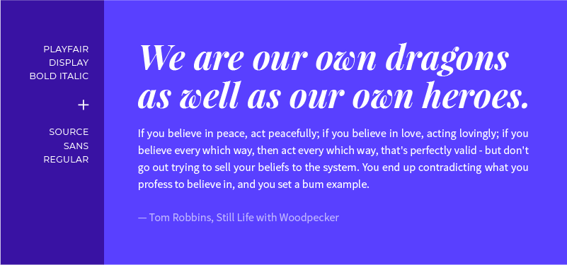
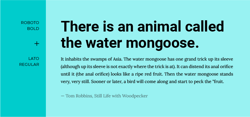
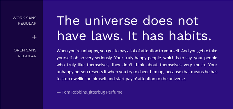
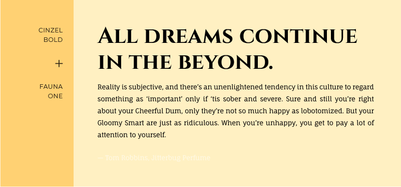
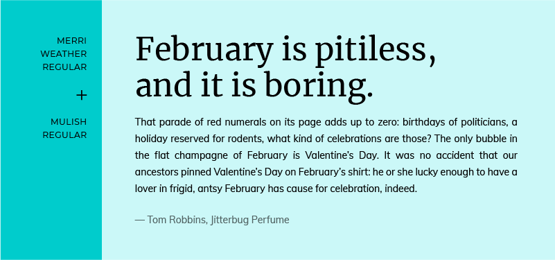
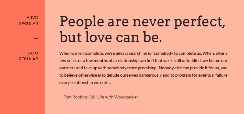
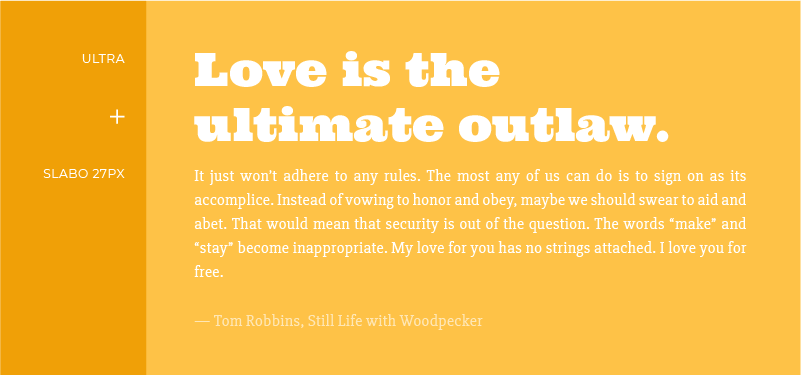
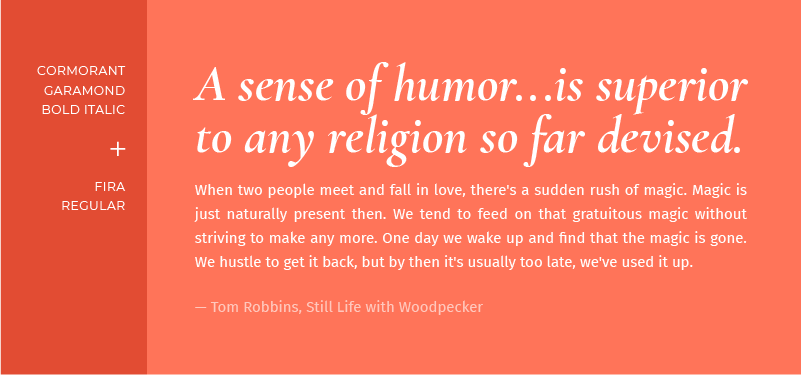
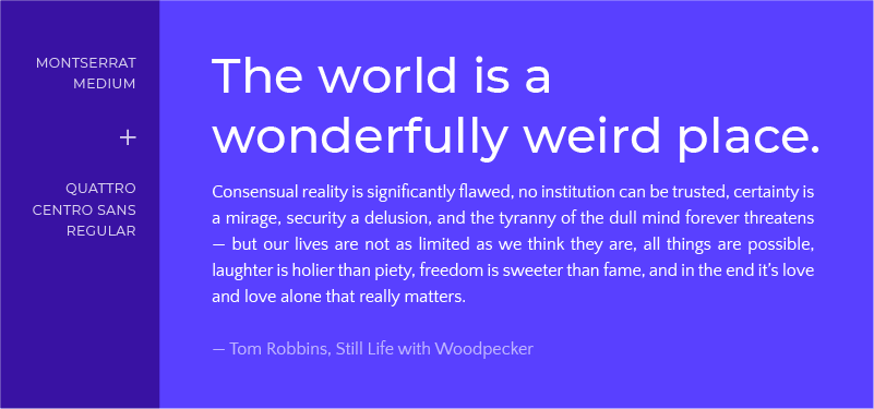
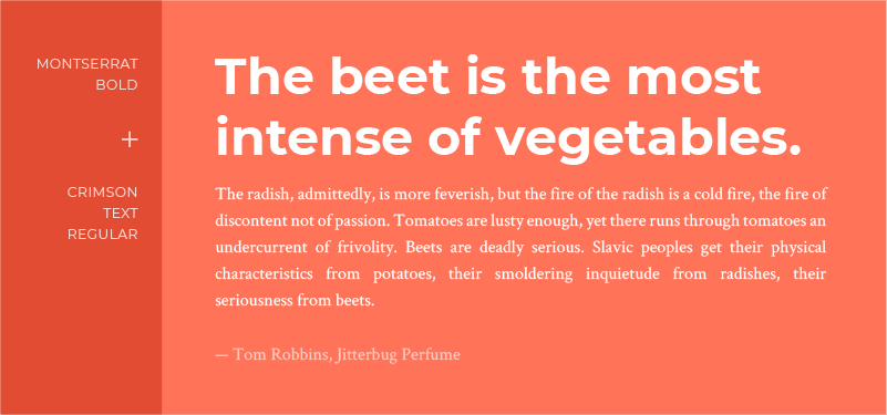
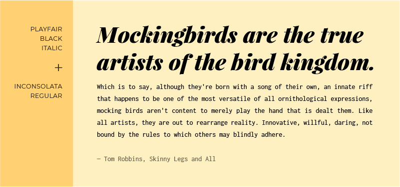
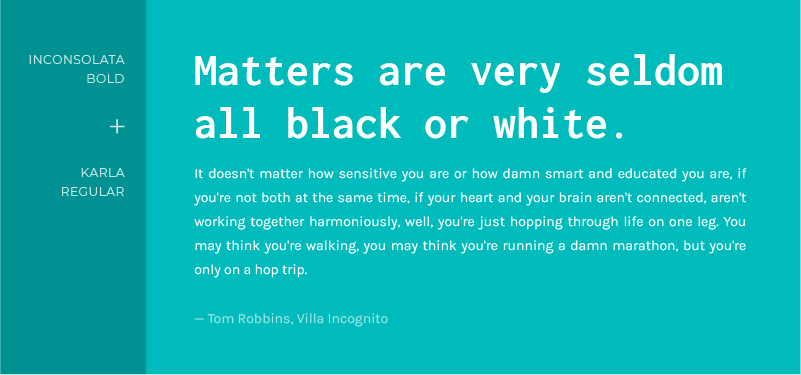
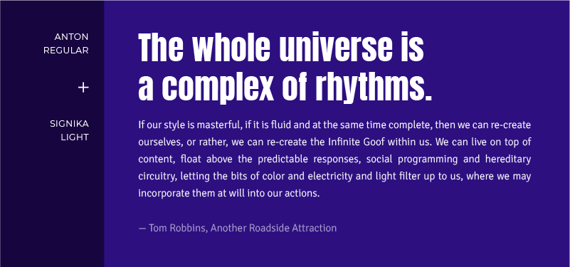
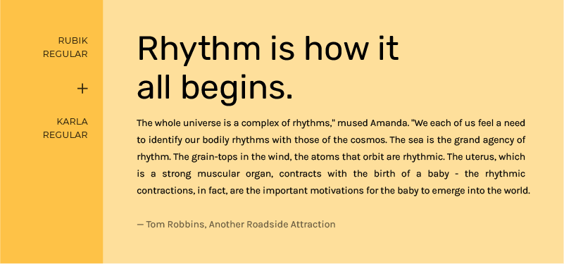
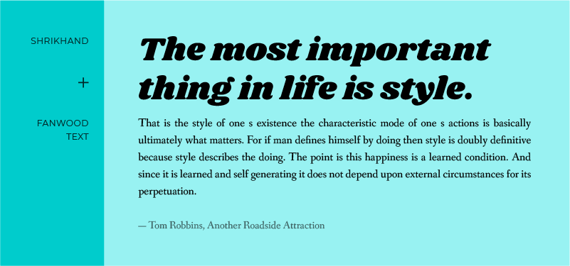
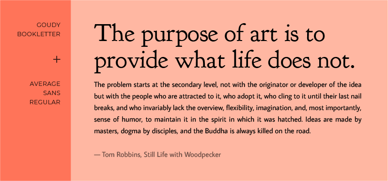
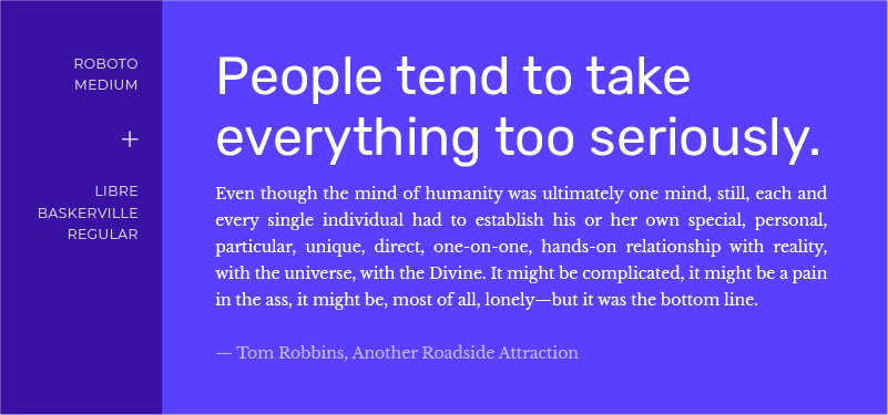
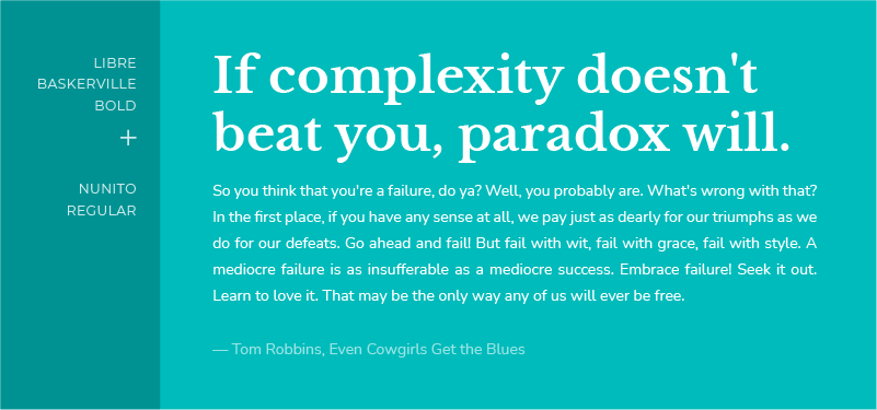
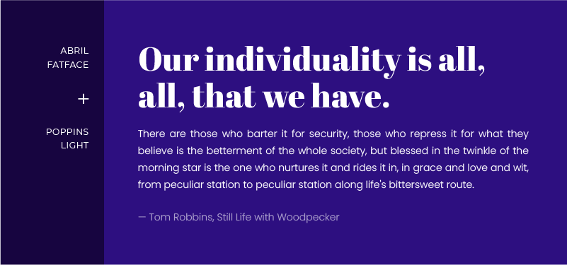
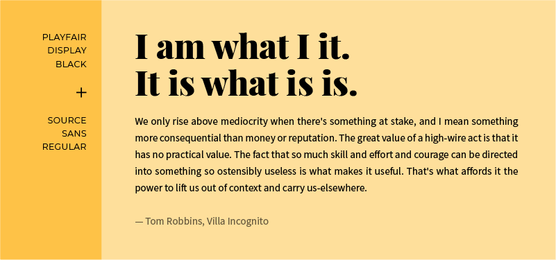
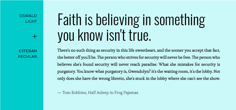
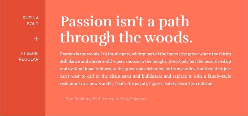
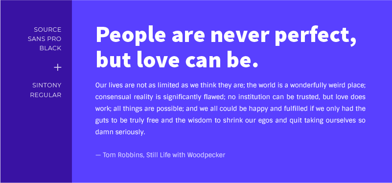
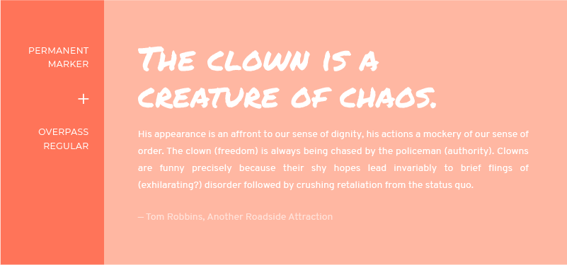
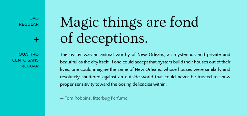
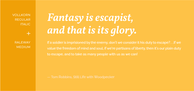
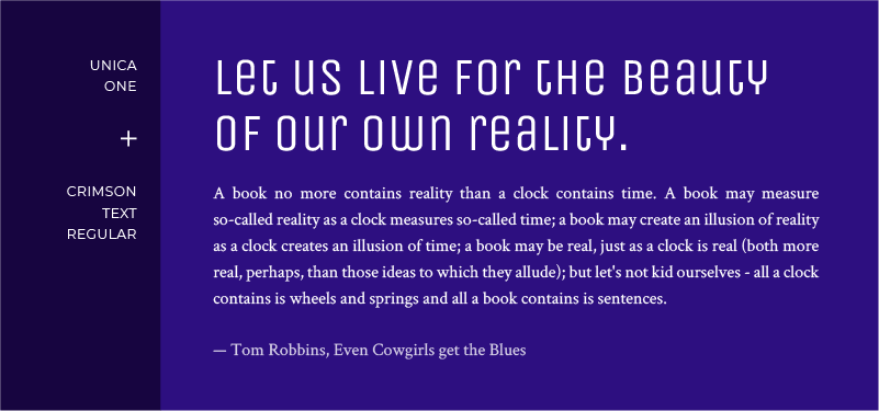
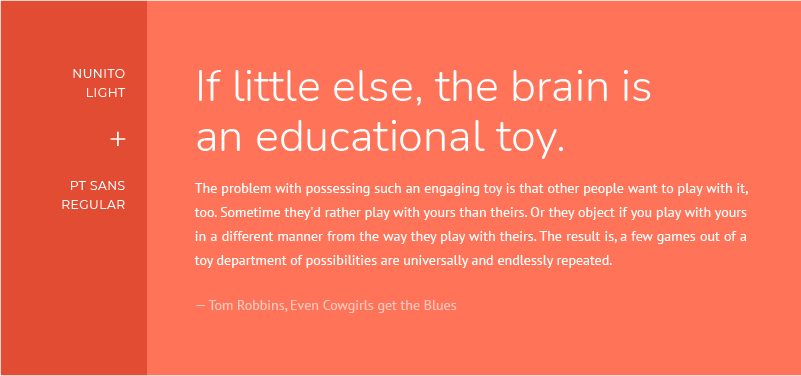
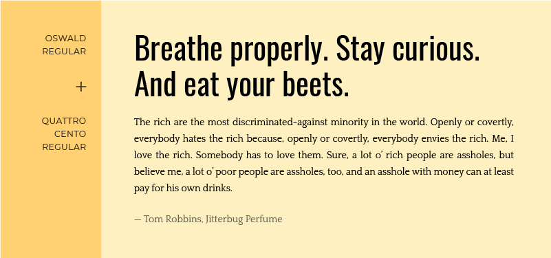
30 Amazing Google Font Pairings
Take a look at a 30 font pairing examples to inspire you for your next web design project!

Start Your 14 Day Free Trial
Try our award winning WordPress Hosting!