Since our launch back in 2014, Pressidium has been growing fast. As our product and brand matured it became apparent that we needed a solid set of design principles to ensure alignment between the work produced by our various teams. Having a set of robust brand guidelines helps in many ways especially when it comes to moving away from superficial and subjective opinions such as “this feels right” and “that looks good”. Brand guidelines ensure that a consistent approach is taken when making design related decisions.
To help others who may be looking to introduce their own brand guidelines for use in their business, we thought it might be helpful to share details on how we think, our values and vision, our philosophy and (of course) how we design here at Pressidium.
1. Honest
Honesty is undoubtedly Pressidium’s strongest core value. We firmly believe that integrity and authenticity is the only way to build good business and strong, meaningful partnerships. Unfortunately, most brands nowadays strive to impress or manipulate customers with promises that cannot be kept. Pressidium is not one of those companies. Our mission is clear and we are who we claim to be. We like being true to our customers’ aspirations and we always leave room to evolve.
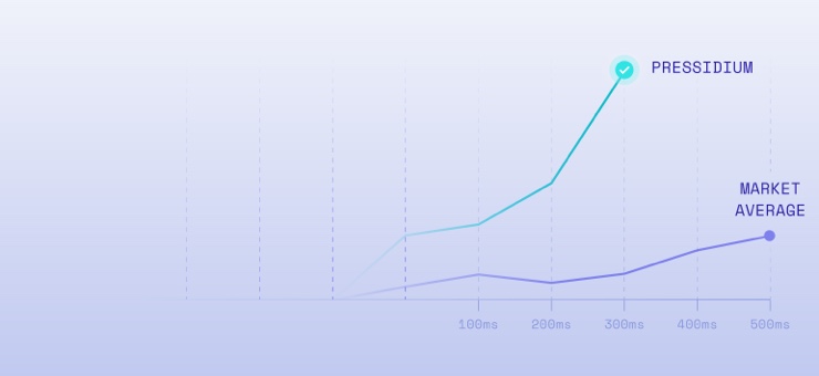
When it comes to design, we remove the unnecessary clutter and noise and we increase confidence with clear visuals that represent a trustworthy message and feeling. We don’t need to sugar-coat our services and neither does our design. Anything extravagant or that “overpromises” does not match Pressidium’s solid personality. Our design should always reflect these strong ethics with graphics that blend naturally with the brand and create a feeling of confidence, balance, and integrity.
2. Unified & Consistent
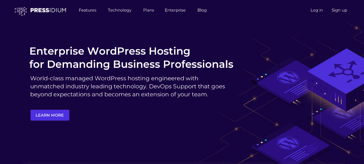
Consistency is a key principle in all design fields. It enables users to feel familiar with a brand and promotes bonding. At Pressidium we have established a unique and recognizable brand, that is used across the company. Our website, dashboard, newsletters, even our social media visuals, they all look and feel “Pressidium” at a glance. We like to keep high-quality standards even with the smallest details of our brand (such as icons) and we strictly refuse to follow trends. We want our users to feel familiar and comfortable with our brand and a strong, coherent design system is the way to achieve it.
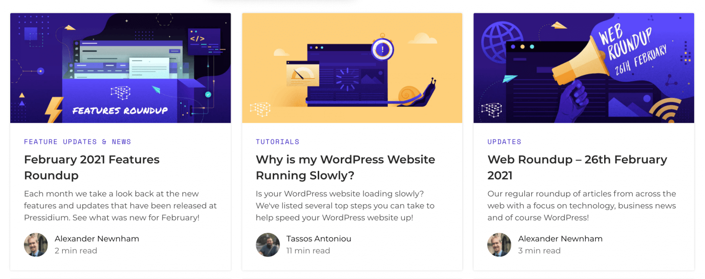
Our design system is a result of extensive and thorough research and can successfully be applied across all manner of materials and mediums. All our brand assets (color palette, typography, UI kit) have been built very carefully, so they can create a brand that can constantly evolve and adjust while being consistent. After all, consistency does not mean repetitiveness and should not be a barrier to innovation. Keeping consistency as a priority while thinking about innovative design ideas is the key to success.
3. Human
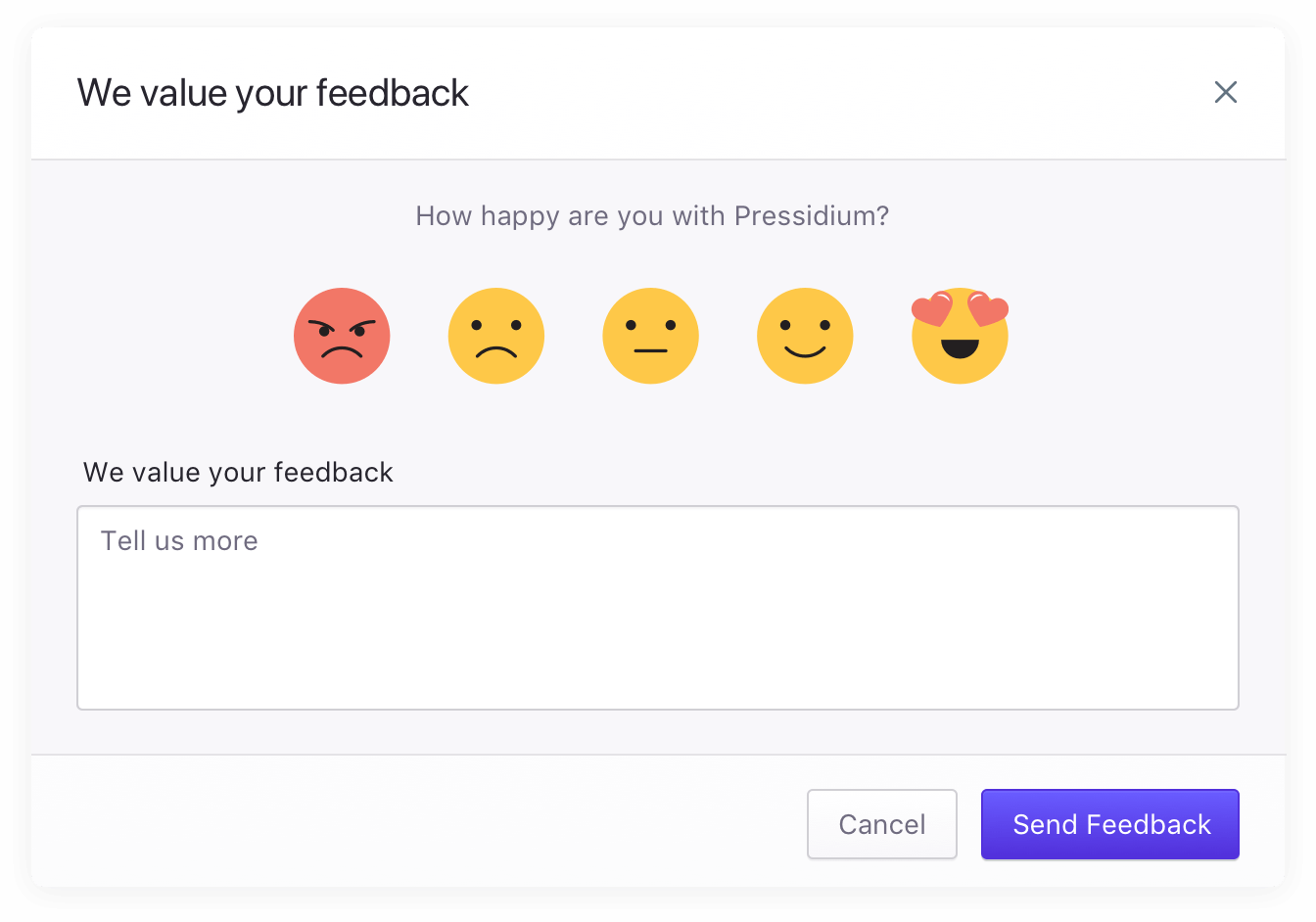
We believe human interaction and connection are irreplaceable. Pressidium’s vision is to connect to people in deep, meaningful, and authentic ways. This is our philosophy, how our Support team operates and is what our design aims to achieve. We challenge ourselves to establish an emotional connection with every design we create. We want our users to feel confident that they will be treated as individuals with specific needs. Emotion is at the core of our design. We don’t just sprinkle it on at the end – we bake it fully into every part of our brand.
We can’t help but notice the way our lives nowadays lack human connection, and we want to change that. Truth is, we spend most of our time everyday interacting with apps, bots, and browsing online. At the same time, creating emotion while depicting complex technological operations can be a challenge.
Try our Award-Winning WordPress Hosting today!

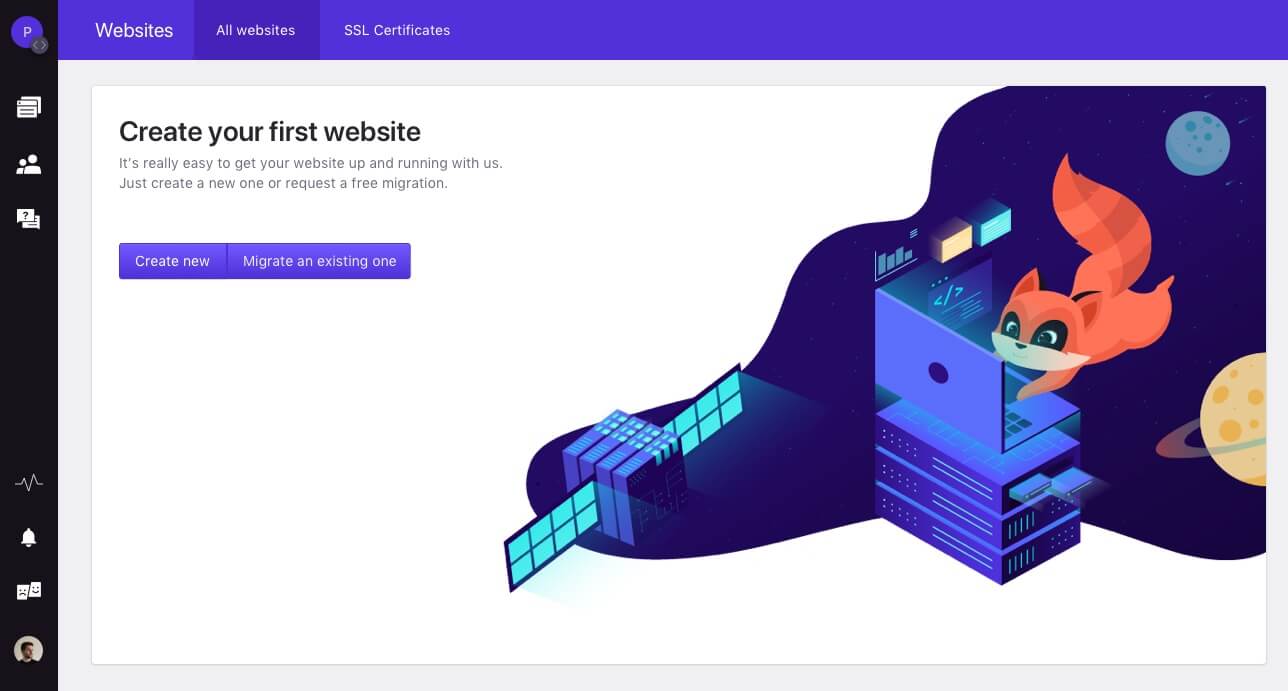
These issues the main reasons that led us to creating our brand mascot, Cody. Cody aims to establish an emotional connection with people even while they are performing everyday tasks in front of a computer screen. He aspires to become our users companion, assistant, and friend on their Pressidium journey. Plus, he can be used to trigger emotion and strengthen the user’s emotional bond to our company.
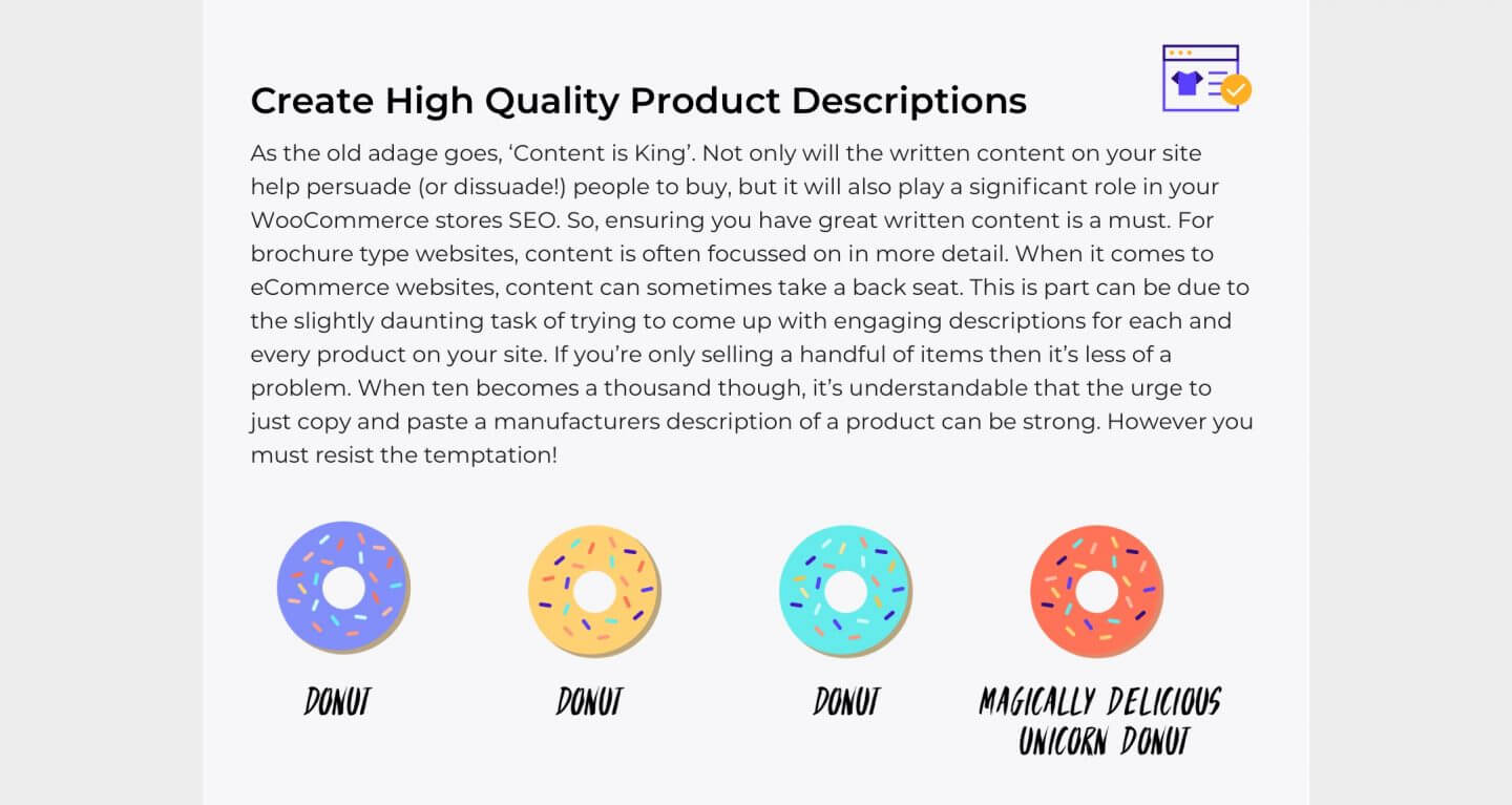
Last but not least, we like a good sense of humor. We want our design to be joyful and use clever metaphors whenever they can be applied.
4. Innovative and Tech-oriented
We don’t like to settle. As a company, we strongly believe in constant learning, development, and growth. Regarding our design, we love experimenting with new techniques (such as micro-animations or interactions) to improve our user’s experience. We never stop exploring new ways in which our users experience can be improved. However, consistency should always be a priority and lead the way. Innovation should work to expand our current design system, not break it.
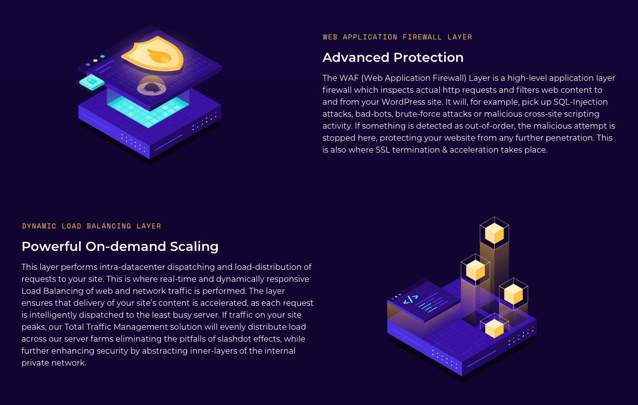
The concepts our design team needs to visualize and explain are technologically complex. Doing so while keeping the overall design aesthetically balanced and attractive is challenging. Our design team works hard to find ways of convey Pressidium’s high-tech core and help users feel familiar with our technology.
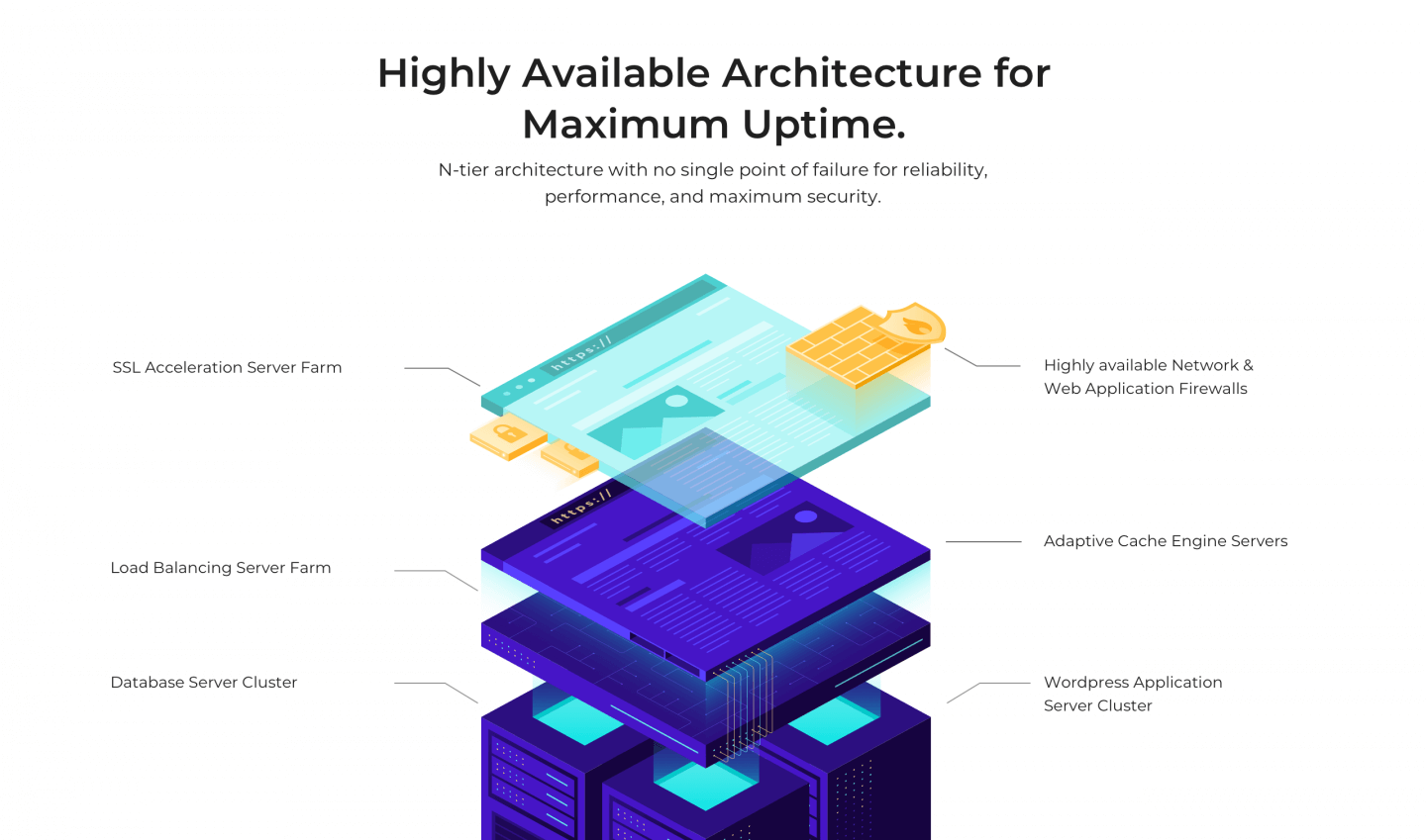
Our goal is to help users easily understand difficult technical concepts and terms with clean visuals that reflect our values and personality. We like metaphors and simplicity where they can be applied and always pay attention to detail.
5. Finely Crafted
“The devil is in the details.” This is our motto when designing for Pressidium. We want our visuals to be perfect and clean. Our designs should be visually balanced (in terms of color and hierarchy) and reflect our premium standards. Therefore, we don’t rush when it comes to design. Every decision, every illustration, and every interaction is thoroughly analyzed and reviewed until the result is flawless.
When combined together, design elements should look and feel right and flow naturally without disrupting the user’s experience. The result should always feel intuitive and create a feeling of fluidity.
We really hope you enjoyed reading about our Design Philosophy and the Principles behind Pressidium. We will keep evolving our brand while staying committed to our values. Hopefully these insights will help you on your own brand journey.
Start Your 14 Day Free Trial
Try our award winning WordPress Hosting!


