

iFrames are commonly used to embed content on a website. They can be super useful but you may also experience problems with them displaying content correctly. In this article, we’re going to look in more detail at what exactly iFrames are, how to use them and how to troubleshoot any issues you might encounter.
Let’s jump into this.
What Exactly Is an iFrame?
iFrame is short for ‘Inline Frame’. Its purpose is to embed HTML content inside other HTML content and display it as a web page element.
The content of the embedded source appears as if it is part of your website layout, except it is not. It could be another webpage, a document, a video or other types of interactive media. A common use for iFrames is to embed things like YouTube videos.
iFrames are an HTML tag and have been around for absolutely ages having been introduced back in 1997. Despite their age, they are still commonly used and are supported by all modern browsers.
How to Use iFrames
To create a simple iFrame you have to use the <iframe> HTML element and set the source in the src attribute. To give this a go, create an html file, for example, index.html. Then open it with your favourite editor and insert the following code:
<!DOCTYPE html>
<html>
    <body>
        <h1>This is an iframe</h1>
        <iframe src="http://www.example.com">
        </iframe>
    </body>
</html>
Now if you open the file with a browser you should see is something like this:
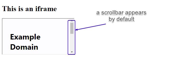
As you can see, the default iframe size does not include the entire width of the embedded content (in this case a web page) so a scrollbar automatically appears to let you navigate inside the window.
Now let’s set the width and height of the iFrame ourselves:
<!DOCTYPE html>
<html>
    <body>
        <h1>This is an iframe</h1>
        <iframe src="http://www.example.com" width="480" height="320" >
        </iframe>
    </body>
</html>
Refresh the page and see what it looks like now.

There are plenty of other options that can be configured when using iFrames. The most popular and useful are:
- name: We can set the name of the Fframe so that we can use it in JavaScript.
- loading: Define how an iFrame loads. Choose from ‘lazy’, ‘eager’ or ‘auto’. For example, when ‘lazy’ value is used, the iFrame loads when the user scrolls down the page to the iFrame. This has the effect of improving the page load speed. ‘Eager’ loads it right away whilst ‘auto’ lets the browser decide when to load the iFrame.
<!DOCTYPE html>
<html>
    <body>
        <div class="wrapper">
            <iframe src="https://www.youtube.com/embed/PMz9ovrVb_Q" loading="lazy"></iframe>
        </div>
    </body>
</html>- sandbox: This attribute sets some restrictions for the content in the iFrame such as script execution, form submission and more. You can also make exceptions for any of them. Here are some of the restrictions:
– allow-forms
– allow-pointer-lock
– allow-popups
– allow-same-origin
– allow-scripts
– allow-top-navigation
– allow-modals
You can apply all restrictions by just adding the sandbox attribute or you can specify which of the above will be excluded by defining it in the code like this:
<!DOCTYPE html>
<html>
    <body>
        <iframe src="https://www.youtube.com/embed/PMz9ovrVb_Q" sandbox="allow-forms allow-modals"></iframe>
    </body>
</html>- allowfullscreen: It does what it says on the tin and allows the iFrame to open fully on the screen.
To test the allowfullscreen you can try it by embedding a YouTube video like this:
<!DOCTYPE html>
<html>
    <body>
        <iframe width="560" height="315" src="https://www.youtube.com/embed/jofNR_WkoCE" allowfullscreen></iframe>
    </body>
</html>
You will notice that the fullscreen button at the bottom right functions only when the allowfullscreen attribute is used. If you remove the attribute, the fullscreen button will grey out.
How to Make an iFrame Responsive
It’s super important that all elements on your website are responsive. iFrames are no exception. To ensure an HTML iFrame is responsive, you have to first remove the width and height attributes from the code and then use some HTML elements and CSS code as shown below:
<!DOCTYPE html>
<!DOCTYPE html>
<html>
    <head>
        <meta name="viewport" content="width=device-width, initial-scale=1">
        <style>
        .container {
          position: relative;
          width: 100%;
          overflow: hidden;
          padding-top: 56.25%; /* 16:9 Aspect Ratio */
        }

        .responsive-iframe {
          position: absolute;
          top: 0;
          left: 0;
          bottom: 0;
          right: 0;
          width: 100%;
          height: 100%;
          border: none;
        }
        </style>
    </head>
    <body>
        <div class="container">
            <iframe class="responsive-iframe" src="https://www.youtube.com/embed/PMz9ovrVb_Q"></iframe>
        </div>
    </body>
</html>
We wrapped our iFrame in a div element and applied some CSS to set dimensions which ensures it looks good on all screens including mobiles.
Try our Award-Winning WordPress Hosting today!


If you test the screen width now inside your browser, you should see that the iFrame displays responsively and its aspect ratio is maintained.
NOTE: If you do not know your way around your browser’s tools, you might find an extension such as the “Responsive Web Design Tester” for Chrome useful.
The Benefits of Using iFrames
iFrames are super popular and for good reason. Let’s look at some of the reasons why:
Sharing External Media
There are lots of occasions where you might want to share external media but keep your visitors on your website rather than sending them off to a third-party website. iFrames allow you to seamlessly do this by incorporating the external media in a user-friendly fashion on your own website.
Custom Configurations
When embedding media (such as YouTube videos), most of the video hosting platforms will provide you with a lot of control over how this content is displayed. For example, you can choose whether you wish the video in your iframe to autoplay on load, or even loop the video indefinitely.
Keeping things isolated
Another great thing about iFrames is that they do not interfere with the parent document (normally your website’s page on which they are embedded). This means iFrames are not impacted by your website’s CSS and/or Javascript.
Some of the most popular uses for iFrames are:
- Embed a Youtube video or a Twitter timeline or a Spotify podcast playlist
- Pull information about the weather onto your site by including a weather forecast
- Adding a Google Maps location
As long as the source you want to display provides an embed code, you can normally always display this on your site within an iFrame.
Potential Downsides of Using iFrames
One of the top reasons for NOT using iFrames is that they can increase the risk of your website being subjected to a cross-site attack.
If the source embedded in your iFrame is not trustworthy then you are at risk of experiencing what’s know as a ‘Malicious iFrame Injection’ which involves an attacker injecting an iFrame into a web page. In an iFrame injection attack, ‘the malicious websites typically exploit code that can potentially compromise the end user’s machine‘.
So, when embedding content on your website using iFrames it’s vitally important that this content comes from a trusted source. If in doubt, don’t use it.
Another downside of using iFrames is that they can slow your website down, especially if you load several of them. Your website then only becomes as fast as the external content that has to be loaded. As a precaution against this, you can use the loading attribute discussed earlier.
Conclusion
iFrames are wildly used on websites and there is no sign of this stopping anytime soon. Providing you use them correctly they can be a great tool for enhancing the content on your website.
Start Your 14 Day Free Trial
Try our award winning WordPress Hosting!


