Do you have a whole load of data that you want to present on your WordPress website in a graph format? Perhaps some sales statistics or data that shows a client how you’ve improved traffic to their website over a period of months? Whatever the reason, presenting data in a visual way makes it a lot easier to communicate core points with your audience as well as being more enjoyable… after all, unless you’re a real numbers geek, poring over spreadsheets with rows and rows of numbers is no-ones idea of much fun!
You might like the idea of presenting data in a visual fashion but the key question is ‘how do you do it?’. It might be tempting to perhaps create a graph or pie chart in some graphic design software (like Canva) and then place the image on your website. That’ll certainly get the job done but what if there was a better way?
Fortunately, there is, and, being WordPress it all starts with a plugin! In this article, we will take a look at some of the plugin options available to help you display that data in a user-friendly, interesting and readable way. Let’s get going!
Easy Charts

The Easy charts plugin is a popular, free plugin that gets the job done. It hasn’t been updated in a while but this seems to be more as a result of it continuing to work just fine ‘as-is’ than due to any significant neglect.
It is well featured and pretty straightforward to get started with. Once it’s installed, head straight to the ‘Add New’ menu link from within the Easy Charts Admin area.
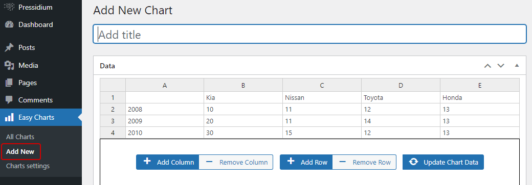
You’ll see that you can add data in rows and columns (much like you would in a Excel or other spreadsheets. As a bonus, there is a preview panel for you to see results on the fly.
Configuration is detailed. You can personalize the style, typography, caption, colors and more to achieve the look you want. There are multiple ways your data can be presented… which you choose will depend in large part on the kind of data you’re presenting.
- Bar Chart
- Area Chart
- Stacked Bar Chart
- Stacked Area Chart
- Percent Bar Chart
- Percent Area Chart
- Pie Chart
- Donut Chart
- Step Up Bar Chart
- Waterfall Chart
- Line Chart
- Polar Area Chart
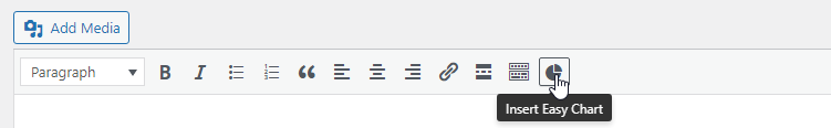
When you have created your chart you’ll be given a shortcode which you can then paste into a post or page. Alternatively, you can add your chart directly from inside the visual editor, if you are using one, with the help of a quick-insert “Easy Charts” button.
The plugin was developed using the uvCharts Javascript library and creates charts with SVG and CSS3 transitions. As a cool bonus you can also download any charts you create as an image file. Finally, you’ll also note that the charts are responsive… a must in today’s mobile-first web design world.
Visualizer

The Visualizer plugin is another popular choice for creating good-looking, responsive charts and diagrams for your website. With over 40,000 installations and a raft of great reviews, it’s an excellent option.
After installing and activating the plugin, you should see its listed in the WordPress menu. Click on “Visualizer -> Add new chart” to add your first chart.
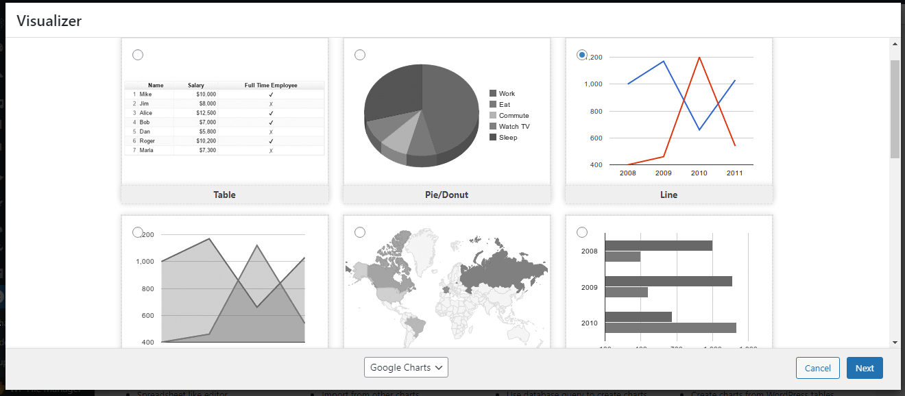
A popup window will appear that takes you through the process of selecting options that are perfect for your particular chart requirements.
Try our Award-Winning WordPress Hosting today!


You have 6 free templates to choose from:
- Table
- Pie/Donut
- Line
- Area
- Geo
- Bar
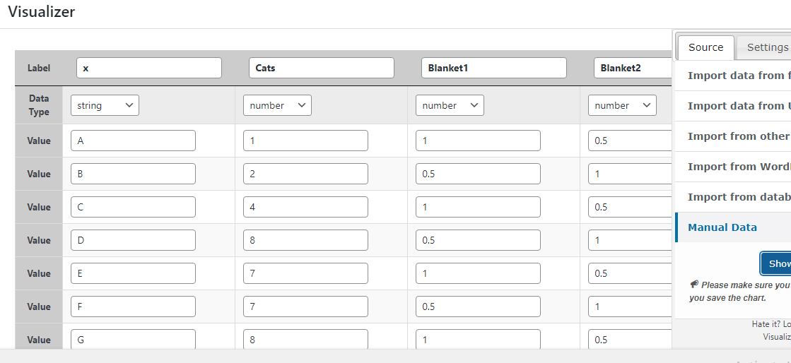
You can upload your data CSV locally or import data from a remote CSV file or Google Spreadsheet. You’ll probably want to download the template CSV file first however to check that your data is structured in a way that the plugin will understand. Alternatively, you can import data from a remote JSON source or add data manually.
In the Settings tab, you will find a range of options that allow you to alter the style of your chart prior to publishing it.
Once you have created your chart, you can copy its associated shortcode or export it as a CSV or image. The Visualizer plugin uses the Google Visualization API, DataTables.net and ChartJS to accomplish the above.
wpDataTables

The wpDataTables plugin is another great choice for creating data tables and charts to display on your WordPress website. It is a premium plugin but does offer a lightweight free version which may well provide enough features for many projects.
Once installed and activated, head to “wpDatatables -> Create a Chart” to get started.
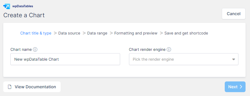
You can use the wizard and follow the steps to create the chart of your choice. Set a name for the chart, pick the render engine and visualization type and then get the source data which has to be a table created with the same plugin.
Let’s look at this process in slightly more detail in order to examine a function not offered by the plugins mentioned previously. Click “Create a Table” to begin.
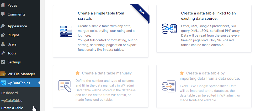
As you can see, you can either create it from scratch or pull the table contents from an existing source. For this example, we will choose to create from an existing source. Having clicked this we will then be asked to choose the “Input data source type”.
In the free version, we can use the CSV, Excel, XML or JSON file format or provide a PHP serialized object.
This is a great feature as it offers the choice to present data from your database. This isn’t the easiest to do but hey, we’re up for a challenge!
In this example, let’s say we want to see some stats that show the number of posts against pages.
The PHP code that outputs the serialized array should look like this:
<?php

include('wp-blog-header.php');
header("HTTP/1.1 200 OK");

$return_array = array();

$posts_query = new WP_Query(
    array(
	'post_type' => 'post',
	'post_status' => 'publish'
    )
);

$pages_query = new WP_Query(
    array(
	'post_type' => 'page',
	'post_status' => 'publish'
    )
);

$posts = $posts_query->found_posts;
$pages = $pages_query->found_posts;

$return_array[] = array(
    'Type' => 'Posts',
'    Count' => $posts
);

$return_array[] = array(
    'Type' => 'Pages',
    'Count' => $pages
);

echo serialize( $return_array );

?>
According to the official documentation provided by wpDataTables, the parent array entries will be parsed as rows, child array keys will be parsed as column headers, and child array values as cell values.
We saved the code in a file we named test.php and, for the purposes of this example, we will place it in the root folder of our WordPress installation.
Back in the admin area, we will fill in the file path like this:

We save the changes and voila.

Now we can set the table as the source for the chart, select the chart type and save the chart. Simple as that! The final steps are to follow the Wizard to its conclusion which will involve tweaking the available settings to get the design you want for your chart. After that, you’re free to publish it.
Conclusion
It’s incredibly useful to be able to display data in a visual way on a website. However, many WordPress users simply don’t realize that it’s a relatively easy thing to do with the help of a plugin. Hopefully the above has given you some idea of the options available to you. Happy graph building!
Start Your 14 Day Free Trial
Try our award winning WordPress Hosting!