What color comes to mind when I say McDonald’s? What about Yahoo mail? Now, let’s try the opposite. Which soda drink do you think of when you see a red Santa Clause riding his sleigh?
The answer to the above questions is pretty obvious. You can’t see the McDonald’s logo, with its yellow-gold arches, without thinking about happiness, childhood, or their delicious french fries. You can’t think of Yahoo mail, without picturing their purple logo. Likewise, you can’t imagine Santa Clause drinking any other soda drink, but Coca-Cola.
So, how have these brands managed to link their name with a specific color in our minds? By successfully using Brand Color Psychology of course! In this article, we will take a deeper look at what Brand Color Psychology is, why it is so important and how to use it to benefit your brand.
What is Brand Color Psychology?
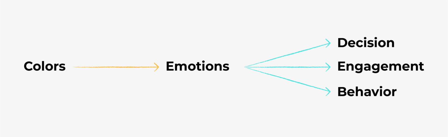
Color psychology is defined as “the study of how colors affect perceptions and behaviours”. In marketing and branding, Color Psychology is focused on how colors impact consumers impressions of a brand and whether or not they persuade consumers to consider specific brands or make a purchase. Simply put, specific colors have the ability to trigger specific emotions, and these emotions can help users engage with a brand or even lead to certain behaviours and decisions.
Brand Color Psychology provides a framework for understanding how and why we interact with the brands in our lives. It’s a powerful tool in a designers armoury.
Why is Brand Color Psychology so important?
Color evokes feeling. It incites emotion. As human beings, our decisions are lead, not only by logic but by emotions as well. We will not sign-up for a service we don’t feel comfortable with, no matter how legitimate they appear to be. Most of us have learned to pay attention to what we call ‘our gut feeling’. This is used by designers and marketeers to powerful effect to get us to buy their products and services… you only need to think of Apple for example to realize that many of us buy their products not because they’re beautifully engineered but more because they make us feel good.
Branding and Marketing are all about controlling these ‘gut feelings’ and emotions your customers get when they see your brand. It’s all about shaping the way your audience perceives your brand and guiding your customer behaviour. Color is one of the fundamental visual stimuli in the human sequence of cognition that subconsciously make us say ‘yes’ or ‘no’ to a brand. So, by understanding how Brand Color Psychology works, you have an edge when it comes to designing brands or products that are successful.
Tips for Picking the Right Colours for your Brand
So, now we understand just how important colors are, how do we go about choosing the right selection for our brand or product? Here are some tips to help get you on the right track.
1. Know your territory
It is crucial, before you even start, to understand the industry you are working in or designing for. Everyone wants to ‘stand out’ from the crowd but overdoing it might have the opposite effect. It is important to choose a color that feels appropriate to your industry and authentic to your products or services. For example, if you are selling health and nature-related products, such as vegan food, purple would definitely make you stand out from the competition, but not in a good way.
It is important to know where you stand and pay attention to certain Color Psychology ‘rules’ in order to make customers feel comfortable and familiar with your brand. It is definitely more important in certain industries than others, but there is no quicker way to turn away potential customers than picking a brand color that feels wildly out of touch with what you do.
2. Know your neighbors.
In order to successfully ‘blend in’ to your industry, it is important to take a good look at your competition. Undertake some in-depth research on how they are handling their color palette and identify what they are doing well. We don’t want to you be a copycat, but it’s always useful to know how competitors companies have handled this issue, so you can find the perfect balance between ‘blending-in’ and ‘standing-out’.
3. Know who you are.
Before proceeding to pick colors, you need to identify your Brand’s personality. In other words, understand who you want to be for your customers. Start by asking yourself and your team a few simple questions:
- If your brand was a human being, which characteristics would describe their personality?
- Is you brand friendly, sophisticated, active, environmentally aware?
- Which personality traits are fundamental for you to have?
- What are the characteristics that make you different to your competition?
You can easily get carried away in this step because let’s face it, we all want our brand to carry all the virtues in this world, so try to limit the main values that describe your brand to maximum 5 to 6. This will help you sort out the most important ones, that need to be reflected in your branding.
4. Know your audience.
Understanding your target audience is Branding 101, in so many different aspects of branding and marketing. This is especially important while picking the right colors for your brand.
Try our Award-Winning WordPress Hosting today!


Consider your typical buyer persona. Your brand’s personality needs to align with their personality if you want to make ‘friends’ with them. Which color will appeal to them more? Is your target audience masculine or feminine? Energetic or easy-going? Don’t forget that when it comes to Color Psychology, culture and context also matter. So, if your brand is not global, also keep an eye on the geographical and cultural characteristics of your audience.
The Color Chart
Our everyday lives are vividly painted with thousands of colors and shades, each of them affecting us in different ways. The color psychology chart is a summarised framework of 12 of the most commonly used colors, and the positive or negative emotions they are usually linked to.
Keep in mind, that emotional responses are never absolute. The exact way each color affects us also depends on our cultural background and our personal experiences. However, this chart will give you a glimpse of how the majority of people emotionally respond to each color.
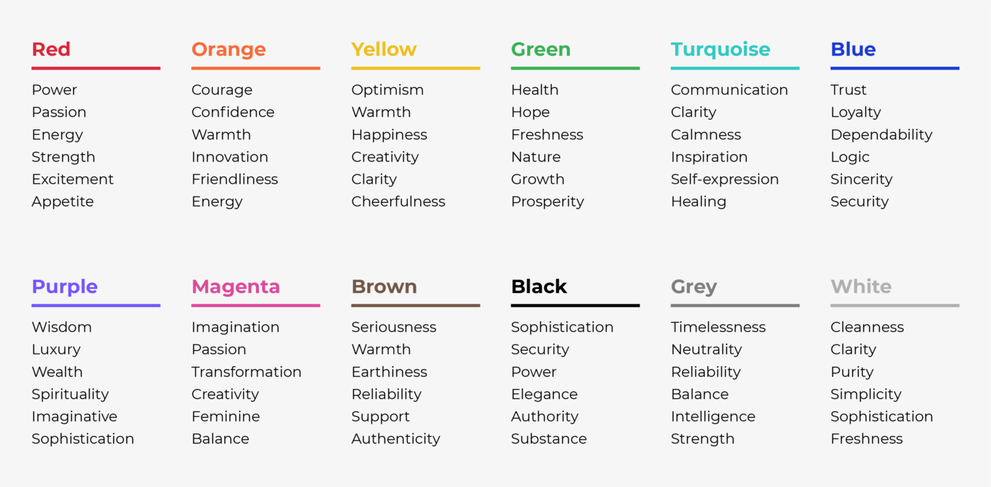
So, have a look and try to identify where your brand belongs to, based on your industry, your brand personality, and your target audience.
How to Combine Colors
After you find out which color or colors appeal to your brand, you need to build your color palette. To do so, you need to combine your selected colors together, in ways that produce a balanced and harmonious palette. There are many standardized techniques for combining colors. Studies have shown that people tend to prefer either color patterns with similar hues or highly contrasting ones. In terms of color coordination, this means following either an Analogous or a Triadic color scheme.
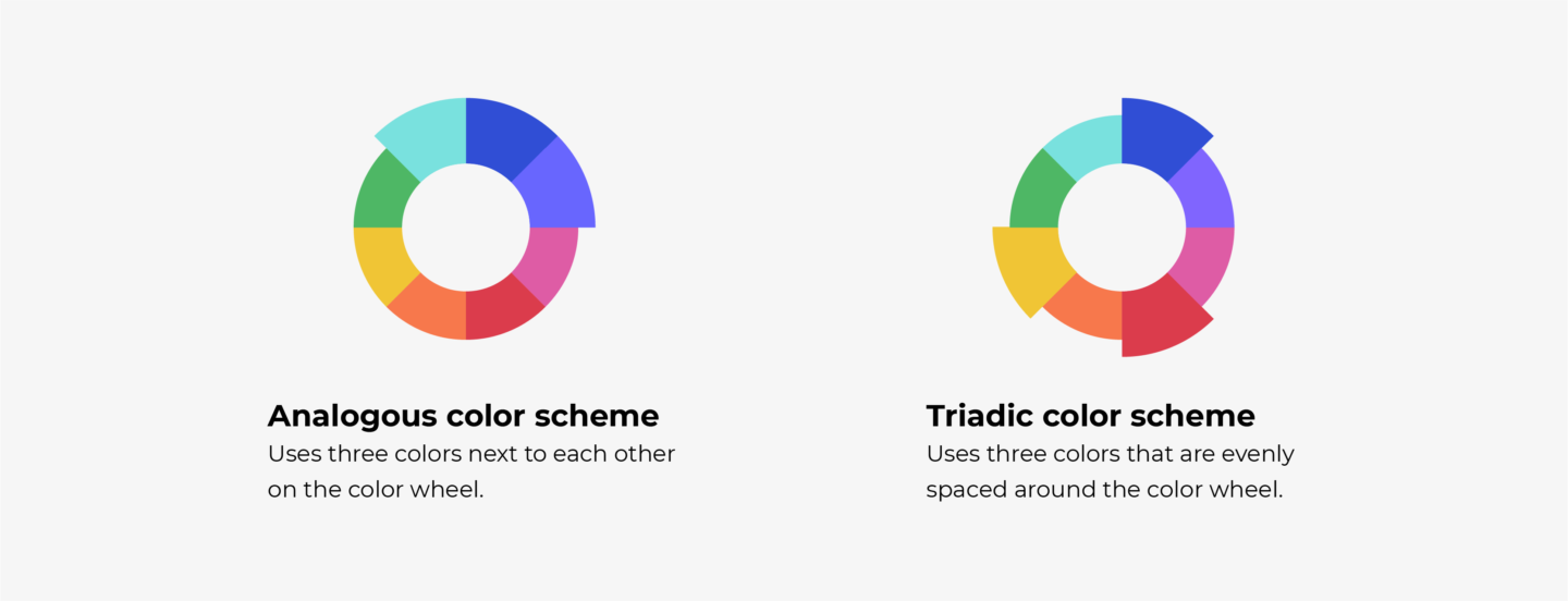
Analogous color schemes consist of three colors with are adjacent to each other on the color wheel. When combined together, analogous colors usually produce a very peaceful and relaxing result. This scheme benefits from having one dominant color with the two remaining colors as accents.
Triadic color schemes, on the other hand, use three colors that are evenly spaced around the color wheel. This gives a highly contrasting result, which helps build visual hierarchy. This is another scheme that benefits from choosing one color to dominate, with the other two as accents.
Besides these two most popular ways to combine colors, you can also use either a Monochromatic, Complementary, or Tetradic approach.
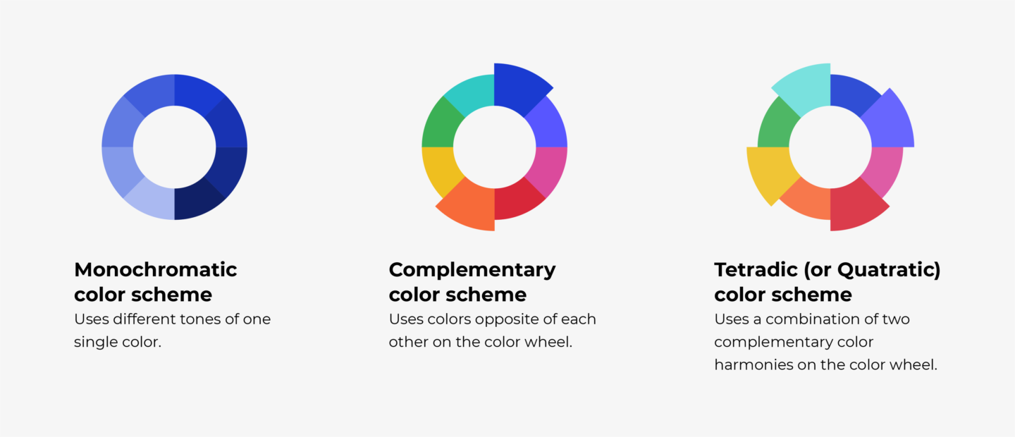
Monochromatic is a color scheme that consists of only one color. By using variations of lightness and saturation, you can easily create a stylish scheme.
Complementary is called a scheme that uses two colors that are opposite to each other on the color wheel. This color scheme can also be vibrant and high contrasting.
Finally, a Tetradic scheme is made by two sets of complementary colors. Having four colors to work with can be more challenging, but it can also produce a full and rich color scheme. Using a dominant color with three accent colors is one way to harmonize a tetradic color scheme.
Summary
Now that you have learned what Brand Color Psychology is and how important it is, we hope you are ready to start using it. Choosing the right color is one of the best ways to create a powerful and meaningful visual identity. So don’t be afraid to invest as much time as is needed until you find a color that is authentic to your brand, embodies your brand personality, and feels right.
Start Your 14 Day Free Trial
Try our award winning WordPress Hosting!